Recreation in Roswell | The Final Prototype

After weeks of reorganizing, testing and analyzing the design and configuration of a new app, the final prototype days have been completed. I created the idea of an app for the city of Roswell, Ga., that creates a platform specifically for recreational activities in the city. From park and trail maps to art festivals and news, this app would cater to the local Roswell resident and give them a place to find information surrounding their community quickly.

My hope was to build a place for users to come to who want to find something to do around their community quickly and in an enjoyable environment. The Roswell municipality website was overloaded with information, and this app targets recreational and outdoor activities more specifically. It will hopefully be the quick stop for adventurous users looking for fun things to do in Roswell.

Step-By-Step

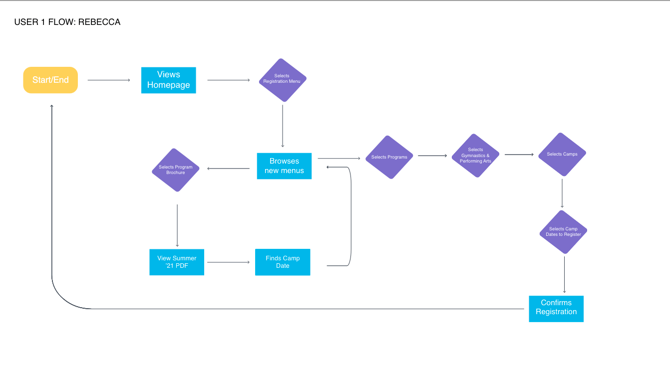
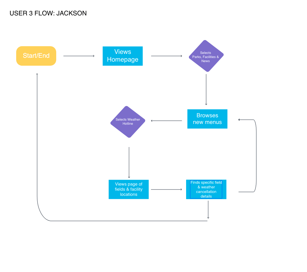
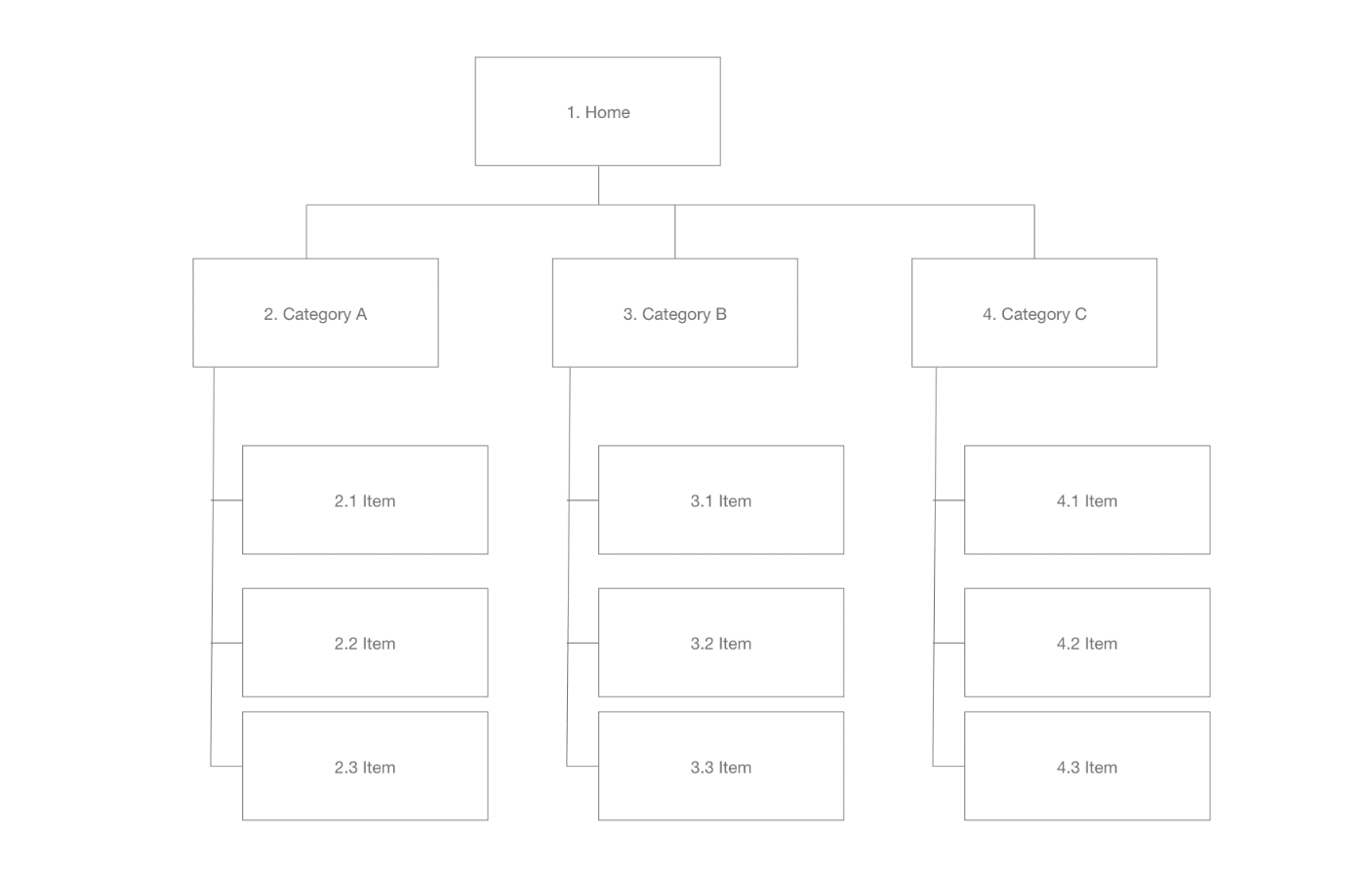
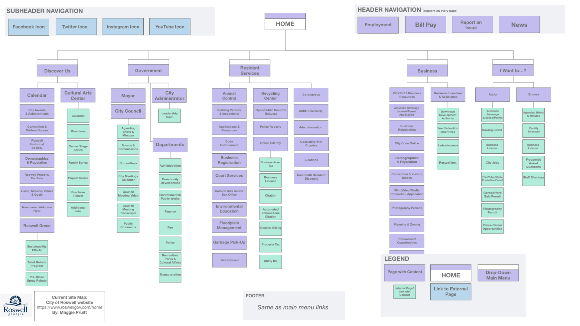
In the opening stages of creation, as the designer, I began by creating a flow chart of information that would be the basis of the app. The flow chart helped me visualize the flow of the app, and how the user would jump from topic to topic. In addition, I created tasks for users that would ideally use the app.

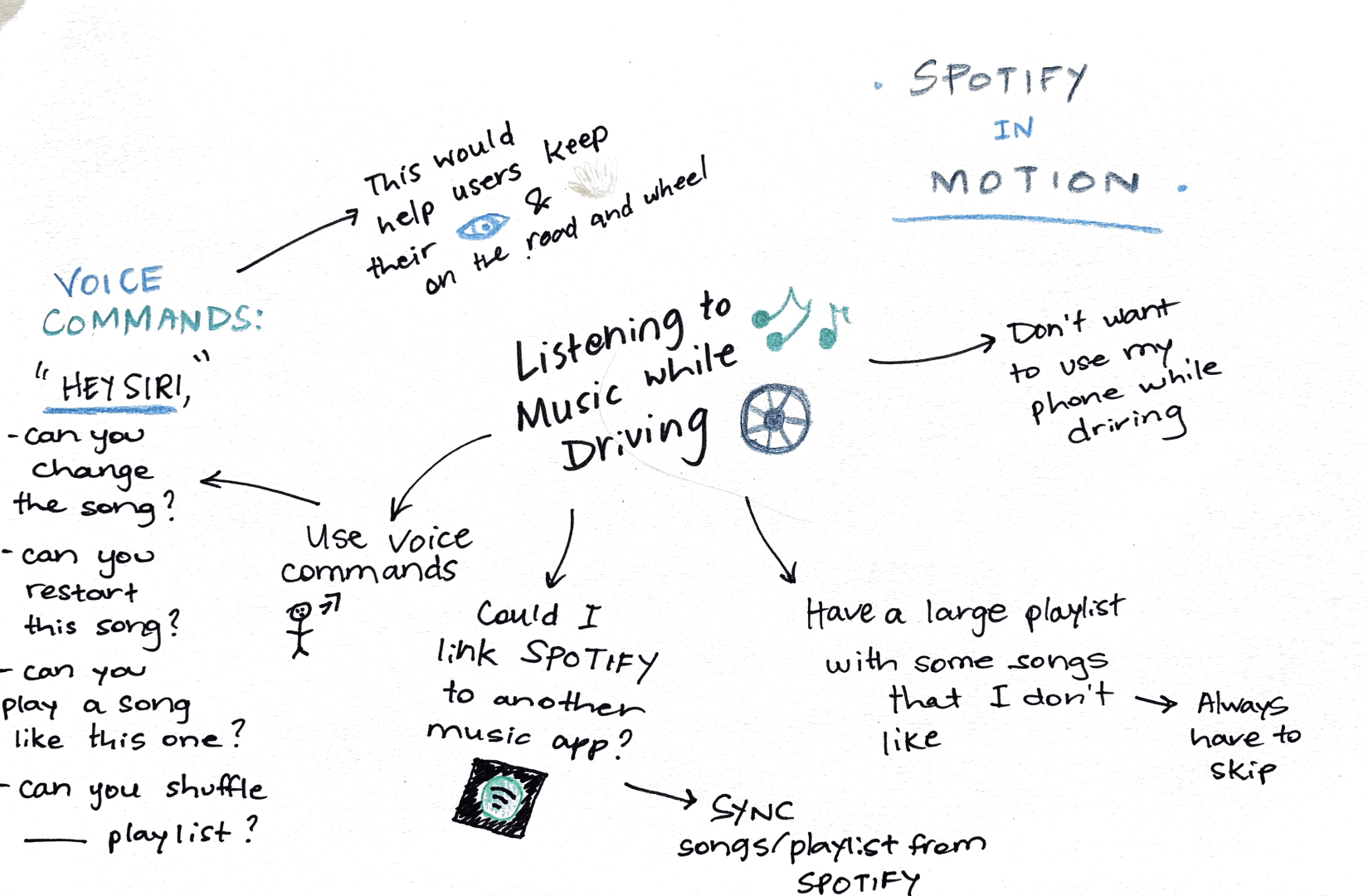
The next step was to create low-fidelity or paper prototypes of the app’s design. This step helped me visualize the what the app would actually look like on a phone. I sketched out numerous screens and used the tasks to help create the screens I knew a user would need to see to complete those tasks. This process was difficult and time-consuming, but in the end, it would eventually help immensely in the design and testing processes.

Testing

Using the paper prototypes, I used the Pop app to create an app-like prototype that would allow users to walk through the screens with a real-life feel. The Pop app allowed me to test the app prototype on real-life users and see how they navigated the app. The two participants I tested gave me detailed feedback about navigation and menu design that I would implement into the next phase of the design process. The testing process helped me see things that I did not see from the beginning as the designer.

High Fidelity Prototypes

After testing participants on navigating the Recreation in Roswell app, I then moved on to the final stage which included the designing of high-fidelity prototypes. High-fidelity prototypes are designed to appear and function as close to the final product as possible (Babich, 2017). These high-fidelity prototypes are mainly used for more testing or as a presentation for stakeholders.

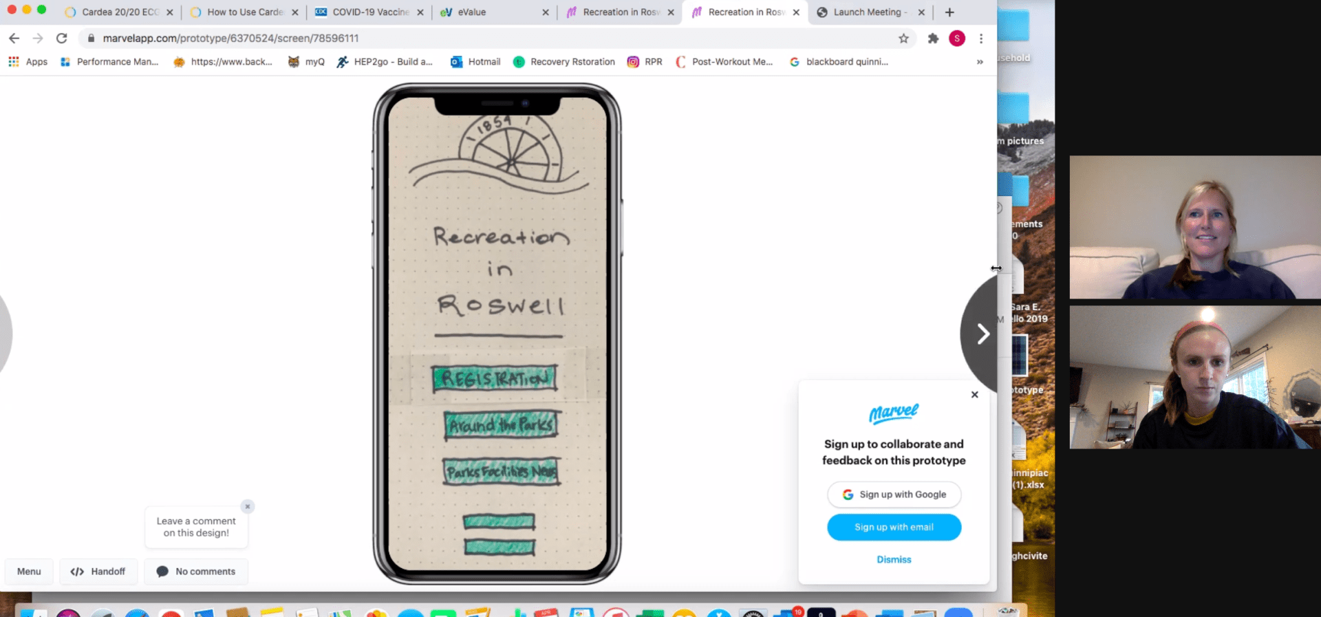
To create my high-fidelity prototype, I designed the Recreation in Roswell app’s screens in Sketch. It took me a little while to figure out the navigation, but it eventually was super simple to create shapes, text and design the screens. After creating all of the screens, I then linked the pages together in prototype mode and uploaded the screens to Invision.

Prototypes in Sketch


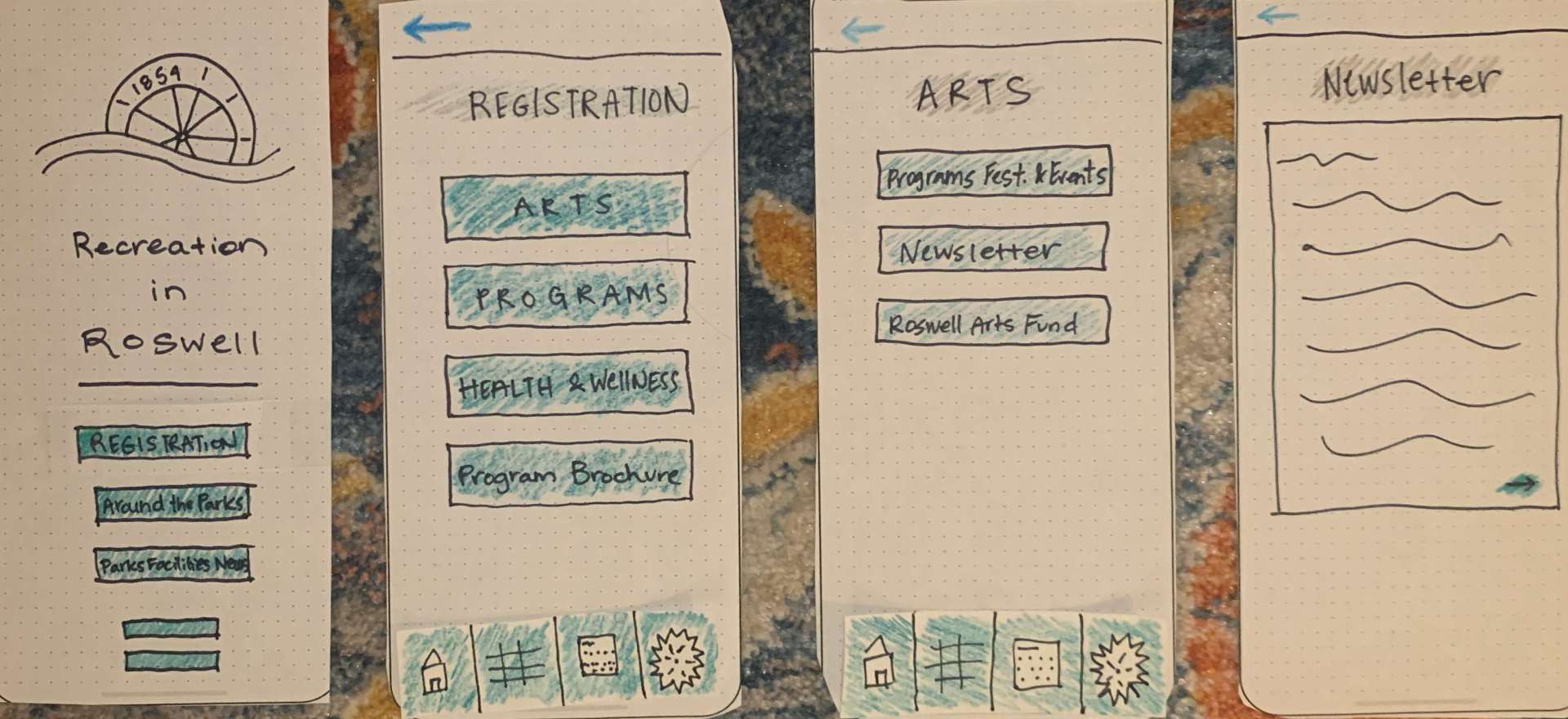
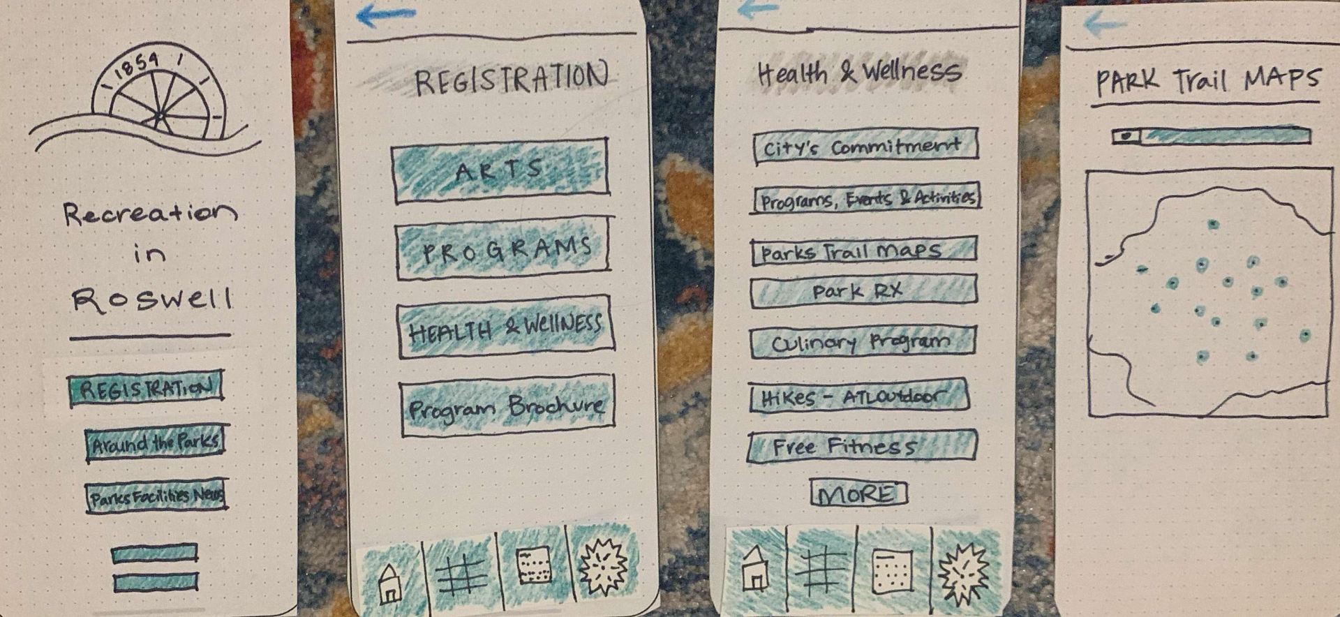
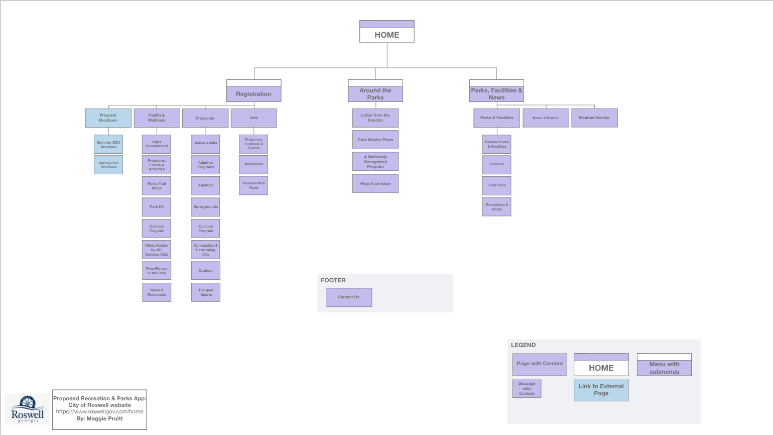
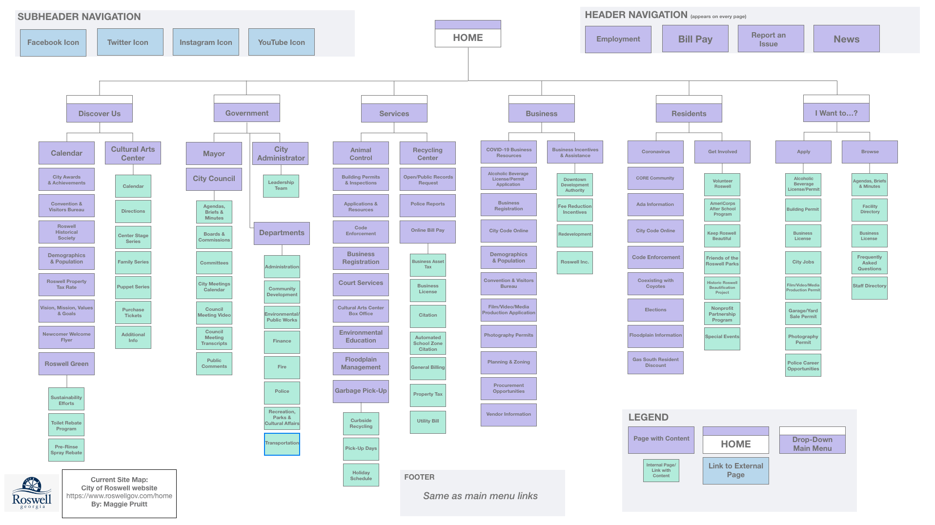
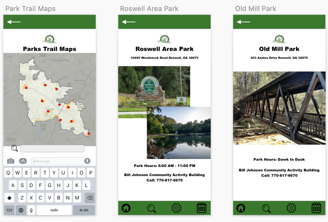
Here’s a breakdown of the Recreation in Roswell app’s main page:

The four main menus include Registration, Around the Parks, Future Planning/Inquiries and Parks & Facilities. I expanded the main menu from three navigation links to four as my testing participants offered that as an idea due to some concerns during testing.

The Registration menu includes links to Program Brochures, Health & Wellness Programs and Art Programs. This menu is where users will go to sign up for camps and programs in the community.

Registration Menu – Recreation in Roswell

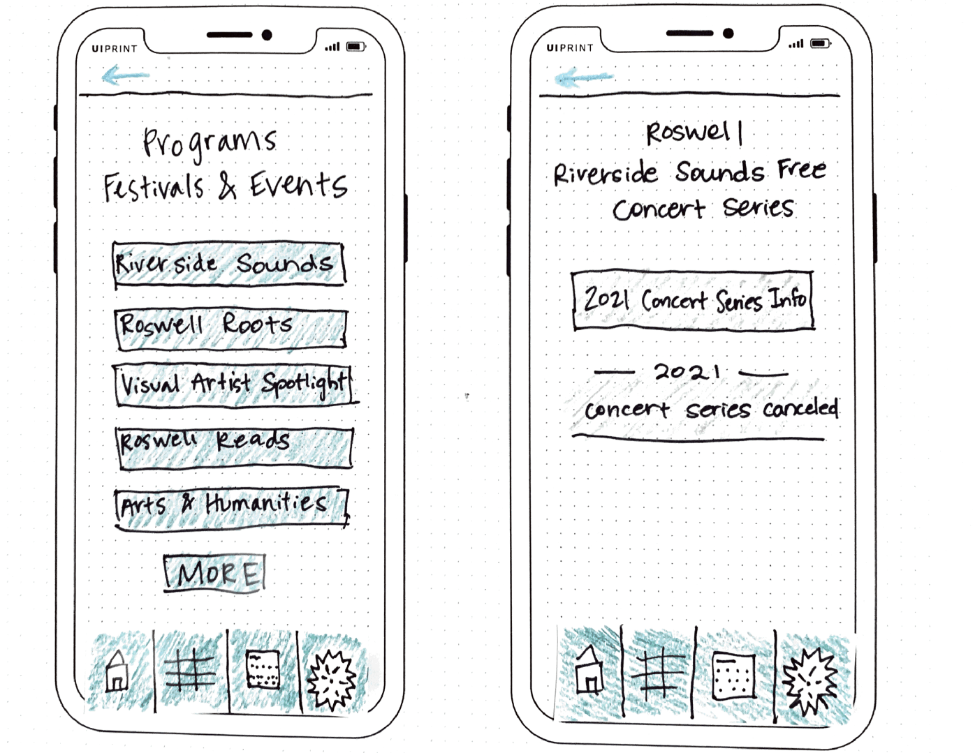
The Around the Parks menu includes information about Events & Festivals, Park Trail Maps, a Newsletter and the Roswell Arts Fund. This menu will be for users who are looking for information about where parks are located, events that are happening at parks and information about the art located in the parks.

Around the Parks – Park Trail Maps

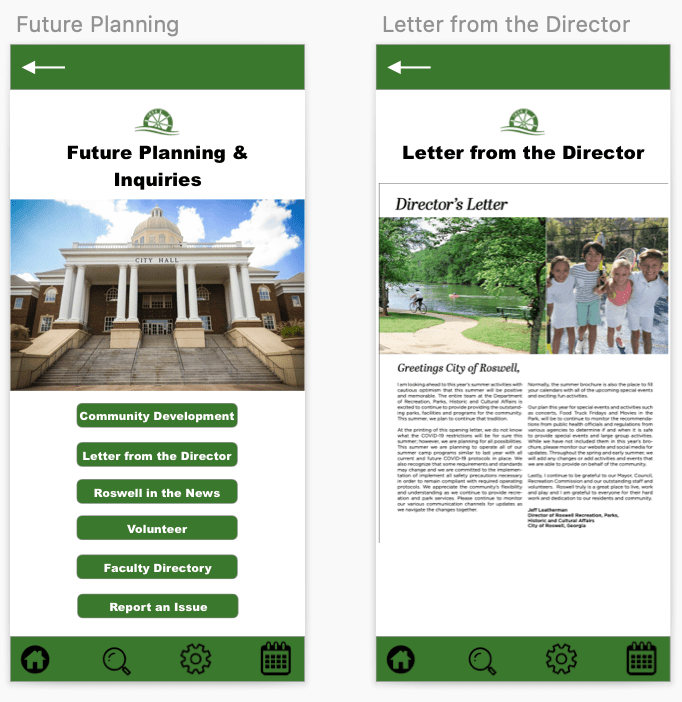
The Future Planning/Inquiries menu is for government and Roswell faculty/staff news. There is a Letter from the Director, an option to report an issue and community development news located in this part of the app.

Future Planning/Inquiries | Letter from the Director

The Parks & Facilities menu includes a plethora of information about all of the different types of attractions and facilities around the parks in the city. From pools to spray grounds and park trails to tennis courts, this part of the app will be the go-to for users who want to find something fun to do around the city. There is also a weather hotline to find out if fields and facilities are closed due to bad weather.

Parks & Facilities – Recreation in Roswell

Final Presentation

To present the navigation of the app, I created a video that shows the app’s features on Invision and walks users and stakeholders through the app’s navigation. You can view the video below.

I also created a final presentation of all of my steps throughout this process. From user flow chart design to paper prototypes, the process used to create the high-fidelity prototype of Roswell in Recreation was a unique and challenging one that taught me a lot about the design thinking process.

Overall, this app design project truly opened my eyes to the design thinking process and what goes into creating an app. It requires thinking ahead, a detailed plan and an open mind, as things come up along the way that the designer might not have thought about. For example, in my process, I did not realize that I had some bias towards the information in the app because I grew up in Roswell. My volunteer participants did not understand what a program brochure was, which in the end, helped me take the action of creating a new menu for it to live in.

This process of creating prototypes was time consuming, but I really grew to appreciate the value of prototyping and how it helps a designer make the best choices for their projects and ideas.

Putting It to the Test

As designers create prototypes for their products, the process of fine-tuning and making improvements requires more people than just the researcher and/or designer. Outside participants are necessary components of the design thinking process.

A product, app or website cannot be created or designed to its best ability without the help of outside feedback. Usability tests are integral to the process of creating a great product.

“During testing of the emerging prototype with the user, the process generates little bits of data that the client can see and gain confidence from,” (Martin, 2014).

Martin explains that the rapid process of testing with the users helps the clients discovered things they may have skipped over or gain confidence in their initial designs. There is a user experience and a client experience, which is not often found in design processes. The user is able to discover a new product and talk about things they like and don’t like, while, at the same time, the client is making notes of the user’s likes and dislikes which will help improve the design.

Testing in Action

I created a rapid user test by using the POP app (Prototyping on Paper) and two participants. The POP app allows researchers and designers to upload screen shots of their paper prototypes to the app, apply links to the other screens and then create a walk-through of how the app would work.

>> My POP website link <<

I had two volunteers participate in the testing. Their identities will be kept anonymous and will be named Participant 1 and Participant 2. Both participants frequently visit the internet, enjoy hiking and being outside and live active lifestyles. These two participants have never lived in Roswell, Ga., and they do not know much about the area.

The testing was conducted on zoom and it took around 5-10 minutes to complete both tests for the participants. The participants were read an introduction about the testing, and they were given three tasks to complete.

Task 1: You are interested in signing your child up for a summer camp at the Visual Arts Center. Locate the Summer 2021 Program Brochure.

Task 1 Screen Flow

Task 2: You want to know more about the local art scene. Locate the Newsletter for the Arts section.

Task 2 Screen Flow

Task 3: You are not sure how far a certain park is from your home. Locate the Parks Trail Map.

Task 3 Screen Flow

Screenshots of videos:

Participant 1 on Zoom
Participant 2 on Zoom

Both participants gave similar feedback, and were able to complete all of the tasks easily. Participant 1 commented positively on the color scheme of the app, and Participant 2 enjoyed the simplicity of the layout. Below you will find an in-depth discussion of the findings and a link to a presentation on the testing.

Summary of Findings

Both users completed the tasks given to them easily. This was reassuring to know that the app’s design is simple enough for non-residents to figure out as my participants would not know much about the city of the Roswell itself. As the tester, I realized rather quickly that the main menu when you open the app created the most issues…

I discovered during the testing that I created the main menus based on the information found in the main Roswell municipality website, which is rather cluster and information is repeated. I did not put enough thought into the layout of the main menus, which proved to be problematic during the testing.

Both Participant 1 and 2 gave feedback related to the main menu setup. They both suggested having additional menus as the Registration menu was not the first menu they would pick when it came to the tasks. During the testing, I had three main menus, Registration, About the Parks and Parks, Facilities and News. After my tests, I realized I definitely needed to add more main menus.

I think keeping the Registration menu is important. Users who want to find out about programs and what is offered during the seasons will use this menu. The submenus will be changed to Program Brochure, Health & Wellness Programs and Art Programs.

The two new menus that will be added/adapted will be titled “Around the Parks” and “Future Planning/Inquiries”. Around the Parks will be changed from the current menu. This menu will feature all of the news going on around the different aspects of the recreation department – events, park trail maps, newsletters, festivals and the Roswell Arts fund. The Future Planning/Inquires menu will include the letter from the director, the park master plans, the park’s national recognition and reporting an issue.  

The fourth menu with be Parks & Facilities. This menu will include information about the different parks, reservations for a facility, parks and trail maps and the weather hotline/updates.

I believe these changes will help the usability immensely. I believe I had a little bit of bias while working on the opening stages of this app design because I know the city and the ins and outs of the rec department so well. This usability testing exercise helped me realize that people do not know a lot about the city’s recreation and park department, which will help me make these changes and improvements.

References

Martin, R. (11 Feb. 2014). The unexpected benefits of rapid prototyping. Harvard Business Review. Retrieved from https://hbr.org/2014/02/intervention-design-building-the-business-partners-confidence?referral=03759&cm_vc=rr_item_page.bottom

The Pen is Mightier than the Sword

When designing and testing a product, sometimes people think they must wait until the product is perfect and 100% complete before they can show people. The best practices in UX design, however, come when the researcher or designer incorporates the users into the beginning stages of testing. UX Planet suggests that designers’ ideas are ready to be placed in front of users moments after the pen hits the paper. Showing designs off early can help researchers and designers anticipate changes early on, which will help with the end results down the line.

When creating the first few designs that go from our minds to paper, designers and researchers use paper prototypes to showcase their ideas. Paper prototyping involves sketching out the ideas and information architecture that encompass the body of a product. You can use paper prototyping for apps, websites and other user-centered design ideas.

There are two types of paper prototypes – low fidelity and high fidelity. Low fidelity prototypes are the ones I will be working with in this blog post, and they consist of paper sketches (in my case, for an app design) that you use to generate ideas and make quick changes along the way. High fidelity prototypes are more structured and polished paper prototypes that you use to show users and test the product.

Low fidelity sketches are a cost-effective way to get ideas on paper

The great thing about low fidelity paper prototypes is that you do not have to know how to use a complex software or design program – you just need some paper, pens, colored pencils or markers, scissors and tape. Having a flexible pre-testing step is very helpful in the design thinking process as designers are able to quickly change, modify and update their ideas in a cost-effective and time-saving manner.

Jacob Nielson points out that designers don’t use paper prototyping as much as they should. It provides designers and researchers with opportunities to collect data earlier than normal and is much cheaper than putting time and energy into designing on Photoshop or another software and then making changes along the way. In addition, you will be able to use paper prototyping skills throughout your career. It is a usability method that can be pulled out and used without a second thought or extensive planning.

Paper Prototyping in Action

Recreation in Roswell App Design

Full presentation with prototypes below:

I recently created a bunch of low fidelity paper prototypes for an app I am designing called Recreation in Roswell. This app shadows the Roswell, GA municipality website and gives users a more specific look into the recreational activities going on in the city.

I have already created the information architecture design for the app, which you can view below.

To begin my paper prototyping process, I gathered the supplies I needed to accomplish the tasks. I knew ahead of time that I would need colored pencils, some markers/pens, scissors and printer and sketch paper. I also printed off an iPhone X template that was really helpful in creating the app design at 100% scale.

Some supplies for low fidelity prototypes

I chose to design my app through the iPhone and iOS interface because that is what I know the best and could replicate in the simplest manner.

Next, I created a check list for the screens/screen ideas and flows I wanted to use for the presentation. This helped me stay organized and check off the screen when I completed it.

Example of Recreation in Roswell screens

I used a few of the flows I had already created previously, which are linked above. I then added more flows to the prototype list so that would end up with a little over 20 screens to view. As I was creating the screens, I had to add in the features that would appear on the screens that the user can interact with. This includes things that are clickable, things that are not clickable, how the menus will be laid out and what color scheme will be used.

I designed the app to coincide with the City of Roswell municipality website, so I used the color green for a majority of the color scheme. I incorporated the City of Roswell logo on the homepage of the app. I also created a sub menu that would live on each page that could redirect users back to the main menu pages found on the home screen. The blue arrow at the top left will allow users to return to the previous page.

References

CanvasFlip. (5 Sept. 2016). The art of UX sketching and paper prototyping. Retrieved from https://uxplanet.org/the-art-of-ux-sketching-and-paper-prototyping-5dae5a1efc7d

Nielson, J. (13 April 2003). Paper Prototyping: Getting user data before you code. Retrieved from https://www.nngroup.com/articles/paper-prototyping/

Go with the Flow

In UX design, it is important to visualize how a user will interact with your product. Will they have questions or be confused? Or will the design be intuitive? Drawing the steps a user might take within an app can help app and UX designers understand where the user would think to go in order to solve their problem.

A UX flow or flow chart is a diagram that helps designers visualize the paths users take while using a product or app (Browne, 2019). The flow chart begins with where the user opens and begins using the app (entry point) and ends with the final action or outcome.

Carmen Browne | What are user flows in UX design?

Flow Charts – Step-by-Step

Flow charts don’t have to be challenging to create; there are a few steps to follow, but in the end, flow charts are a great way to visualize the user’s flow while using an app. Carmen Browne created the list of the following steps:

The first step is to understand your user. In order to create a constructive flow chart, the designer has to understand the user’s needs and motivations. The problems that the user needs solved will help guide the flow of the chart. Incorporating key pathways into the flow chart will help the designer understand the different paths the user might take to solve their problem.

Next, the designer should create a flow outline. This outline works like a mind map and will help the designer visualize the different pathways. The outline will include the entry point (how the use opens the app) and the different pages that come along while the user is interacting with the app.

The next step for the designer will be about creating the elements of the user flow. This involves creating shapes and defining colors that will make-up the flow chart. This step will also involve the creation of the legend. Rectangles, circles, arrows and diamonds are most frequently used in flow charts.

The fourth step is to refine the flow chart outline. This includes making sure the labels are clear and meaningful and that your colors work with the chart (Browne, 2019).

Recreation in Roswell – The App

For an information architecture project, I am going to create the design for app related to the City of Roswell, Ga.’s municipal website. This app focus on the residents and their interactions with the recreation programs, health and wellness activities, park/city news and facilities information.

The name of this app will be Recreation in Roswell. The purpose of the app is to allow residents and/or visitors a specific place to look at information relation to recreation programs, health and wellness activities, news and facilities. (Site map located here for general information).

The app will include information and links based in three main menus:

Registration – The menu includes a majority of the information in the app. This menu will be used by residents looking to sign up or find more information about the programs the city offers. There are art programs, programs for adults, health and wellness activities and so much more. In addition, this menu serves as the landing page for the most up-to-date program brochure. This will be linked as a pdf file for residents to browse.

Around the Parks – This menu includes more general information about the parks department. There will be a letter from the director that is updated every month. There is information about future plans for the numerous parks around the city. Roswell has a nationally recognized parks and recreation department, and this menu would give users an inside look at what is happening in the departments. In addition, there is a link for users to report an issue.

Parks, Facilities & News – This menu is for users who are looking for information about facilities, which include park pavilions, picnic areas and pool areas. Residents can reserve these areas for parties and events. There is also a link for news and events, and a link for the weather hotline. The weather hotline is where residents go to find out about practice and game cancellations for recreation sports related to weather.

Target Audience

This app will be targeting Roswell residents and non-residents who are interested in programs related to the City of Roswell’s recreation and parks department. The app will help users register for programs, find out more information on programs they are looking to get involved in and help display information about local happenings. This app will help making finding information about specific and local programs easier than searching on the main Roswell municipal website.

In order to explain how this app will help meet the needs of users, I have created three different types of users, along with their stories and scenarios, that will detail their own problems and solutions while using the app.

Meet Rebecca, Sara and Jackson:

Rebecca’s story – She is a mom looking to find out more information on summer camps in Roswell.

Sara’s story – She is a runner who enjoys the Roswell trails and running after work.

Jackson’s story – He is a youth baseball coach that practices at the local Roswell recreational fields.

Scenario 1 – Rebecca is a resident of Roswell and a mom. She wants to see if there is a musical theater camp taking place this summer in Roswell for her daughter to participate in. She has a specific week in mind and is willing to register her daughter for the camp if there are spaces available. Rebecca is looking for a quick way to search a camp and register for it on the go.

Scenario 2 – Sara is an avid runner. She loves running throughout Roswell, especially in her local park (Roswell Area Park). She occasionally works late and likes to get a trail run in as the sun is setting, so she sometimes leaves the park at dark. Sara recently ran at the park, and there were numerous lights out from a recent storm on the trail and in the parking lot. She wants to report it to the city so they can fix the lights. Sara is looking to help her community and give the parks department a heads up about a safety concern.

Scenario 3 – Jackson is a Roswell resident and coach of his son’s baseball team that plays for the city. They practice on the city’s fields. Jackson noticed a bad storm coming for one of the team’s practice days. On the day of practice, he wants to find out if the field his team is practicing on is open or if they are closed due to the weather.

Each user has different steps they must take in order to complete their task. The cases are found below along with their own flow chart that represents the users’ actions and navigation patterns within the app.

Rebecca | Case 1

  1. Opens app
  2. Views homepage
  3. Selects Registration menu
  4. Browses menu
  5. Selects Program Brochure
  6. Views Summer 2021 PDF
  7. Finds Camp date
  8. Returns to Registration menu
  9. Selects programs
  10. Selects Gymnastics & Performing Arts
  11. Selects Camps
  12. Selects Camps Date & Registers
  13. Exits app
User 1 – Rebecca’s Flow Chart

Sara | Case 2

  1. Opens app
  2. Views homepage
  3. Clicks on Around the Parks
  4. Views menus
  5. Selects Report an Issue
  6. Types in details & submits
  7. Exits app
User 2: Sara’s Flow Chart

Jackson | Case 3

  1. Opens app
  2. Views homepage
  3. Clicks on Parks, Facilities & News
  4. Clicks Weather Hotline
  5. Views page of fields and facility locations
  6. Finds specific field and weather cancellation details
  7. Exits app
User 3: Jackson’s Flow Chart

These flow charts help the designer (me) understand how easy/difficult it is to navigate the app. I found that the registration process could be changed a little so that users don’t have to look at a PDF file to see the brochure and then go back to the app menus to register for the app. There could be a way to see the brochure within the app and register for the classes as the next step. This would require the brochure to be part of the menu navigation, rather than a pdf. At this moment, this would be the easiest for the designer, as the brochure is very long and filled with detailed information about hundreds of classes.

This process helped me realize the information above, and it helped me to visualize the navigation within the app. ­

See the full User Report Flow Chart presentation here:

References

Browne, C. (4 Nov. 2019). How to create a user flow: A step-by-step guide. Career Foundry. Retrieved from https://careerfoundry.com/en/blog/ux-design/how-to-create-a-user-flow/

Browne, C. (14 Oct. 2019). What are user flows in user experience (UX) design? Career Foundry. Retrieved from https://careerfoundry.com/en/blog/ux-design/what-are-user-flows/

City of Roswell App Proposal

When designing navigation and menus for a website, a designer has a large window of viewing space to think about. There is a lot of space to work with, but there is also a balance to understand about the space that is being taken up. How large or small should text be? How big should the images be?

These are all great questions for a website, but what should a designer think about when designing an app? The navigation is a bit different on an app as compared to a website when viewing on a computer. The menus are more condensed, and the clicks (taps) a users takes should be simplified. It should be easy for a user to find what they are looking for.

According to Bowers, information architecture has two primary concerns within a mobile/app version:

Identify and define the content and functionality that exists within mobile interfaces, and determine how different pieces of content within mobile interfaces relate to each other.

In addition, the goal of mobile/app functionality is to help users find information quickly and intuitively. The following ideas will also help positively impact the usage of an app…

The content should be prioritized as the font is smaller and more condensed. If you don’t need the information, then it shouldn’t be in the app. The text should be easy to read – not too big and not too small. Hand positions are also important and should be discussed on each screen. Bowers also explains that users dislike entering text in fields, so that should be limited.

City of Roswell – App Proposal

The City of Roswell, GA has a municipal website at roswellgov.com. This website is very informative and has a simple navigation, but there is a lot of text and information to go through. Below is my proposed app site map for the City of Roswell. I will expand on my ideas through the rest of this blog post.

IA Map for Proposed App for City of Roswell Recreation and Parks

My dad works for the City of Roswell as the Superintendent of Parks. I grew up in the Recreation Department – at parks, on trails, in camps and as an athlete. The city has an award-winning and nationally recognized recreation and parks department.

Entrance to Roswell Area Park | roswellgov.com

I believe the most important parts of the Roswell website are the Residents, Businesses and Services menus. For this app proposal, I had the idea of taking some of the more specific parts of the website and transforming them into an app. Ideally, this app would not be like the broad website that is roswellgov.com, but it would be more centralized on the Residents tab on the main navigation page, specifically the Recreation, Parks, Historic and Cultural Affairs programs.

The three main menus on the Home page of the app would be Registration, Around the Parks and Parks, Facilities & News.

The Registration menu would have all of the information residents need to find out about different programs, camps, clinics, events and health & fitness opportunities they can sign up for. This will also include a link to the most up-to-date brochure for recreational activities (camps, performing arts, and sports).

The Around the Parks menu will include a Letter from the Director that will be updated monthly, the Park Master Plans, News about the Park on a national scale and an option to report an issue.

The Parks, Facilities & News menu would include all of the geographical information about the parks, how to reserve spaces for event/parties, news and weather hotlines/updates.

I would also add a navigation bar that remained consistent while using the app. The menu would include a Home button in the middle and the other menus that were not clicked.

I believe this app could help residents find information quickly and while on-the-go. Having grown up in Roswell, the recreation and parks are very important to the community and a big part of the culture. There is a lot to do in Roswell and the activities and parks are continually evolving and being updated. I think this app could be a huge help for people wanting to learn more about their community and how to get active.

References

Bowers, M. Information Architecture principles for mobile. Toptal. Retrieved from https://www.toptal.com/designers/mobile-ui/information-architecture-principles-infographic

Roswellgov.com

City of Roswell Site Map

When designing the structure of a home or a building, the average person does not create the blueprint for how the building will be designed. That job goes to the architect. Architects, when it comes to building structures, are the people to call because they know the ins and outs of how a building will be supported. The foundation and core aspects of the building are very important to the overall structure of the end product.

This idea is the same when it comes to designing digitally – the foundation must be supportive of the entire product if you want to a successful user-centered experience (Babich, 2020). This is what information architecture is all about.

Information architecture is the “discipline that focuses on the organization of information within digital products” (Babich, 2020). In the information architecture process, designers will organize each webpage or app page so that they can see all of the information. Then, the designer will create flows of action so that they can see the user experience navigation.

The users, the content and the context all coincide as the main aspects of information architecture. An organized, simplified and creative architecture helps the user connect with the content and context more efficiently.

Venn Diagram of Information Architecture and how it works with context, content and users | UX Collective

Keep It Simple

As Babich explains in his Adobe article, a user’s time is their most valuable resource, and if they come to a website and can’t find the information/content they are looking for quickly, they will abandon the website. It is also evident that if a user abandons a website once, they are unlikely to ever return.

In addition, I have also discovered in my own research that if a website’s appearance is complicated and cluttered, it will affect the user’s willingness to look around for their answer, even if the information is there and correct. For example, the Yale School of Art website is a visual mess. From the first look, the website is very colorful, complicated and text heavy.

When I first stumbled upon this website, I thought I had found the wrong one. But, it is the Yale School of Art official website. As a general user/browser, I did not want to return to this website because the text, color and images were too much for my eyes. However, the information is all there and is correct, but the website’s appearance negatively impacts my experience as a user.

Analyzing a Website with Site Maps

Ever wonder why the navigation of a website is the way that it is? Why is a certain page listed under a specific menu? Why was it difficult to find a certain page? These questions are all represented in the ideals of user experiences, the Design Thinking process and information architecture.

The layout of a website and its information architecture can be examined in a site map. Site maps are frameworks for the body and makeup of a website. They can be changed and modified to help support the user experience. The site map displays a hierarchy of pages and menus and defines the symbols with a legend.

Example of a site map | Image from Adobe

In the end, the goal of a site map is to create better information architecture and help designers figure out how one item is or could be related to another.

Site Mapping the City of Roswell’s Website | roswellgov.com

Full Presentation is found below on the City of Roswell’s website.

Roswell, GA | Photo by Maggie Pruitt

I created two site maps for the layout of the City of Roswell’s municipal website. This was the city I grew up in and my father works for the Recreation, Parks and Cultural Affairs department, so I know it well.

Site Map for roswellgov.com

First, I created a site map that represented the current website and its content (shown above). The Roswell website is very extensive and detailed. There are a lot of submenus and pages, so it took me a long time to go through them. (I did not include every page/link in the site map.)

As I clicked through the menus and submenus, I noticed links that were repeated on multiple pages. After thinking through this, I realized that it probably isn’t the worst thing in the world to have repeating links, as some users my get to different pages through different links.

The Roswell website’s homepage includes a main menu with six title menus with icons. I liked the icon feature – it makes it easier to scroll over the menus to see the dropdown menus. Each menu has numerous links underneath it. It is a little overwhelming, but from what I could tell, the information included in essential on the website. Even though there is a lot of information and links, it is not difficult to navigate.

I then tried to figure out what I would redesign with a second site map. This was rather difficult as the website does not have too many issues. One thing I did notice was that if you clicked on an internally linked page, the side menu that pops up is the exact same as the dropdown menu at the top. I feel like this is not necessary, and the page could be expanded without the side menu.

Site Map 2 with changes

Above is the second site map with the new structure proposal.

I combined the Residents and Services main menu/dropdown menu because many of those links overlapped and repeated.

Code enforcement, Floodplain management and city code online were links that could be minimize into one menu within the new Resident Services menu. I also took away the submenus of Garbage Pick-Up, as those links would be pretty self-explanatory to find update Garbage Pick Up. This change would minimize the words on this dropdown menu.

In addition, I took away the submenus under Get Involved, which also helps minimize the text on the dropdown menu. I left the submenus under Bill Pay because that would be a link many residents would click on.

References

Amherd, B. (30 June 2016). The difference between information architecture (IA), sitemap and navigation. Medium. Retrieved from https://amherd.medium.com/the-difference-between-information-architecture-ia-sitemap-and-navigation-64eba19296c

Babich, N. (24 Nov. 2020). The beginner’s guide to information architecture in UX. Adobe XD. Retrieved from https://xd.adobe.com/ideas/process/information-architecture/information-ux-architect/

Spotify in Motion

Quality over quantity? Or is it quantity over quality?

Well, if we are talking about idea generation in the Design Thinking process, sometimes quantity is better than quality! We still want to have quality ideas, but we want to generate as many as possible through the ideation phase of the Design Thinking process.

In the ideation phase, researchers, designers and creatives work together (or sometimes individually) to compile as many ideas as possible towards a common goal. When creating these ideas, it is better to just get every idea out in the open and noted – the crazier the better!

“You ideate by combining your conscious and unconscious mind. You combine your rational thoughts with your imagination,” (Dam & Siang, 2020).

 The researchers and designers will then narrow down the ideas and find the best ones. The ideation phase of the Design Thinking process is the third step; the two steps before ideation are empathize and define.

The Design Thinking Process is based on five steps. Ideate is the third step after Empathize and Define.

In the empathize phase, the researcher or designer must understand the user and what makes them tick. What problems does the user experience? What would make their experience [in a certain situation] better? This phase helps the researcher or designer understand why users act or feel the way they do. Having this knowledge will allow the designer or researcher to take it with them into the next phase of the process. In the end, the problems the users experience are what the researchers hope to solve, so this phase is very important.

The next phase of the Design Thinking process is the define step. This step involves the researchers and designers compiling the information they gathered in the empathize phase and specifically targeting a problem and defining it. Personas, which are user profiles of the target audience for whatever the end goal of the process is, are used in this stage. In addition, it is important for the designer or researcher to establish a Point of View or POV statement before moving on to the ideation phase.

Putting Ideation to Work – App Idea

When thinking about my app usage and what apps I enjoy the most, a few came to mind…

I love Twitter, Instagram, my fitness app, Aaptiv and Spotify. I have to have my work email on my phone, so I use the Outlook app (which is rather poor). Obviously, I use the Message app and phone app a lot, as well. In addition, the Google maps app is a very important app to have, but I don’t have to use it too much.

After compiling the list above, I thought most about my music intake and how much I use the Spotify app. I have about a 20-minute commute to work, so I love to listen to music on the way. However, one thing that I try to not do is use my phone while driving. I get frustrated while I am driving if a song comes on that I would like to skip, but I can’t use my phone to skip it.

I thought about one of the playlists I listen to a lot, which has over 30 hours of songs on it. I would normally skip a lot of the songs on the shuffle mode, but since I can’t use my phone, I get stuck on a song that I don’t like. In addition, sometimes I want to change the playlist I am on, especially if I am in the car for a while. How can I address this problem?

The Idea – Spotify in Motion

The idea that I came up with to address my problem is an app called Spotify in Motion. This app would allow users to connect their favorite Spotify playlists to this app, and then, while the user is driving, the user will be able to use a voice command to tell Siri to do numerous actions. This allows the user to keep their eyes and hands on the wheel and also allows them to have more control of their music in the car.

Spotify in Motion app logo

(This app would be especially important for drivers who are not driving newer cars and do not have a touch screen monitor in their console area aka me.)

Users can shout commands like…“Siri, can you skip this song?”, “Hey Siri, can you start this song over?”, “Siri can you play another song that is similar to this song?”, “Siri, can you shuffle this playlist?”

The Ideation Methods

I used Mindmap and Sketching ideation techniques to come up with ideas about the Spotify in Motion app. My presentation is linked above.

Mindmap about Listening to Music in the Car

The Mindmap allowed me to see the different parts of the user experience, in this case myself, when it comes to listening to music in the car. I was able to think about the voice commands that would be needed for the users. I added the idea of syncing music from the Spotify app to the new Spotify in Motion app, so that users would not have to transfer all of their songs to a new app; it would just sync up through their Spotify account.

The sketching technique allowed me to think about how the app would be designed and what the user’s car would look like for the Spotify in Motion set up. I added the idea of having a “Drive Mode” button on the app. This button would allow users to turn it on and off when they were about to start driving. This would then turn the Siri voice command feature on, which would allow users to voice commands.

Voice Command examples:

“Hey Siri, skip this song.”

“Siri, can you restart this song?”

“Siri, restart this song over.”

“Siri, can you shuffle this playlist.”

“Siri, can you play ____ playlist.”

Conclusion

The two techniques allowed me to generate ideas about this problem. I actually have thought about this problem in real life and wondered if there was a way to play specific music while driving, but without touching my phone. This exercise allowed me to generate ideas about a new app that could help me solve my problem.

Lightning Strikes, Ideas Collide

When creating ideas or brainstorming, our minds are filled with thoughts and pictures of how we see the problem at hand. We think about solutions and take those solutions into the real world. If someone could see all of the sparks of ideas inside your mind while having a “brain storm,” can you imagine what it would look like on paper?

What would a lightning strike resemble in a brain storm? Would that occur when there is a jolt of creativity on a topic that had been building up in your mind? Sometimes the brain “storm” gradually builds up until there is a downpour of ideas. Mind maps can help facilitate those storms and get the ideas out of our minds and on paper.

A brain storm can be difficult to get out into the world – mind maps can help us do that.
Photo from Unsplash.

This idea of visualizing the thoughts in your mind and drawing them on paper is called mind mapping. There are many ways to help boost creativity in efficient ways, and many researchers, designers and creators use mind maps to help get their ideas rolling.

“The map looks like the picture of your brain. When one level is done and the whole picture is visual, your brain automatically starts developing those ideas, incrementing ideas to more ideas, assuming relationships between them,” (Razakhatskaya, 2016).

Mind maps, unlike some ideation techniques, can be used in a group or individual setting. They allow the creator to connect ideas together that may have not been thought to align at all. Mind mapping begins with a central image/idea and then branches out to connect with other words, ideas, images and concepts. The ideation technique of mind mapping is a non-linear process; ideas and concepts can be added or taken away at any point in the process, whereas linear thinking follows a step-by-step progression (Luenendonk, 2019).

The History of Mind Mapping

According to Luenendonk, Tony Buzan is frequently associated with the origin of mind maps. He popularized the term “mind mapping,” but the illustration of ideas in a “map” format has been used for centuries. There is evidence of similar strategies used in the third century to depict Aristotle’s ideas (Luenendonk, 2019).

Buzan claimed that mind maps help people visualize ideas in a more natural way because they are non-linear. He believes that the cerebral hemispheres can view the ideas in a mind map more efficiently and naturally.

Step-by-Step

Luenendonk also explains the six steps that you can use to create a mind map. To begin, you should start with a topic and put it into a visual form. Draw the image and add the words needed to the center of the page. When you begin in the center of the page, you allow yourself the freedom to move in all directions.

Next, you should decide how you want to structure your branches. After that, you should define each branch and add a key image as they come to you. As you continue, you can add smaller branches if you think of less-important ideas and add more ideas throughout the process. In the end, take a step back from your mind map and come to add any remaining ideas that come to you. Luenendonk also mentions that you should use color as much as possible and words as least as possible.

My Mind Map

I created a mind map on the history and background of mind mapping and how to be successful in a mind map endeavor. Here is a link to my mind map and a screenshot.

Conclusion

Mind maps are a great way to disconnect from technology and spark your inner-creative self. Using your mind in unconventional ways, like drawing a mind map, can help spark new ideas, too. We are bogged down with technology and screens; mind maps help us take a step back, find a creative spark and accomplish tasks.

References

Luenendonk, M. (20 Sept. 2019). Techniques for idea generation: Mind maps. https://www.cleverism.com/techniques-idea-generation-mind-maps/

Razakhatskaya, M. (3 Aug. 2016). Ideation & planning techniques – MindMaps. Medium. https://medium.com/@maryna_ct/ideation-planning-techniques-1-3-mindmaps-e4365df53f91

Mini-Portfolio

Over the course of seven weeks, I dove into the steps of the Design Thinking process and how it related to user experience (UX). I learned about the five steps – empathize, define, ideate, prototype and test – and how they affect the process of solving problems for customers.

When learning something new, you have to begin with the basics. The Stanford Design Thinking Crash course was a really cool introduction to how the Design Thinking process works. I enjoyed this introduction and also got to know one of my classmates, Michelle, which was a fun experience. The exercise showed us how to create a problem statement, analyze our partner’s needs and create a solution.

In addition, I researched Puma’s Clever Little Bag campaign, which is a great example of the Design Thinking process and how a company turned a problem (cardboard waste) into a creative business campaign.  

Puma’s Clever Little Bag

FEEL and NEED Statements

With the Design Thinking process comes the art of learning about customer’s psychological tendencies. The way we feel when we use objects or services directly impacts our return to that specific product or object. FEEL and NEED statements help us understand why certain objects or products appeal to us more than others. I analyzed three tangible objects – Starbucks coffee, my gym and my camera – to see how those objects make me feel and why I continue to use them.

The ideas behind why we continue to use the same products or gravitate back toward familiar areas in our lives is correlated with the Design Thinking process and how researchers make products and services better for their users.

mActivity Fitness Center

Empathizing with the User

Analyzing a customer or user’s needs leads us into the beginning stage of the Design Thinking process – empathy. Researchers and designers use empathy maps to dissect user’s needs, thoughts, feelings, actions and pains in a situation or experience. In an exercise, I analyzed an episode of Undercover Boss and created an empathy map for the experience. An empathy map is a visualization tool that is used to express information about a user’s needs. It’s like a window into people’s minds.

An important quote or “mantra” about user-centered design is “know thy user, for they are not you.” As a designer or researcher, you must take your own thoughts or opinions and set them to the side, as your customers and users are the ones you are creating solutions for.

Personas

Creating a persona can help designers and researchers understand more about their customers. A persona is a unique tool that gives a designer an inside look and summary on different types of users that are using a product or service. Research is needed to create personas; the more information you have on a specific user, the better their experience can turn out. Creating a persona for myself as a shopper for Anthropologie.com and one for an influencer, helped me understand the persona process and how it influences the Design Thinking process.

After analyzing your users and customers, it is important to dive into the problem. Why is this happening? What problems are arising for these customers? Can we make it better for them?

Problem Statements

These questions are important to ask, and they will help lead to solutions. Problem statements help designers and researchers focus in on the problem at specific, detailed points. Sometimes a problem is too board, and a problem statement can help the researchers focus in on a smaller part of the problem. I used the Undercover Boss episode’s problems to create problem statements for a few of the characters.

In most cases, researchers won’t have to look too far to find out where their problems lie. Customer reviewers are a great way to take stock of your service and to see what customers like, don’t like or have problems with. I analyzed the customer reviews for the Pandora, Starbucks and Aaptiv apps and discovered a few problems. After understanding what problems the customers had, I then tried to create solutions for each app.

Ideation

The step in the Design Thinking process that involves creating solutions is called the ideation step. This step is used to generate ideas in broad terms that could be configured to make solutions and prototypes. There are many ideation techniques – some require you to have a large group of people to brainstorm and bounce ideas off of each other, and others are for individuals who can create ideas on their own. Storyboarding, braindumping and brainwriting are examples of other ideation techniques.

One of the last pieces of the Design Thinking puzzle comes with creating a map about the customer experience. A journey map is a creative infographic that details the customer’s journey in completing a task or general activity with an end goal. Designing journey maps for personas helps researchers and designers target specific problems and create solutions for those problems.

Conclusion

The Design Thinking process is all about the user. How can we help make this user’s experience better or more satisfactory? Is there a way to make this process more efficient? What does the user care most about? We can ask these questions to help us understand the user and their needs more.

The Design Thinking process is something that I did not know much about going into this course. But, I realized very quickly that the process is worth the work. I discovered a lot about myself as a consumer through the Design Thinking process, as well. The process targets the things we need most from our products, and services and it highlights the flaws, too. This course helped me understand more about User Experience design. It broke down the process and helped me understand what it takes to create an efficient product or service for users.  

Journey Map, Starbucks App

It’s about the journey, not the destination.

Well, in this case, it is about a journey map, and the destination is a customer’s goal. A journey map is a creative infographic that shows the process a customer goes on when they are completing a task or a general activity with an end goal. A journey map can focus on a number of different types of customer journeys. In addition, the journey map highlights specific personas related to the journey.

For example, you could create a journey map about a customer buying a house. The personas could be anything from a family of six with specific needs about their house or it could be a single bachelor looking for a temporary place. The journey map is created for those individuals based on their buying process and the positive and negative outcomes within that process.

Putting the Ideas to Action

I created a journey map about the process of a customer using the Starbucks mobile app to order coffee. To begin the exercise, I sketched out the journey map based on how my coffee ordering experience with the Starbucks app.

Journey Map Sketch

Starbucks Mobile App Map

I created 10 steps within my journey map for ordering coffee:

Think about ordering coffee from Starbucks.

Open the Starbucks App.

Make the selection and choose the store location.

Pay and confirm order.

Get to the store (walk or car).

Arrive at the store.

Go to the Pick Up window.

Give the barista the name for the order.

Wait for the order to be received.

Receive order and exit the store.

After sketching out the rough journey map, I thought about the persona I would use to enhance the finished journey map artifact. Sally Starbucks was used as my persona for the journey map. She is an avid Starbucks drinker who is trying out the mobile app for the first time. Sally will go through each of the 10 steps in the journey map.

She opens the Starbucks app and creates an account. Sally liked how the app remembers her login information and allowed the use of facial recognition. The next step takes Sally to the order page – she likes how she can customize her order, but she wishes she could tell if the store she is going to has a drive thru window or not.

The next few steps revolve around the persona, Sally, traveling to the store, going inside and finding the Pick Up window. Sally gets annoyed if the Starbucks’ parking lots are crowded and if there is no place to park. In addition, Sally remarked that the baristas were not working at the mobile order pick-up station and it took them a few minutes to come over and ask for her name.

Sally noticed that other customers were also waiting for mobile orders, while some customers walked in and had their order already prepared. She figured that the estimated time for the completion of the order is not accurate. Sometimes your order is ready when you get there, and other times it is not, and you have to wait.

How Can We Create a Solution?

This issue has impacted the Starbucks stores since the beginning of the pandemic. The stores mobile order process changed because they cannot have customers touching all of the mobile orders looking for their drinks, so this means that a barista has to work the mobile pick-up station. This creates a line of customers waiting for mobile orders.

A solution to this problem would be to have a more detailed process for picking up mobile orders that gives the app a specific wait time for the customers. If you come into the store and scan your phone, pick up your order and scan the phone when you leave, the app could then create a “waiting period” time stamp on the app for customers coming to pick up.

This could give customers a better idea for how long their order will take. If they live five minutes away, and the order will take 10 minutes to make, then the customer knows to leave their house a little later.

Here is a final design/artifact for my journey map as a screenshot and a PDF file.