
When designing the structure of a home or a building, the average person does not create the blueprint for how the building will be designed. That job goes to the architect. Architects, when it comes to building structures, are the people to call because they know the ins and outs of how a building will be supported. The foundation and core aspects of the building are very important to the overall structure of the end product.
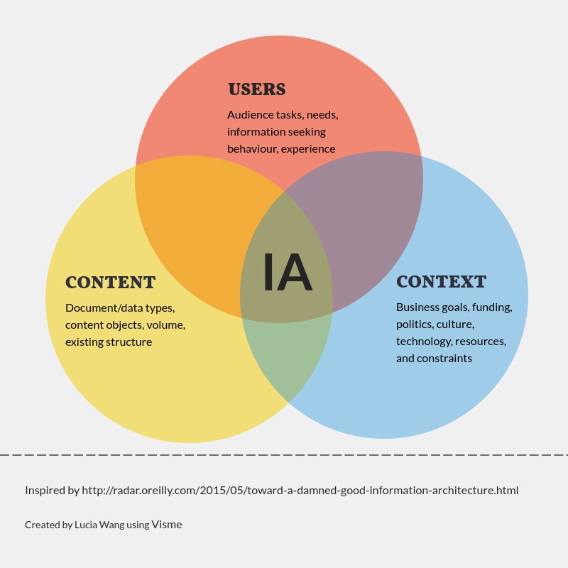
This idea is the same when it comes to designing digitally – the foundation must be supportive of the entire product if you want to a successful user-centered experience (Babich, 2020). This is what information architecture is all about.
Information architecture is the “discipline that focuses on the organization of information within digital products” (Babich, 2020). In the information architecture process, designers will organize each webpage or app page so that they can see all of the information. Then, the designer will create flows of action so that they can see the user experience navigation.
The users, the content and the context all coincide as the main aspects of information architecture. An organized, simplified and creative architecture helps the user connect with the content and context more efficiently.
Keep It Simple
As Babich explains in his Adobe article, a user’s time is their most valuable resource, and if they come to a website and can’t find the information/content they are looking for quickly, they will abandon the website. It is also evident that if a user abandons a website once, they are unlikely to ever return.
In addition, I have also discovered in my own research that if a website’s appearance is complicated and cluttered, it will affect the user’s willingness to look around for their answer, even if the information is there and correct. For example, the Yale School of Art website is a visual mess. From the first look, the website is very colorful, complicated and text heavy.
When I first stumbled upon this website, I thought I had found the wrong one. But, it is the Yale School of Art official website. As a general user/browser, I did not want to return to this website because the text, color and images were too much for my eyes. However, the information is all there and is correct, but the website’s appearance negatively impacts my experience as a user.
Analyzing a Website with Site Maps
Ever wonder why the navigation of a website is the way that it is? Why is a certain page listed under a specific menu? Why was it difficult to find a certain page? These questions are all represented in the ideals of user experiences, the Design Thinking process and information architecture.
The layout of a website and its information architecture can be examined in a site map. Site maps are frameworks for the body and makeup of a website. They can be changed and modified to help support the user experience. The site map displays a hierarchy of pages and menus and defines the symbols with a legend.
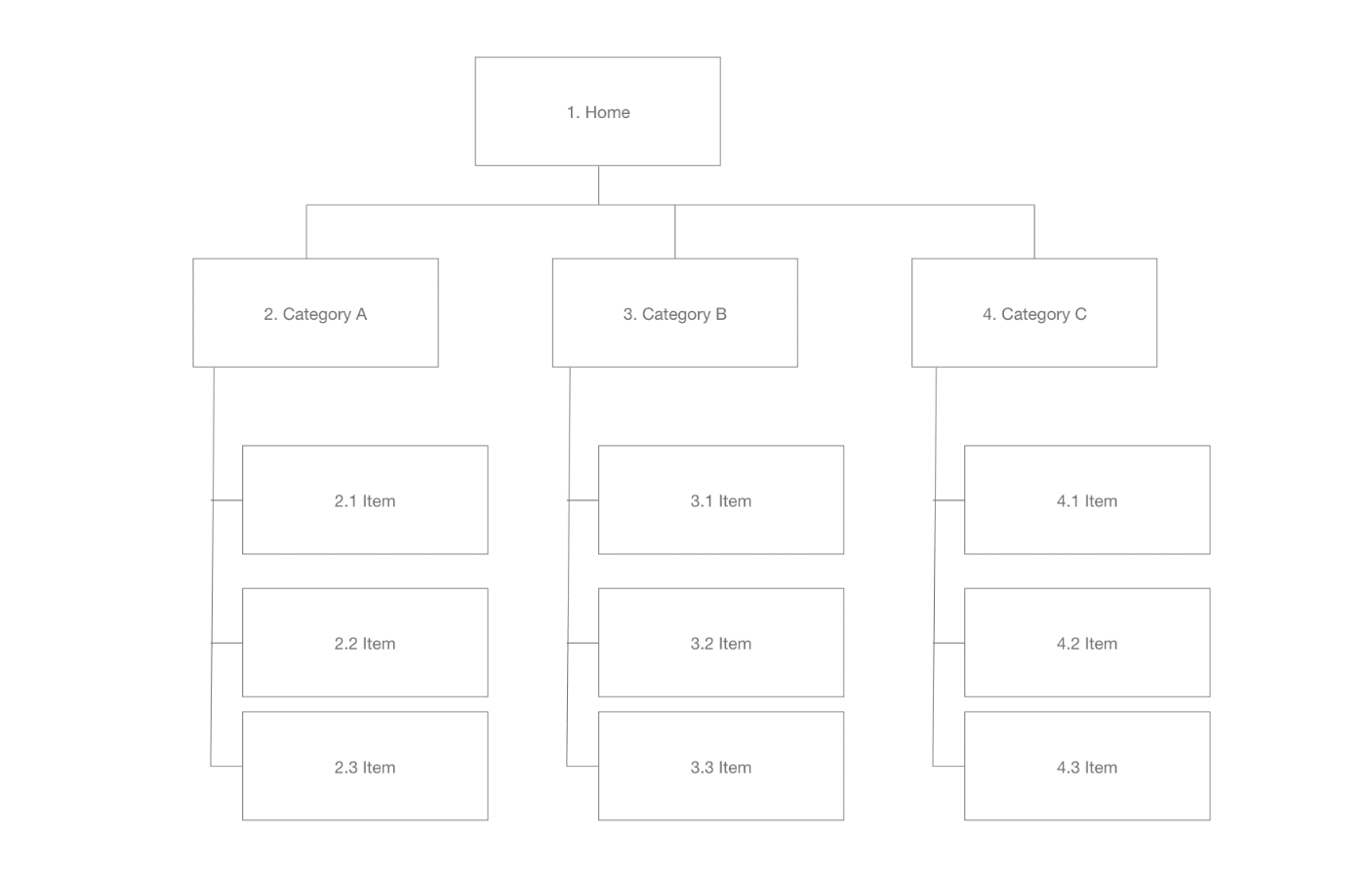
In the end, the goal of a site map is to create better information architecture and help designers figure out how one item is or could be related to another.
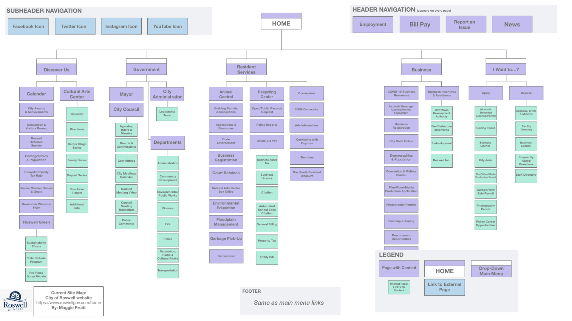
Site Mapping the City of Roswell’s Website | roswellgov.com
Full Presentation is found below on the City of Roswell’s website.
I created two site maps for the layout of the City of Roswell’s municipal website. This was the city I grew up in and my father works for the Recreation, Parks and Cultural Affairs department, so I know it well.
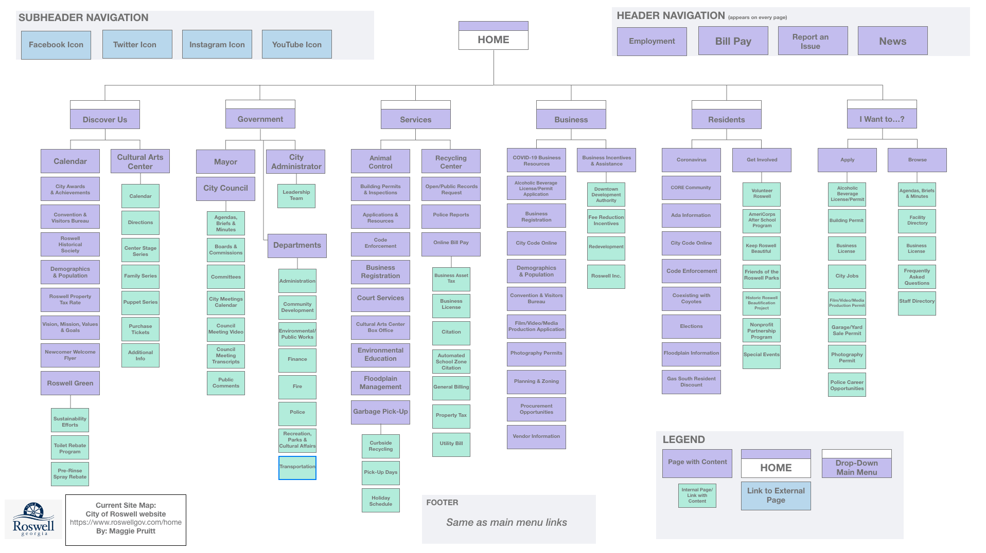
First, I created a site map that represented the current website and its content (shown above). The Roswell website is very extensive and detailed. There are a lot of submenus and pages, so it took me a long time to go through them. (I did not include every page/link in the site map.)
As I clicked through the menus and submenus, I noticed links that were repeated on multiple pages. After thinking through this, I realized that it probably isn’t the worst thing in the world to have repeating links, as some users my get to different pages through different links.
The Roswell website’s homepage includes a main menu with six title menus with icons. I liked the icon feature – it makes it easier to scroll over the menus to see the dropdown menus. Each menu has numerous links underneath it. It is a little overwhelming, but from what I could tell, the information included in essential on the website. Even though there is a lot of information and links, it is not difficult to navigate.
I then tried to figure out what I would redesign with a second site map. This was rather difficult as the website does not have too many issues. One thing I did notice was that if you clicked on an internally linked page, the side menu that pops up is the exact same as the dropdown menu at the top. I feel like this is not necessary, and the page could be expanded without the side menu.
Above is the second site map with the new structure proposal.
I combined the Residents and Services main menu/dropdown menu because many of those links overlapped and repeated.
Code enforcement, Floodplain management and city code online were links that could be minimize into one menu within the new Resident Services menu. I also took away the submenus of Garbage Pick-Up, as those links would be pretty self-explanatory to find update Garbage Pick Up. This change would minimize the words on this dropdown menu.
In addition, I took away the submenus under Get Involved, which also helps minimize the text on the dropdown menu. I left the submenus under Bill Pay because that would be a link many residents would click on.
References
Amherd, B. (30 June 2016). The difference between information architecture (IA), sitemap and navigation. Medium. Retrieved from https://amherd.medium.com/the-difference-between-information-architecture-ia-sitemap-and-navigation-64eba19296c
Babich, N. (24 Nov. 2020). The beginner’s guide to information architecture in UX. Adobe XD. Retrieved from https://xd.adobe.com/ideas/process/information-architecture/information-ux-architect/
