Keys to Keywords

Keywords and hashtags give social media users and content creators the power to understand their brand and the trends that help improve the appearance and following numbers. I decided to analyze my work Twitter (@qu_wih) by taking some keywords related to the account and using Sprout Social to see what I could learn about the account’s analytics. 

I picked five keywords to compare: ice hockey, Connecticut, female athletes, recruiting & bobcats. 

Sprout Social lets users pick keywords and adjust the time line that the user would like to analyze. I set the timing to be analyzed between Aug. 16 and Sept. 12. The five keywords I picked are all tied into the brand that is Quinnipiac Ice Hockey, but they all have different weights related to our own content. Obviously, Connecticut and recruiting are more broad topics, and ice hockey, female athletes and bobcats are more specific. 

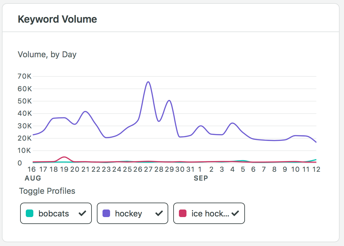
The photo below shows the Keyword Volume from Sprout Social. From the graph, we can see that the far-reaching keywords of Connecticut and recruiting had the most volume by day on average. 

Interestingly, the two-day period of Aug. 19-20 had some consistent volume from Connecticut, ice hockey and recruiting. Recruiting had its best day of the 28-day period with over 57,000 volume numbers. In addition, ice hockey had its best day with over 4,000 volume numbers. I believe the spike for ice hockey could be related to the NHL playoffs going on during that time. As for recruiting, an NCAA announcement or change in COVID-19 rules from the NCAA could have impacted the high spike in volume. Connecticut had a moderate spike the next day, and I believe this could be related to announcements about returning to school in Connecticut.

From Sept. 7-10, female athletes had its two biggest spikes of the 28-day period. This uptick could be attributed to many different pieces of content and national stories about female athletes. Naomi Osaka and Serena Williams were competing in the U.S. Open and the WNBA playoffs are in full swing this past week. 

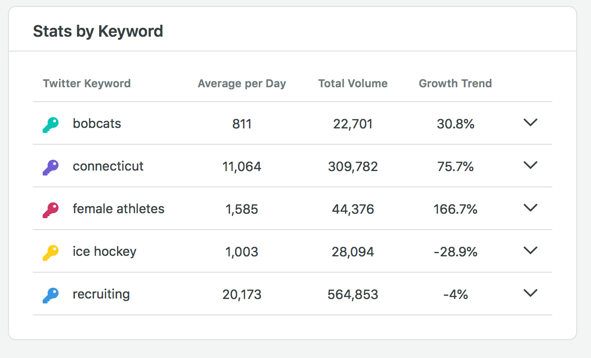
Bobcats, which was the most specific keyword to the Twitter account, was fairly consistent throughout the 28-day period; it received 2% of the total amount volume from all five words and averaged 811 per day. 

Connecticut also had a huge spike on Sept. 11. This could be related to content from the protests that were happening in New Haven, Conn., regarding high school football cancellations. 

The Share of Volume numbers are shown below. Recruiting took up over half of the volume at 58%, followed by Connecticut with 32%. 

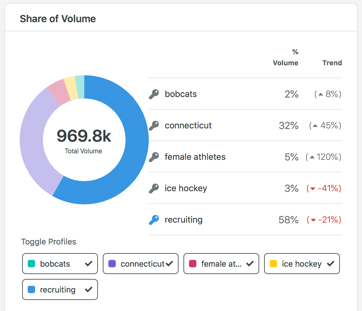
In addition, Sprout Social lets users look at the stats from each keyword. Female athletes had a 166.8% increase and had the third-most total volume out of the keywords I chose. Ice hockey and bobcats were the least popular keywords, making up only 5% of the total volume. 

One question I asked myself after analyzing the volume numbers and stats was about the word bobcat and ice hockey. In relation to Quinnipiac, Bobcat, with a capital “B” would actually pop up more than just bobcat, with a lower-cased “b”. Does a capital letter make a difference? In addition, in the ice hockey world, “ice hockey” is not used as much as “hockey” by itself. Would “hockey” have been a better word to target?

I looked into these questions on Sprout Social. It turns out, there is no difference in their analytics between “Bobcats” and “bobcats”. But, the term “hockey” ended up having much better analytics and volume numbers than “ice hockey”. 

In conclusion, keywords can help social media managers learn a lot about their audience and what is popular at specific times. If a word is broad, however, it may be difficult to draw any direct conclusions based on the large volume numbers. 

Media Metrics: How to Analyze your Publishing Performance

Social media metrics are great tools for social media managers. The numbers tell the stories of how your social media account connects with the viewers and followers. From increasing the number of likes, comments, shares to building more of a community on social media, social media managers use metrics to help uncover the meaning behind those numbers and achieve the brand’s goals. 

Engagement metrics help uncover the reason behind your audience’s tendency to interact with your account and how often. Likes, comments, retweets and shares are simple engagement metrics that add up to paint the picture of how your audience engages with your individual posts. The post engagement rate is the number of engagements divided by impressions or reach; a high rate means many people find the content interesting. Account mentions occur when someone tags your account in an organic way and not from a post. These metrics indicate the account has a well-received brand awareness (Chen, Sprout). 

In addition to looking at individual metrics, you also should look at a combination of metrics can help you achieve goal or build a strategy. Impressions, reach and share of voice are other metrics social media managers can use to analyze their account’s performance. Different metrics will mean more to different businesses or brands. Some metrics might not be as helpful to some brands as they are to others (Hughes, 2015). 

Who is my audience?

When asking this question, social media managers need to know who their audience is so that they can create content specifically for their audience. If your audience is primarily young, females who enjoy fitness, then you wouldn’t post content that appeals to an older generation interested in tips for investing in the stock market. Twitter analytics has an audience tab that lets social media managers find out more about their current audience. In the analytics audience tab, you can view interests, buying styles, incomes and net worth. This can in turn help you grow your audience even more by posting content geared towards the audience you already have. (You would hope that the audience you already have would share or repost your content and share with their other followers who also would be interested in your content.) (Griffin, 2016). 

Am I doing better than my competitors? 

Facebook has an interesting analytics feature that allows you to track other accounts that you may be in competition with.  The social media giant will show engagement performances for numerous other pages. For social media managers, it is important to look at your competition to see how they are doing on social. This helps you create benchmarks and goals to beat for your business’ or brands performance. Browsing the content of other social media pages can also help with inspiration and keeps you up-to-date with other things go on in your industry. 

What are people saying about my brand?

Comments are a great way for social media managers to engage with their customers and followers, and it helps to see what people are saying about your business. Customers leave comments on posts for a variety of reasons; sometimes, they can be positive reactions praising the company, or other times, customers may be reacting to a post with negative reactions. Either way, analyzing and responding to comments can help the social media team grow and evolve because they are seeing direct reactions to posts from followers. 

When is the best time to publish?

When looking at timing for publishing posts, the easiest metric to look at comes from the likes, retweets, comments and shares. The more likes, retweets, comments and/or shares, the better your post did with your audience. In addition, it is helpful to analyze more than one post to see if you can find trends on when the best time to publish a post is. Sometimes, businesses or brands find that morning posts do well because their audience checks their phones when they wake up. On the other hand, sometimes social media managers find that posts published later at night do better because everyone is on their phone at that time, too. 

What content does my audience enjoy the most?

From video content to written content on a blog, the numerous ways businesses and brands can share their stories is endless. But, there are certain types of content that appeal to audiences in different ways. One audience may prefer photos and videos to links to written content. In similar cases of finding the best timing for your posts, you have to look at the engagement numbers and the likes, shares, retweets and views on the content you post to see if it does better in different formats. Nowadays, younger audiences usually don’t want to sit down and read a longer, written pieces, but rather watch quick videos like Tik Toks. 

Which social media network is the best for my brand? 

With so many different social media networks out there, sometimes it is best to stick with one platform to share content. For influencers who rely on photography to tell their stories, Instagram is probably the better choice rather than using Twitter. To find out which platform is better for your business or brand, you can use various analytics to see the difference in engagements, likes, shares, retweets and comments across the different platforms. If your content is doing increasingly better on Instagram than Twitter, it doesn’t mean you have to only post on Instagram, but you could look into posting more on Instagram, as your audience is more present and engaged on that platform. 

How can I have a better performance on social media?

Using analytics and researching what other brands or businesses like yours are doing on social media can help build your brand up. It won’t happen overnight, but discovering what works for your brand and business and executing that strategy will help create a community of followers. In addition, if you find a strategy is working for you, keep it going and expand to keep growing in how you connect with your audience. 

I also believe great photography is the best way to get a clean and unified look for your brand or business on every social media platform. 

References 

Chen, J. The most important social media metrics to track. Sprout Social. Retrieved from https://sproutsocial.com/insights/social-media-metrics/

Griffin, J. (16 November 2016). How to track social media metrics on four social networks. Social Media Examiner. Retrieved from https://www.socialmediaexaminer.com/how-to-track-social-media-metrics-on-four-social-networks/

Hughes, B. (29 April 2015). Which social media metrics actually matter? Business.com. Retrieved from https://www.business.com/articles/which-social-media-metrics-actually-matter/

Social Media Analytics | Module 1

Social media is something I look at every day. It is a big part of my job as an Assistant Director of Athletic Communication at Quinnipiac University, and it is something I enjoy using in my personal life, as well. We see photos, videos, stories and all kinds of digital content on our numerous timelines every day. Let’s analyze an Instagram post to see what goes into posting on social media. 

I chose to analyze an Instagram post from an account that I manage at Quinnipiac – the women’s ice hockey team (@QU_WIH). Click here to see the post or see below.

QU_WIH Instagram Account

This set of six photos was posted on Aug. 19, 2020 at 4:50 p.m. to celebrate World Photography Day. This post received 470 likes with 2 comments. Eight people reposted the Instagram to their Instagram stories. Thirty-six people visited the QU_WIH profile after viewing this post, and the photos reached 2,231 people. There were over 3,000 impressions on this post. 

I have been running this account for two full hockey seasons and over two academic years, so I know a lot about the content that our audience enjoys. This post did very well and was one of the top pieces of content for August on this account. 

I believe the time of around 5 p.m. or later is usually a good time to post for this account. When thinking about timing of posts, you want to keep the audience in mind. 

Are the ages of the audience all over the place? 

Is the audience mostly male or female or mixed? 

For QU_WIH, its audience is pretty diverse in terms of age and gender. As the social media manager, I sometimes look to send a message through a post to a specific part of our audience. Most of the time, the target audience is high school-aged females that play hockey. This is the general group of females we are recruiting to play hockey at Quinnipiac. 

In addition, the quality and edit style of the photos of the hockey players adds to the value of the post. In my experience, if the photos you are posting are edited well and are unique, the post will perform better.  

Photo by Rob Rasmussen

The caption included a hashtag, which I believe helped the post immensely. #worldphotographyday was a popular hashtag on that day that helped the post reach more people in the explore part of Instagram. Over 200 people saw and engaged with the post from the explore or “other” option, according to my Instagram analytics. Ten percent of the accounts that were reached by this post were not following QU_WIH. This shows how hashtags can help expand the reach of social media posts. 

QU_WIH is also a public account. Having a public account rather than a private account helps an account grow quickly and expands the reach of the account and its posts. 

As you can see, there is a lot of information that can be found from analytics. From the details in the analytics, the photos and content posted were successful for the QU_WIH account. It reached a wide audience, received a lot of engagement and likes and helped develop the brand. 

Explaining Social Media Analytics to the Average Person

Why is social media so important? What is the purpose of deciphering analytics and strategically planning and creating content? 

Well, social media is now essential for business, brands, teams and organizations to share messages and communicate with stake-holders and followers. Nowadays, everyone is on a smart phone and perusing content on multiple social media platforms. But, with so many different types of content, audiences and platforms, companies can put a lot of work into social media and end up not seeing any return. In order to work smarter, not harder, companies, businesses, individuals and anyone trying to use social media efficiently, should look into using analytics and research. 

Most of the time, throwing a post on social media without any thought behind it proves to be less effective. This is where analytics come in. The details and numbers behind why certain posts do better than others are what analytics are all about. 

All social media posts/content are posted at a certain time on a certain day. In addition, all social media content receives views, shares, likes and reposts. These numbers all fall under the umbrella of social media analytics. 

For example, a picture is posted on an Instagram account related to a nationally-syndicated network television show at 8 a.m. on the east coast. The photo is a promotion for the TV show’s season two premiere later that night. The account also posts another promotion for the premiere later in the afternoon, closer to the show’s start time. The photo posted at 8 a.m. ET did not do as well on Instagram as the photo posted later that day. 

Social media analytics can help determine why. While posting in the morning when people wake up and look at their phones is sometimes a great strategy, in this example it is not as effective. For a national syndicated TV show, you want to have as many eyes on the social media promotion as you can. In the case of the first photo posted, the 8 a.m. posting time is probably too early considering a large part of the audience resides on the west coast, where it would be 5 a.m.

Social media analytics are helpful in situations like these, and for smaller brands and companies time stamps and location are more important. Sometimes, however, trends are not as apparent as something like time changes across the country. 

Another example of social media analytics is related to Instagram and the story feature. In my job, I run a collegiate women’s ice hockey social media account, and I have found that many users are more likely to engage with and look at Instagram stories over actual posts. I used analytics of story views compared to likes and comments on posts to determine this.

Social media analytics have eight layers: 

Networks – The social media networks provide their own analytics for all users.

Text – Analytics are extracted from the text of posts including comments, tweets, Facebook status, captions and blogs. 

Actions – The actions of social media users are analyzed. This includes likes, dislikes, shares, mentions and endorsements. 

Search Engines – Analytics are gathered from search engine history, keywords and advertisements.

Location – Social media users’ locations are used in analytics. 

Hyperlinks – Analytics use hyperlinks to see what people are clicking on and track incoming and outgoing traffic. 

Mobile – Analytics are used with mobile apps to measure users’ experiences and data. 

Multimedia – Video, images, audio and animations are involved in the analytics used to measure how multimedia affects users’ experiences. 

To analyze your own social media analytics, you can go into the settings of the social media platforms like Facebook, Twitter and Instagram. They all have basic analytics for the normal users to view. If you have a business account, you have the ability to view more analytics, which can be found on each post and in the apps settings.

As you can see, social media analytics covers all of the bases related to social media and how users’ experiences are affected. Likes, shares, retweets, time stamps and so many other details all come together to help social media managers and normal users post successful and engaging content. 

Dear Data & Reflection

In Data Visualization, I learned to navigate the ins and out of personal data collection, cleaning and visualizing. For three weeks out of the entirety of the class, we collected our own data and then created data drawings based on the book Dear Data. My drawings are found above.

I really enjoyed these projects throughout the class. I am a visual learner and like to doodle and draw things out to help understand topics and information better. Throughout the three weeks, I learned that I really analyze what actions I am taking when I am collecting data. For example, while charting and noting my social media use, I was very aware with how much time I was spending on Twitter and Instagram. I also learned that I am interested in what my emotional response is to data collection, as I used emotions in all of my data drawings.

Interestingly, my favorite data drawing is the the second one conducted on Week Two. But, I actually found that the linear ones from Week One and Week Three are easier to understand for someone else at first glance.

When I comes to public data and collection, I did not know a lot coming into the class. Data cleaning was a brand new topic/practice that I did not know about. I also did not know how much public data is out there for anyone to use! I discovered that a lot of people use DataWrapper to show their visualization on public forums, and now I notice it a lot.

For the most part, I was able to grasp the general aspects of cleaning data and uploading data sets to DataWrapper. I will continue to learn more about Excel so that cleaning also becomes easier. Once you understand cleaning and all the things you can do with DataWrapper, it becomes an easier process than using daily manual data visuals, in my opinion. With DataWrapper, I enjoyed with interactive parts of the visuals. At first glance, I thought that it was going to be really complicated to create something like a choropleth or symbol map, but DataWrapper actually makes it really simple. The only thing I disliked was the help forums – I wish they had been a little more detailed and specific rather than just general inquiries.

With both final projects, Dear Data and the data story, I was able to learn how data can tell stories and create stories of my own. Even with something as simple as a color chosen on a data drawing, the story data can tell is so visually interesting and then, in turn, the viewer is more likely to keep reading. In addition, data graphics and drawings can help viewers and readers comprehend more information. It gives the eyes more to analyze and keeps them moving down or across the page.

As we have seen with the current pandemic, data sets, infographics and data visualization are important aspects of sharing information. It is also so important that data visuals are reliable, informative and easy to understand.

In my career, I can use data visuals to help with recruiting on social media and for in-person recruiting visits (when we have those again). I could also see myself using interactive data visuals to show statistical values of players for our student-athletes at Quinnipiac. The skills I have developed in this class will be so helpful in my job. Having the ability to share information in a visually informative and appealing way will be a great skill to have in the collegiate sports world. I am also excited to learn more about cleaning data sets and navigating DataWrapper.

Module 5: Narratives and Aesthetic Considerations

There is an art to data visualization. A designer must understand the presentation methods that lead to corruption or misleading ideals while also trying to create hopeful and curious information for the audience. Presenters can also be led to cherry-pick, which involves selecting and revealing only certain parts of a data set (Tufte, 2006).  The goal of cherry-picking is to advance the opinion or thoughts of the presenter. 

Cherry-picking can be spotted by using some ideas from Janice Morse, who wrote Cherry-Picking: Writing from Thin Data in the Qualitative Health Research journal in 2010. Morse explains that a viewer can recognize cherry-picked data if the sample size of the research is small with a tight scope. Having a large sample size with a wealth of data is more reliable than a small sample size. 

Another way to recognize cherry-picking is when the viewer believes there are missing categories in the research. This can be caused if the researched is too specific when creating categories or setting the boundaries for a study to tight. Morse explains that the worst case of cherry-picking can come from a lazy researcher. If a researcher has selected the most interesting or the most unusual quotations from the study, cherry-picking has been utilized. (Morse, 2010). 

In relation to my data visualization project about the impacts of the COVID-19 pandemic the film/entertainment industry, I will be looking at the large increase of Netflix subscriptions since the pandemic began in March. As the researcher, I would be cherry-picking if I did not include data from other online streaming services and the impact COVID-19 had on them. I would not be able to say “Netflix was the most widely used online streaming service during the pandemic” unless I compared the data from other online streaming services and their subscriptions.  

Tufte explains the process of data collection to the final published report. First, the researcher observes and collects raw data. For my data visualization final project, I have asked myself questions and observed something that is happening in the world. 

What does online streaming look like before, during and after the pandemic, specifically, Netflix?

How has the pandemic impacted online streaming for movies that were originally for release in movie theaters?

Are people willing to pay to watch movies on a online streaming service like Disney+?

The next step in the data collection to final report process is “evidence reduction, construction and representation” (Tufte, 2006). This middle step requires the researcher to analyze the data he or she has collected so that they can advance into the final step of presenting the reports/data in charts, graphs, images, numbers or words. 

Related to my research/data viz project, I looked into Netflix’s dramatic rise as the pandemic began. According to the BBC and Netflix’s quarterly reports, Netflix had almost 16 million people create new accounts during the first three months of 2020. Comparatively, the online streaming giant had almost half of that number in the final months of 2019. 

But, Netflix also had to halt almost of their productions due to the pandemic, which were happening all around the world. In addition, currencies around the world have also lost some of their value, which means the new international subscribers aren’t worth as much to Netflix as they would have been before the global crisis (BBC, 2020). 

To add, as the U.S. begins to slowly reopen, Netflix predicts new subscriptions will decline. Netflix also believes future subscribers could decrease due to back-up of shows and movies that haven’t filmed yet. 

Zoe Thomas, BBC News Technology Reporter, explains that Netflix faces a steady competition against Disney+ and Amazon Prime, which seem to have a library of unreleased content to bring in new subscribers. Thomas also reports that Europe, the Middle East and Africa recorded seven million new members to Netflix, which was the largest group of new subscribers worldwide. 

Netflix is an American company, so new subscribers have been lagging in recent quarters in the States and Canada, but during the lockdown, 2.3 million new viewers logged on, as compared to 550,000 in the final months of 2019. Profits almost doubled compared to the same time last year from $344 million to $709 million (Thomas, 2020). 

Statistics before the pandemic – Worldwide growth for Netflix (Kindig, 2020)

190 OTT providers in the U.S. (over-the-top streaming platform)

Netflix claims 87% of OTT households in the U.S. 

For my project, I have a few different ideas for story-telling and aesthetics. I can imagine a bucket of popcorn that represents all of the different OTT providers in the U.S. and how Netflix holds a massive spot with 87% of U.S. households. I also imagine a world map that shows the increase in Netflix subscriptions during the pandemic. In addition, I envision a film reel maneuvering its way throughout the visual. 

The audience is anyone who is interested in the growth and decline of businesses during a crisis. It is anyone who enjoys sitting at home watching movies and television. My audience is anyone who has binge-watched a few shows during this global health crisis. The goal of my visual story is to keep the viewers entertained and informed. How has the pandemic affected some of the biggest businesses in Hollywood? Are people turning over the movie ticket stubs and grabbing their remotes to turn on their favorite online streaming service? The entertainment business, specifically online streaming content, has been changing since the inception of YouTube and later, Netflix – the red envelopes we used to receive in the mail with movies in them quickly transformed into award-winning pieces of content for viewers across the globe.

The goal of this project is to inform viewers about the changing landscape in the entertainment business, and how it has been directly related to the COVID-19 pandemic. 

References 

Kindig, B. (2020, Jan. 1). Netflix stock: Unshakeable long term. Retrieved from https://www.forbes.com/sites/bethkindig/2020/01/20/netflix-stock-first-mover-is-unshakeable-long-term/#43806c785abb

Morse, J. (2010). “Cherry-Picking:” Writing from thin data. Qualitive Health Research Journal. 20 (1), 3. Sage Publishers. 

Thomas, Z. (2020). Netflix gets 16 million new sign ups thanks to lockdown. BBC. https://www.bbc.com/news/business-52376022

Tufte, E. (2006). Beautiful Evidence. Graphics Press. 

Tufte, E. (1997). Visual Explanations. Graphics Press. 

Module 4: MAPS

Maps

The three primary mapping attributes are scale, projection and symbolism. A scale is used to show a ratio of size for the map and the real-life area. Scale can also refer to the level of zoom the map is placed in. A projection refers to how the creator represents a globe on a flat surface. This means that features on a map with be stretched and squished. 

Maps can be grouped in two different ways – conformal or equal-area projections. Conformal projections keep the continental shapes, but the size is changed dramatically. A Mercator projection is the most widely used conformal projection, which has been used for sea navigation. Equal-area projections usually distort shapes but keep area ratios consistent to the real-life ratios. 

Map symbols are used to show where places, features and other geographical information is. When selecting map symbols, the creator should keep the viewer in mind and make symbols easy to understand. Tourism maps use numerous symbols to help tourists get around and learn where sights are. 

Choropleth maps can create problems. In the example used by Professor Marchese, the election map used by Pres. Trump showed counties won by either himself or Hillary Clinton. But, it did not show the distribution of population. The choropleth map made it appear that Trump won more of the country because of the amount of red in the map, but that is misleading based on population distribution in those areas compared to bigger cities, which Hillary won more of.

The Truthful Art – Alberto Cairo

Maps deal with spatial recognition and representation for visual information. 

Because our planet is a globe shape, it is difficult to present this visual on a 2D surface. When you project a globe on a flat surface, five things will be distorted 

How to Lie with Maps 

Making Maps through Data Wrapper

Locator Map: Atlanta Movie Theaters Inside the Perimeter

For the locator map, I collect data for the movie theaters in the Atlanta area. “Inside the Perimeter” is a term Atleins use to describe the area inside of the circle-like 285 highway that encompasses the city. The outer part of the Perimeter is mostly suburbs.

Inside the Perimeter (ITP) includes 15 movies theaters. The red dots represent name-brand or chain movie theaters that you would find in other parts of the state or country, like AMC or Regal. The blue dots represent unique-to-Atlanta movie theaters (small local businesses). On Data Wrapper, if you hover over the dots, the name and location of the movie theater pops up.

I also assumed this could be classified as a symbol map as well.

Symbol Map: Connecticut Universities’ Growth from 2013-2017

I had some trouble with this map. I created a data set by following the same outline that the tutorial page used with population change across the country, but I was not able to get pass the step after adding the data to data wrapper. Here is what my page looked like.

I am not sure why the title column was added into the data set? I did not have that in the information I copied and pasted. Is this page supposed to show something on the map of Connecticut?

Module 3 – Data Literacy, Persuasion, and Manipulation

Making Data Visual: Chapter 2 From Questions to Tasks

All visualization begins with asking questions. We are curious about an issue or thought and look to explore more about it. The question may be far off in regards to its connection with data, but looking into visualization of the data can help correlate the answer to the question. 

Operationalization – the process of reducing a complex set of factors into a single metric (Fisher & Meyer, 2017). 

It is also important to know who needs to know the answers to these questions. With Fisher and Meyer’s example of “Who are the best movie directors?”, there is a vast audience that may want to know about the data. It could be relatable to a film student, a hiring manager or a journalist. 

Proxies – partial and imperfect representations of the abstract that a researcher is interested in (Fisher & Meyer, 2017). 

Fake News: What It Is and How to Spot It 

Emma Charlton (2019)

Fake news has many definitions and forms. Fake news stories can be falsely written to emphasize a certain viewpoint or they can be partially true with exaggerations. Lack of fact-checking can lead to fake news stories, as well.

One thing that is so dangerous about fake news is how fast it spreads. Spreading like wildfire, fake news can grace a timeline and then BAM, ten thousand shares later and that news is everywhere. 

How Finland is Fighting Fake News – in the classroom 

Emma Charlton (2019)

Finland has become one of the most resilient nations fighting against fake news, and they are using education to do it. Regulating the information that is spread to a nation is part of this process, but only a small amount can be done due to free speech. Education seems to be the best option for a large-scale intervention of fake news. 

Research skills and critical thinking are big parts of education in relation to combating fake news. According to FactBar, Finland’s fact-checking organization, there are three areas to recognize when analyzing something as fake news or not. 

Misinformation (defective information or mistakes)

Disinformation (hoaxes)

Malinformation (stories intended to damage)

“Widespread critical-thinking skills and a coherent government response are key to resisting fake-news campaigns,” Marin Lessenski, the Programme Director for European Policies at OSI-Sofia, said (Charlton, 2019).

The Ultimate Guide to Data Cleaning 

Omar Elgabry (2019) 

Incorrect data can cause a lot of issues. For example, in the business world, having incorrect information in a database of customer information can result in wasted time and money for the company or a lost customer. 

Data cleaning involves based on the type of data that you need and can let go of. 

“Incorrect data is either removed, corrected or imputed,” (Elgabry, 2019). 

Irrelevant data is data that you don’t need. For example, if you were looking at the statistics of a soccer team, you would not need to know how many siblings the players have. In addition, duplicated data should be removed as it will alter the dataset’s values. 

Assignment Mod 3

Geographical Data How One High-Risk Community in Rural South Carolina is Bracing for COVID-19

The first data set I collected was from FiveThirtyEight. The data the media/statistical company collected is about high-risk communities in the U.S. that are fighting against COVID-19. The article about the data set goes into detail about a rural town in South Carolina and how the town is bracing for COVID-19 by looking at the percent of individuals in metropolitan areas that are at a high risk on becoming ill from COVID-19. The data collected also shows the number of high-risk individuals per hospital in those areas. The data was collected from the CDC’s Behavioral Risk Factor Surveillance System.

Questions:

  1. Are there other factors involved in the data that shows higher numbers of at-risk people in larger metropolitan areas?
  2. For the health conditions that qualify people to become “high or at risk”, is there one that has shown correlations to rising COVID-19 numbers. (Example – does something like chronic bronchitis have a larger impact on someone suffering from COVID-19. Or what do these same numbers look like for someone with chronic bronchitis?)
  3. Is there a trend related to the number of high risk individuals in hospitals in certain areas as compared to the total number of COVID-19 cases in that area.

For this data, I believe a horizontal bar chart would work best. There are a lot of metropolitan areas involved, but with very few categories. The horizontal bar chart would be able to fit the metropolitan areas and give viewers the ability to compare the data set. 

Data from a Reliable Public Data How Urban or Rural is Your State?

The second data set I found was also from FiveThirtyEight. This data set is about urban versus rural places in the country and how those cities/places are going to affect the upcoming election. The teams at FiveThirtyEight calculated the average number of people living in a five-mile radius of every census track and then created an “urbanization index”.

FiveThirtyEight compared partisan lean with urbanization indexes of all fifty states. Partisan lean is the average difference between how a state votes and how the country votes overall, with the most recent presidential election weighing 50%. This data shows how important the urban-rural divide has become – the more urban states like New York, New Jersey and California fall on the blue side while the rural states like Wyoming, Montana and South Dakota are more red. 

Questions

  1. How does the urbanization index break down when it comes to race/ethnicity? 
  2. What is the average education level in in these areas?
  3. How many people are registered to vote in these areas?

For this data, I believe a bar chart would be best to show the divide of urban and rural areas in the country when it comes to elections. On the other hand, a map of the U.S. could also be used. The colors red and blue would be used to show partisan lean, and a lighter shade of the red and blue could be used to show a rural area versus an urban area. 

Module 2 – Data Viz

Good Charts by Scott Berinato 

Learning the ins and outs of data visualization can be compared to learning a new language. But, we, as humans, view and perceive charts and data in different ways. Scott Berinato writes in Good Charts (2016) that the best analogy for data viz is similar to music. Everyone has their own likes and dislikes when it comes to music, and that is also how people read and view data viz. 

The information involved with data viz is always changing, but there are five ideas related to how people view charts…

People don’t read charts in order. Normally, when you read a book there is a pace, and in the West, we read left to right. But, in data viz, the viewer will jump around based on what catches the eye.

Eyes will go to what stands out first. From colors to shapes, viewer’s eyes will travel to points on a chart that stand out. This could include the intersecting lines on the chart about rural/urban migration or the large mountain-like figure in the chart about customer service calls (Berinato, 35-36).

We also don’t see a lot of information at once. The busier a chart is the harder it is to find individual meanings. In addition, experts believe we can only process eight colors at a time (Berinato, 37). As a chart increases the number of elements/variables (5-10), the meaning of the information weakens.

As we read charts and begin to make connections, we look for the meaning. If the design of the chart is not great, it is harder for the viewer to understand what the purpose of the chart is. 

The fifth idea is that viewers use metaphors and conventional thinking to read charts. We read time as moving from left to right, not up and down. Viewers think of something like a high customer service performance to be visually high on a chart, not low. We have also formed conventions about information in our brains – north is up, south is down; red is negative, green is positive. 

In order to make a good chart, there two questions you should ask before you start designing. 

Is this information conceptual or data-driven?

Am I declaring something or exploring something?

A conceptual chart’s goal is to simplify information by using ideas. A data-driven chart uses statistics or numbers to inform the viewer of something. 

Declarative charts focus on documenting something with the hopes of affirming information. Exploratory charts dive into a question with hopes of discovery through prototyping and interaction (Berinato, 56). 

The two questions above asks about what information you have and what you are looking to do with it, respectively. 

Four types of charts visual (Wodtke, 2017)

A Visual Vocabulary for Concept Models – Christina Wodtke (2017)

Conceptual-declarative

Idea Illustration

These types of charts use people’s abilities to understand metaphors to simplify ideas. Organizational charts, decision trees and cycle charts are examples of conceptual-declarative visuals. 

This chart is used to show the process of making movies at the Walt Disney company from 1943. Michele Debczak describes the process with the center of the chart showing the director’s responsibilities and the production and management making up the perimeter. The chart is a good example of a conceptual declarative chart because it shows the flow of the data in a visual representation. (Debczak, 2015

Michele Debczak (2015)

Conceptual-exploratory

Idea Generation 

This type of “chart” relies on conceptual metaphors but in a more informal setting. It usually happens on a white board, scratch sheet of paper or napkin. It is used in the early-phases of projects to get ideas down. Jon Kolko, the founder and director of Austin Center for Design, says it is “our go-to method for thinking through complexity” (Berinato, 60).

This is a whiteboard sketch from Flickr that shows the process a team goes through when proposing changes to their layout. This sketch is the first draft and idea-centered process for the Flickr team and gathers numerous points of view (Crick, 2019).

Shelley Crick | Flickr (2019)

Data-Driven Exploratory

Visual Confirmation

Within this category, there is a new type of task – confirmatory, in addition to declarative and exploratory. When using a visual confirmation for a chart, you are asking yourself “is what I suspected actually true?” or “are there other ways of looking at this?” (Berinato, 61).

This scatter plot shows a strong correlation between the number of overtime hours worked and the number of items picked in a line in a warehouse. This is good example of a data-driven visual confirmation because you can see the correlation from the plots’ shape. 

SPC Excel

Data-Driven Declarative 

These are the charts you see all the time. They can come from an excel spreadsheet and morph into bar charts, line charts, pie and scatter plots. The simpler, the better when it comes to data-driven declarative – the goal is to provide information without the need for explanation. These types of charts are often found in annual reports to show sales figures. 

This chart shows iPhone growth compared to iPod growth over a span of 10 years. This line chart shows the growth/decline of each item and is easy to read (Crick, 2019).

Crick (2019)

The Beauty of Data Visualization – David McCandless 

David McCandless expresses how a map of information can help viewers when they are lost in it. The chart that shows the world’s fears was colorful and caught the eyes of the audience with not only the ease of information but with content’s humor. 

McCandless quotes data as the world’s new oil. “Data is the ubiquitous resource that we can shape to provide new innovations, new insights, and it’s all around us, and it can be mined very easily” (McCandless, 2010).

But, he then comes back to describe data as the world’s new soil. There has been a continuing and evolving process of putting data into world and fine-tuning it. 

He also explains that because we live in a connected and technologically-advanced world, we sometimes don’t receive the whole picture. A military budget chart shows that the U.S. has the biggest military budget in the world, but that number can be broken down and shown as information in many different ways. 

References

Berinato, S. (17 May 2016). Good Charts.

Crick, S. (2 June 2019). Types of Visuals and when to use them. Retrieved from https://shelleycrick.com/types-of-visuals-and-when-to-use-them/

(July 2018). Scatter Diagrams. Retrieved from https://www.spcforexcel.com/knowledge/root-cause-analysis/scatter-diagrams

Wodtke, C. (25 May 2017). A visual vocabulary from concept models. Retrieved from https://medium.com/@cwodtke/a-visual-vocabulary-for-concept-models-f771b2b2e9