Brain Blast

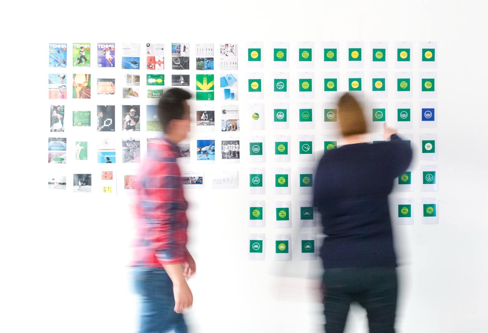
With the numerous types of ideation methods, sometimes there is one that fits the need of creators and designers more than another. From brain-dumps to sketching, there are many different ways to get your ideas flowing when you come to the ideation step in the Design Thinking process.

Circling back to the POV statements I created for the Starbucks, Pandora and Aaptiv apps, I will now analyze those statements with ideation methodologies. I asked myself questions like “how can this app be polished in order to help the users” and “how can this be managed more efficiently?”. The technique that I liked the best was brain-dumping. This is why a research or designer brainstorms individually. I was able to let me ideas flow and figure out ways to improve the three apps.

Here is my Ideation Methods presentation:

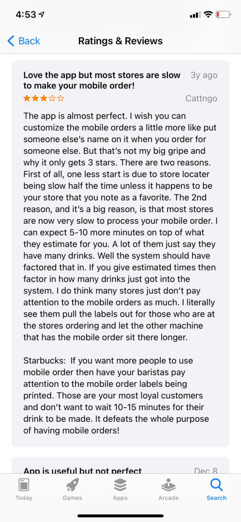
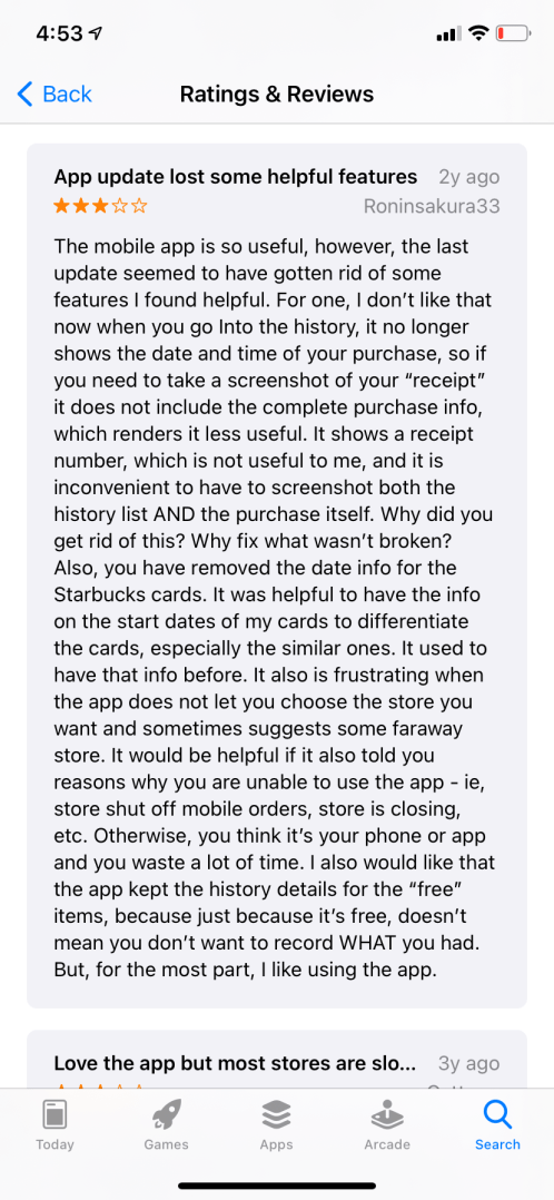
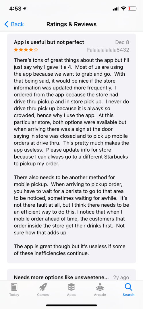
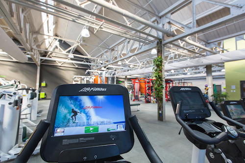
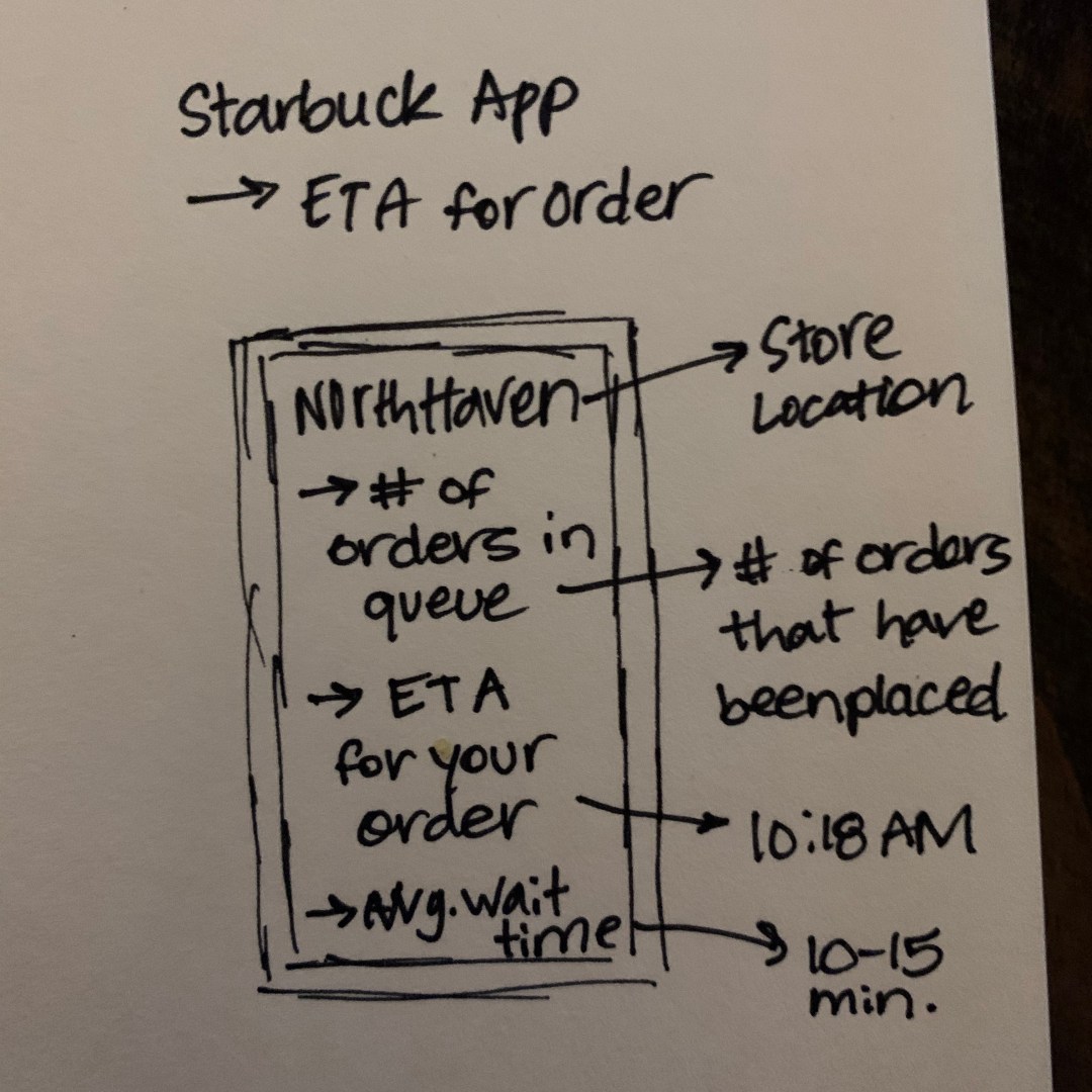
Starting with Starbucks

I refined the POV statements I had originally created for the Starbucks app to make them more specific to issues users were having based on reviews from the App Store.

Starbucks POV #1: Users who are in a rush and want a convenient way to order coffee/food need an app that gives the user a time stamp for when the order will be ready.

Startbucks POV #2: Users who want the same experience they receive when ordering inside of a Starbucks as compared to using the app.

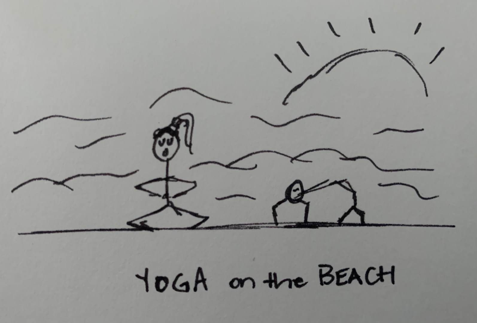
I used the Sketching and Brain-dump techniques to analyze these POV statements. I sketched out what the app would look like with a “New Item” page and a “Order ETA” page on the Starbucks app.

Pondering Pandora

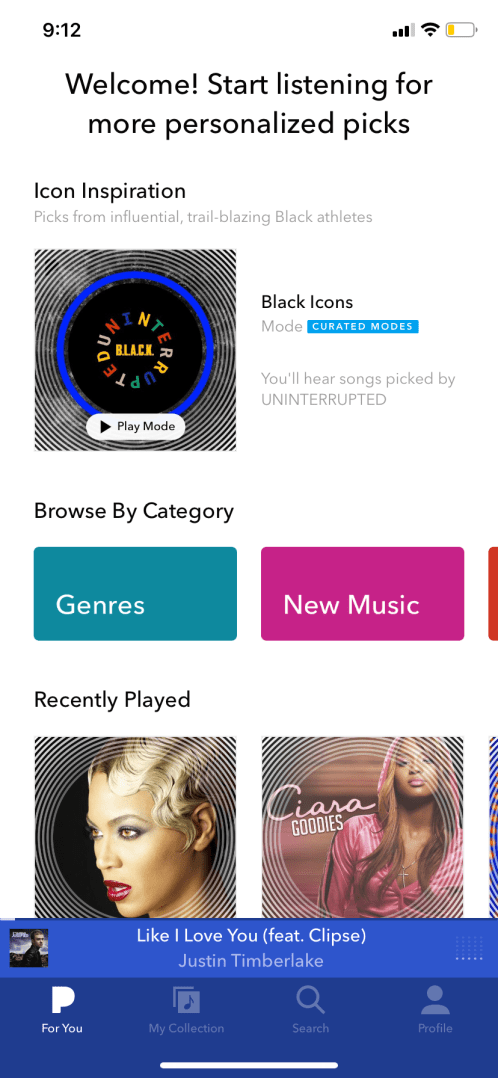
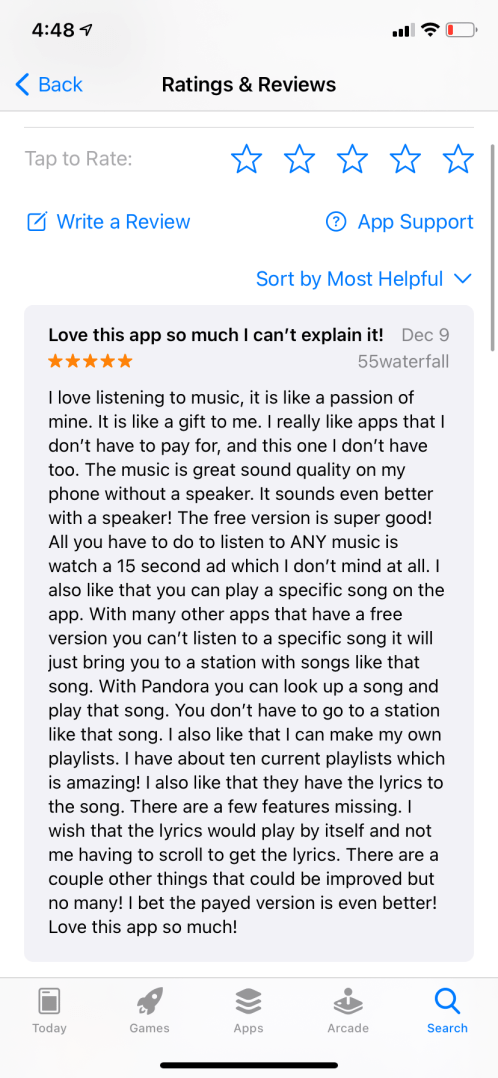
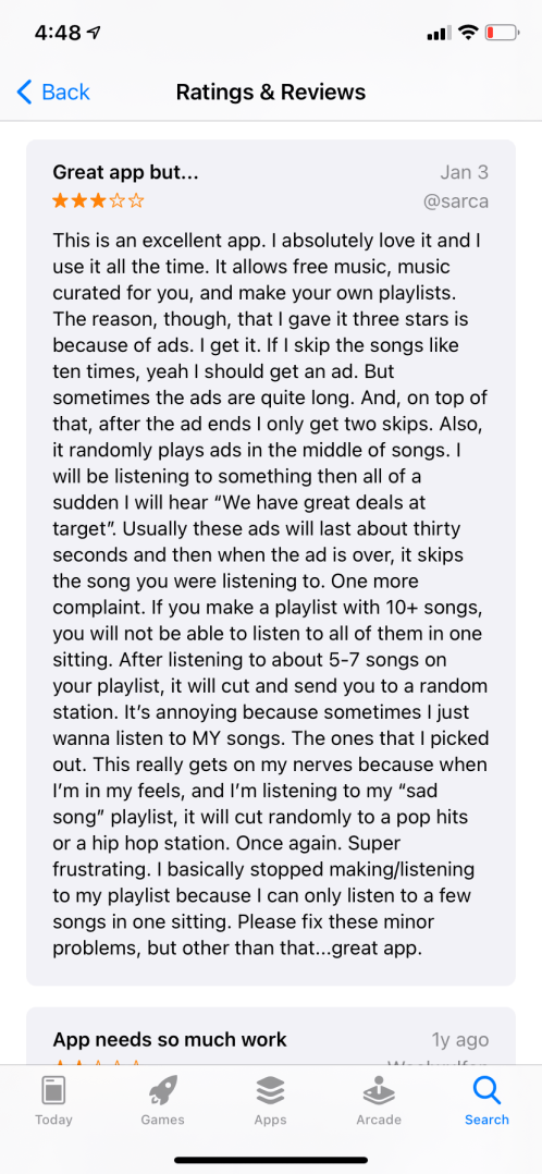
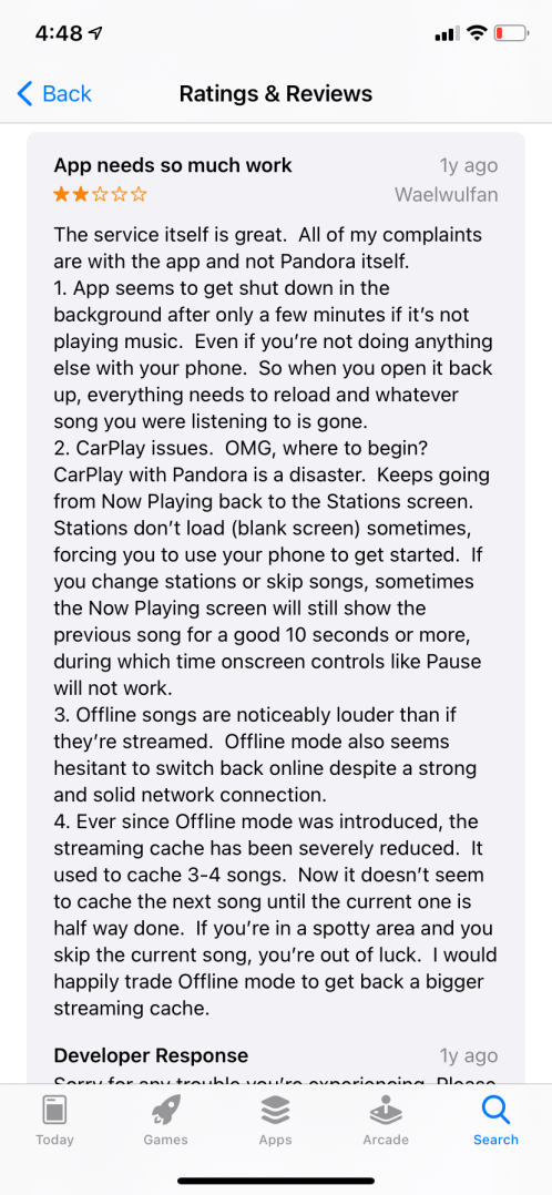
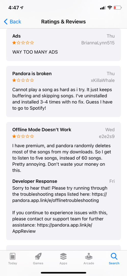
POV Statement #1: Users who want to listen to their favorite songs without any streaming issues need to have better usability options with less bugs because the Spotify app offers a seamless streaming experience with few usability issues, if any.

POV Statement #2: Users who like to find new artists need to have an app with few glitches and ads because Pandora offers unique features that do that, but the competition has less usability issues.

Pandora has a difficult time keeping the free version working smoothly. What can be done about that?

For the Pandora app, I use the Challenging Assumption and Brain-dump techniques. The main problem with the free version of Pandora are the glitches and streaming issues. I tried to figure out if there is a way for the app to cut down on its clutter in order to have less glitches. In addition, I realized people have the free version of the app because they do not want to pay for the premium version. So, I wondered if there was a way to make the premium version accessible to more people.
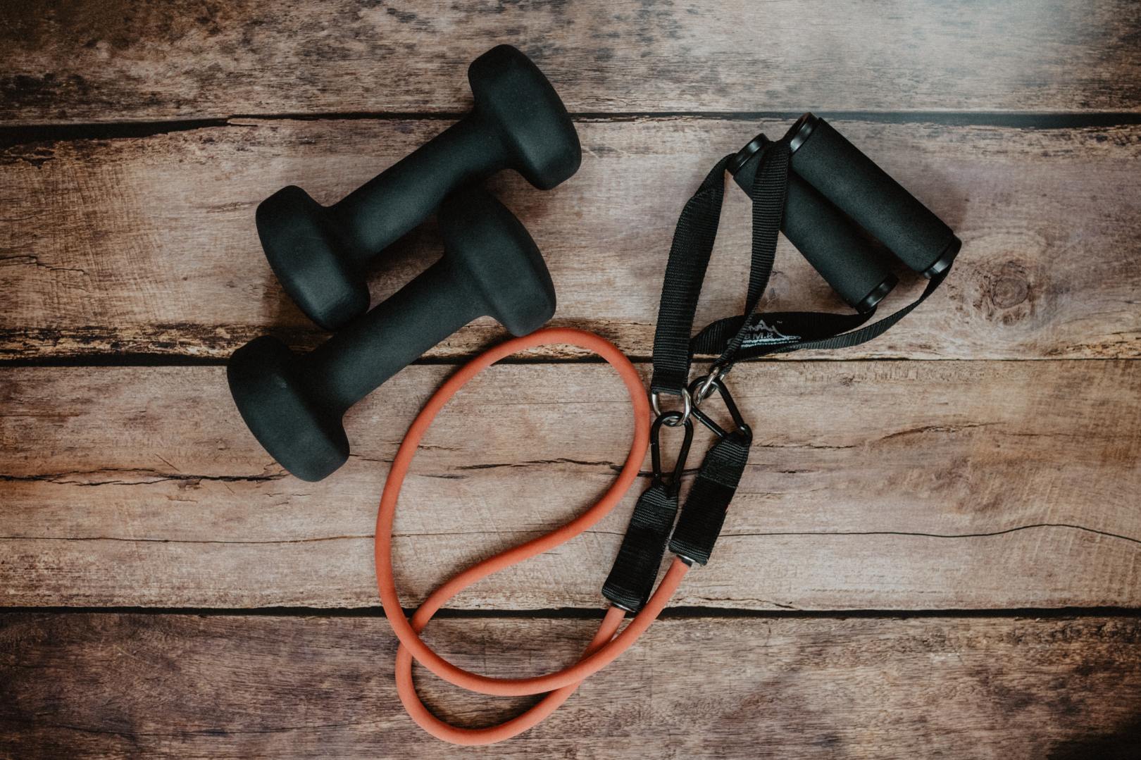
Analyzing Aaptiv

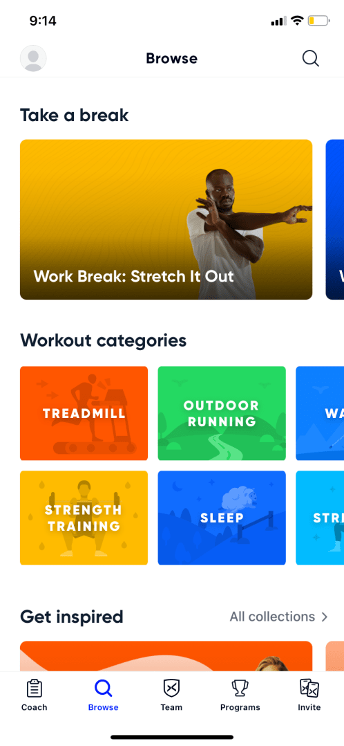
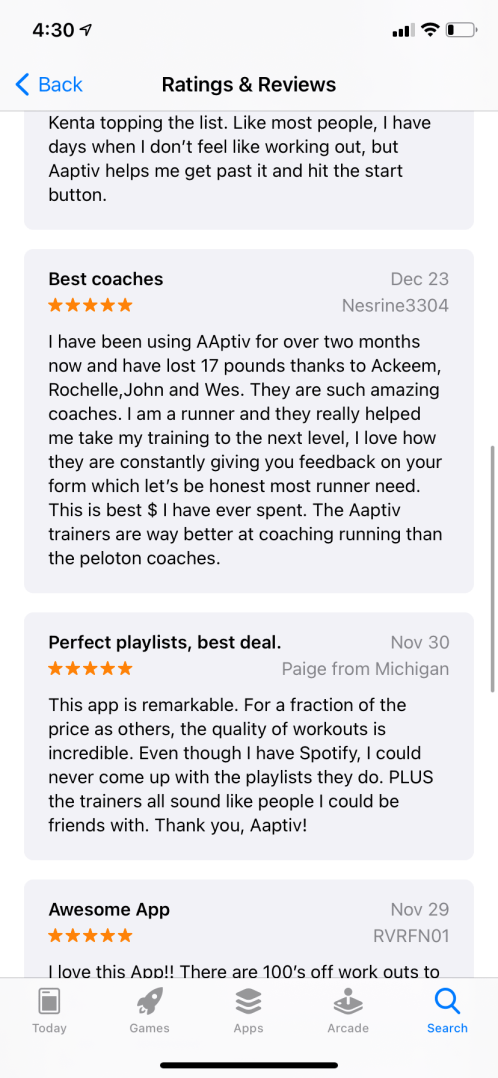
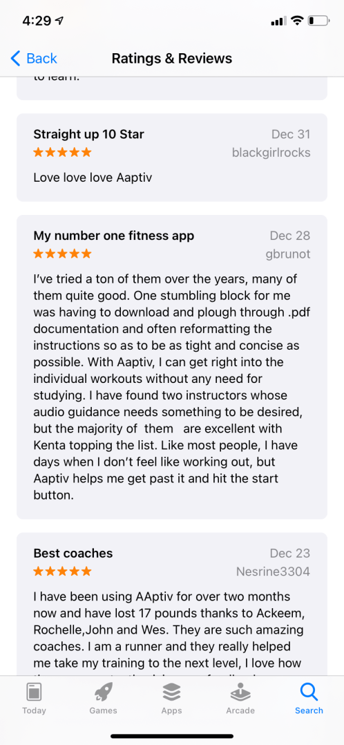
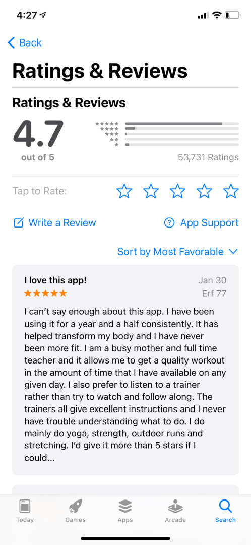
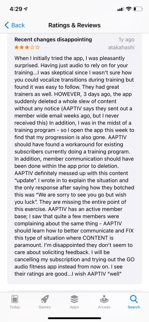
POV Statement #1: Users who want a unique workout session/plan need an app that is not only simple, but also has plenty of options because users want to get a great workout in without the hassle.

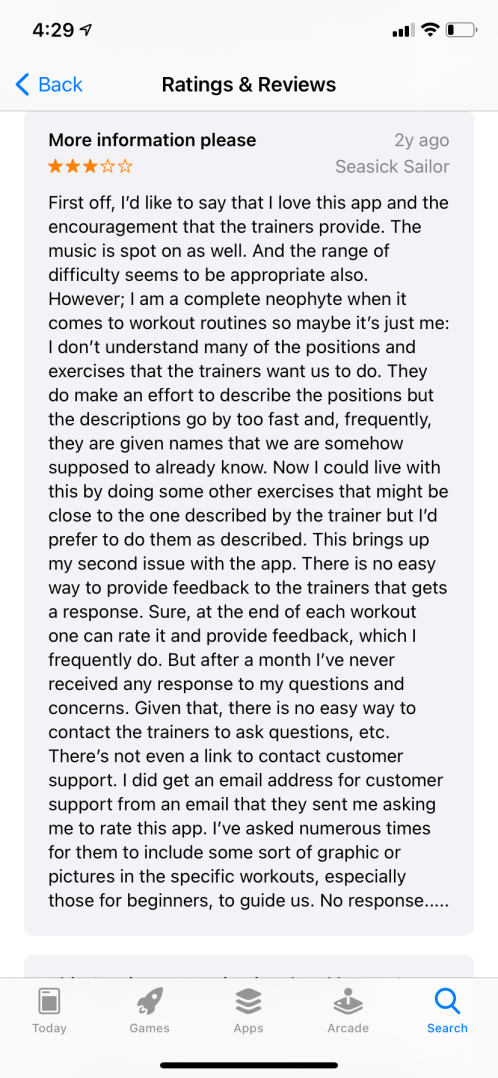
POV Statement #2: Users who have never worked out before need an app that allows them to learn as they go and ask questions when needed because the app currently does not support a back-and-forth communication with users.

For Aaptiv, I also used the Challenging Assumptions and Brain-dump techniques to attempt to formulate ideas to make Aaptiv better for all users, but more importantly uses who don’t have workout experience. I think one of the biggest parts of the Aaptiv app that could be improved are the user-to-instructor interactions.

I created the idea that new users who sign on to the app should have a free zoom session with an instructor that allows the user to ask questions and talk about their fitness goals. The instructors can provide advice, give the users a starting point on the app and offer advice based on the user’s fitness goals. In addition, I thought it would be helpful to add a “How To” page to the app that shows videos of movements in the classes. If users are not sure how to perform a movement, they can go to the search menu, type in the movement and watch a video of someone performing the movement.

Aaptiv would be a top-notch app for beginners if they had a chance to talk to an instructor directly.

In conclusion, the ideation methodologies allowed me to expand my thinking on these apps, the problems and the potential solutions for different users.

Mash-Ups

As we move through the Design Thinking process, the step that involves idea generation is called ideation. This step requires the designers and creators to think in broad terms about solutions and prototypes that will specifically help the users at hand. There are many techniques to use for a successful ideation process (Dam & Siang, 2020).

Here are a few examples from Dam and Siang (2020)…

Brainstorming is the process of blending ideas together, usually with other people, that are normally all over the place. Having wild ideas that may not seem conventional is all part of the brainstorming process.

A Braindump is similar to the brainstorm technique but it is done individually, while brainstorming is executed more efficiently in a group.

A Braintwrite occurs when a group comes together and writes their own ideas on a piece of paper. Then, the individuals pass their ideas around to another member of the group and discuss the ideas. The process continues for about 15 minutes and then there is a discussion.

A Storyboard helps develop ideas through a visualization related to the problem or situation. Storyboards can include visuals and quotes from users.

Storyboarding helps designers visualize ideas for users.

An important note to remember about the ideation process is that the goal is quantity over quality. This part of the Design Thinking process is about getting ideas out and figuring out which direction to go in. In addition, evaluation or judgement of the ideas is not recommended. The individual decisions on the ideas will come later, but during the ideation process, the more ideas, the better!

Another ideation method is a mash-up. Mash-ups use “How Might We” statements to generate ideas on a problem and create a starting point for solutions. Mash-ups bring ideas together that you would normally not think to be related at all.

Here is my Mash-Up presentation:

Creating the “How Might We” statement is the first step in the Mashup process. For my statement, I decided to use one of my app review projects and tackle a problem with Aaptiv.

Statement: How might we create a better fitness experience for users who have never worked out before?

After creating the statement, I then made two categories that are completely unrelated to one another.

Category 1: Things You Would Find in a Gym

Category 2: Favorite Things about Summer

The next part of this process is to add 15 items that would fall into each category. I gave myself 2 minutes to do this.

Category 1 Items:

1 Treadmill

2 Yoga Mat

3 Trainers

4 Shower

5 Dumbbells

6 Ropes

7 Turf

8 Speakers

9 People

10 Headphones

11 Medicine Balls

12 Elliptical

13 Stairmaster

14 Mirror

15 Sneakers

Category 2:

A Warm weather

B Sunshine

C Pools

D Beaches

E Free time

F Vacation

G Parties

H Food

I Lake

J Swimming

K Vitamin D

L BBQ

M Surfing

N Fourth of July

O Soccer

The next part of the Mash-Up exercise is to “mash-up” ideas from both categories. This was the most difficult part of the process. I had a hard time figuring out and creating ideas from the items I created. I was able to generate six idea mash-ups.

  • 2.D – Yoga on the beach:  This idea does not necessarily mean yoga on the beach. It is more of a general idea about allowing users the opportunity to workout from wherever they want. It will give users a chance workout where they feel comfortable.
  • 3.G – Parties with Trainers: This idea promotes a celebration at the end of each workout accomplishment or levels. This gives users a chance to zoom with one of their favorite trainers and ask questions about working out. (zoom party)
  • 8.A – Speakers and Warm Weather: This idea is about giving users workouts to do in the warm weather.
  • 9.E – People and Free Time: This idea is about creating an enthusiastic message about using free time wisely. Maximizing your time (even if it is 20 minutes) will help create a healthy lifestyle for users.
  • 10.C – Headphones and Pools: This idea is about creating a product that works like headphones but allows you to wear them in the pool to hear a swimming workout.
  • 15.I – Sneakers and Lake: This idea is a generic idea about creating workout classes that appeal to a range of users. Some users like to be outside, but they are not sure what type of workout to do if they are not at a gym. This idea will cater to different types of landscapes with workouts that go with them.

1 – Early riser? Beach lover? We’ve got the class for you! | 2 – Crush a workout, zoom with a trainer! | 3 – Love to swim but need a challenge? Our water-proof headphones will be perfect for your workout needs!

Point of View | Starbucks, Pandora & Aaptiv

We use apps every single day. They help us order food, listen to music, workout, read, socialize, find places and even help us fall asleep. I bet the Apple App store created reviews for apps because we use them so often. When you use something every day, you want to make sure it is doing its job efficiently, right?

Customer reviews help us uncover problems or issues that users are having while using a product or service, and in this exercise, I looked at three app’s customer reviews on the Apple App Store. The reviews ranged from positive to negative and also suggestive. Many people like to leave positive remarks about their favorite apps, which helps give other new users a reason to download an app. Negative reviews can also sway new users away from downloading an app. Suggestive reviews have some positive and some negative remarks, but overall, these types of comments give feedback about parts of the app.

I analyze these three types of reviews for three different apps – the Starbucks, Pandora and Aaptiv apps. All three apps have solid overall ratings. Starbucks has a 4.8, Pandora has a 4.8 and Aaptiv has a 4.7. In addition, I created Point of View statements for each app, which combine a user’s needs and insights, after reviewing all of the comments.

Find my presentation of the findings below.

The Starbucks app is used to order ahead of time at a Starbucks store. You can pick any menu item and pay through the app. Then, your order is ready when you arrive at one of the stores that you select on the app.

Pandora is an online music streaming service. The biggest competitor to Pandora is Spotify. There are two versions – free and premium – that offer different music services.

Aaptiv is one of the most popular fitness app apps on the market where users have access to thousands of online fitness classes. Coaches train you through different types of online classes like strength training, running, cycling, yoga and more.

Starbucks Reviews

Positive:

With over 3 million reviews, the Starbucks app has overwhelmingly positive remarks from the customers. Customers love the ease of mobile payment, the ability to “skip the lines” and the stars reward program. The reviews also remarked on the app’s ability to remember your order and the option to add a tip for the barista. Users like the app because of the convenience and incentives.

Positive Review for Starbucks

Suggestive:

Many users suggested that the Starbucks app have more up-to-date information about drive-thru changes and store closings. Other users wished there were options to customize your order more. Reviewers mentioned changing the name of the order or having a place to type in a request. Users also mentioned bringing back the time stamp that was placed on each mobile order so that if the order was lost, you could show the barista your receipt. In addition, users asked for the Apple watch version to be cleaned up from a usability standpoint.

Negative

Users with negative remarks about the Starbucks complained about not being able to receive rewards when you pay with a normal debit or credit card on the app. On the app, you have to add money to a Starbucks card to be able to receive awards. Other users have had trouble with glitches and the app logging the user out. Some users have had trouble trying to tip baristas on the app. In addition, users wish the app would update as frequently as the menu in the store does.

Starbucks POV Statements

1) Users who are in a rush and want a convenient way to order coffee/food need to have an app that is reliable and easy-to-use because other apps are cluttered with glitches and other stores are too crowded to go inside.

2) Users who want the same experience they receive ordering inside of a Starbucks need an app that gives them up-to-date menu items and a rewards program that allows them to pay with their own debit/credit card from the app because the Starbucks app seems to cause some users more trouble than satisfaction.

Pandora Reviews

Positive:

Like Starbucks, Pandora has many positive reviews on their review page of the Apple App store. Users who love the app mention Pandora’s ability to target the users’ favorite songs and continue to play songs in that genre. The users like that the app quickly discovers what songs the users like and continuously play those songs. Other users like that the app takes the songs you like and adds other artists to your library that are similar for you to listen to. Users are complimentary towards the app’s usability and uniqueness.

Positive reviews for Pandora

Suggestive:

Some users wish the lyrics section of the app would play automatically, rather than the user having to look for them. Many of the suggestive reviews are about the ads. Users wish the ads weren’t as long and didn’t pop up during the middle of songs. Users also mentioned that if they create a 10-or-more song playlist, the ads pop up during the playlist. The users wish the ad portion of the free-version of the app would not apply to playlists. In addition, users mentioned that if you leave your phone for a few minutes, the Pandora app shuts down and must reload when you open the app again. This causes users to lose the song they were listening to. Other users have remarked on the online and offline aspects of the app in relation to how much service a user has.

Negative:

Users with negative reviews and low-star ratings complained about Pandora’s ads quite frequently. This, however, is part of Pandora’s setup. There are two versions of the app, one with ads and one without. The free version has many ads, and the paid version does not. Other users have usability and glitch problems. There are many issues mentioned about buffering and skipping songs. Many users with the premium app said that their downloaded songs will randomly get deleted, as well.

Pandora POV Statements

  1. Users who want to listen to their favorite songs without any streaming issues need to have better usability options with less bugs because the Spotify app offers a seamless streaming experience with few usability issues, if any.
  2. Users who like to find new artists need to have an app with few glitches and ads because Pandora offers unique features that do that, but the competition has less usability issues.

Aaptiv Reviews

Positive

Like the two apps before, Aaptiv is an app most users love with numerous positive reviews. Users love the easy-to-use menus, the inspirational coaches and the unique class options. People like the options of picking the duration, coach and type of workout class. Many users have credited Aaptiv to their weight loss while using the app. Users also praise the app’s music, layout, usability and price.

Suggestive:

Users have remarked on classes being removed from the app unannounced. A user mentioned that they left comments on the classes (positive comments), but the Aaptiv team took the classes off anyway. So, if the app could have a notification sent out when a class may be taken off, many users would appreciate that. Many users also commented on customer service issues and the timeliness of the Aaptiv team’s responses.

Negative:

Users who had negative comments about Aaptiv complained about the subscription cancellation process. A user had difficulty canceling their subscription. In addition, a user made negative remarks about the quality of the workout session, the programming and the music. Users also had complaints about the customer service, as there does not seem to be a responsive customer service communication line. Reviewers also wished there were more new classes added on a regular basis.

Aaptiv POV Statements

  1. Users who want a unique workout session/plan need an app that is not only simple, but also has plenty of options because users want to get a great workout in without the hassle.
  2. Users who have never worked out before need an app that allows them to learn as they go and ask questions when needed because the app currently does not support a back-and-forth communication with users.

Problem Solved (Almost)

In the Design Thinking process, sometimes the problems that the creators and researchers are working to solve can seem out-of-focus and blurred. Our scope can be too big and too vast for us to focus on. We have to be able to concentrate our attention on specific needs to help solve the bigger problems of design. 

It’s kind of like solving a puzzle. You can’t solve the puzzle without taking a look at the little pieces that make up the entire picture first.

This is where problem statements can come into play. Problem statements can help teams focus on simpler parts of the problem, rather than focusing on the problem as a whole. The problem statement can help spark other ideas formed by the research team during the Ideation stage of the Design Thinking process (Dam & Siang, 2020). The Ideation stage follows the Define stage. 

According to Dam & Siang, a problem statement should be human-centered, broad enough for creative freedom and narrow enough to make it manageable. The problem statement should be centered around your users, and it should be balanced around a central idea that is not too specific or broad. 

Problem Statements: Undercover Boss 

Frontier Airlines – Season 2, Episode 4

A few weeks ago, I analyzed an episode of Undercover Boss to dive into the Empathize step of the Design Thinking process. The episode I chose was about Frontier Airlines and its CEO, Bryan Bedford, who went undercover to see the ins and outs of his airline’s operation. Below, I have created five problem statements for the characters of the episode as they relate to their jobs. 

Problem Statement 1: Cleaning the airplanes fast is a challenge for Sue because there is only a certain amount of time given to her to clean. 

This problem statement is about Sue, who is an aircraft appearance coordinator. She cleans the planes once they dock at the terminals. She is always very rushed to clean the planes because she only is allotted 7 to 9 minutes to clean. The time she is given is not enough time to truly clean the plane. Yes, she is able to get the garbage up and straighten the chairs and seating, but she is not deep cleaning the plane between flights, which can cause more problems for the next crew or passengers. 

In the episode, a passenger had gotten sick on the plane, and Sue had to clean it as other passengers were loading the plane. This isn’t sanitary and can lead to problems with other passenger’s health and satisfaction of wanting to travel on Frontier Airlines again.

Problem Statement 2: Maintaining a polished work appearance is a challenge for Valeria because she is working two jobs in different climates. 

Valeria is a cross-utilization agent at Frontier. This means she helps marshal the plane to dock at the terminal, unloads the baggage once the plane lands and also checks customers into their flight inside at the check in station. This job is tough for Valeria because she moves back-and-forth from each jobs without much of a transition or break. In the episode, Valeria was working on a hot day and got sweaty as she was working outside. She then came back inside and worked at the check-in desk, but customers could tell she was hot and sweaty, which is not what you want for a check-in employee. This problem statement leads us to believe that this position should be split into two different jobs. 

Valerie (left) shows Bryan how to check customers in for their flights.

Problem Statement 3: Providing for his large family is a challenge for Tui because of the 10% pay cut that Frontier initiated. 

Tui explains to undercover Bryan that he is having a tough time making ends meet for his family of eight. He works six days a week and is barely getting by. He explains that this is a challenge for him because of the pay cut. He isn’t asking for much more from Frontier, but if they could reinstate the 10% pay back, it would give him a little more peace of mind. 

Tui (right) teaches Bryan the ins and outs of being a flight attendant.

Problem Statement 4: Maintaining a positive attitude is a challenge for Hector because he is having a hard time paying for his son’s college. 

Hector brought a great attitude to the day when Bryan was working with him. He is a great teacher and helped Bryan through the process of unloading the waste form the lavatory. Hector tries to keep spirits high when he is at work. He says that him and his co-workers try to work as much overtime as they can. He advocates from his fellow employees and states that a little goes a long way with them and himself. He is currently trying to pay for his son’s college but is having a hard time. 

Problem Statement 5: Being successful in the different roles he takes on is a challenge for Bryan because he has never had to work those types of jobs. 

Bryan is the CEO of Frontier, and when he goes undercover, it is apparent that he has never really had to work a blue-collar type of job. He does not learn quickly and has a difficult time adjusting on the fly. He quickly learns that his employees are great at what they do, but with a little help from the upper management, their jobs can be done more efficiently and, in some cases, more safely. In the end, Bryan is able to help meet the needs of the employees he interacts with, and he begins working on a plan to reinstate the 10% pay cut to the employees’ salaries. 

Getting Personal

When designing or creating a product, service or website, the creator’s goal is to meet the users’ needs and continuously improve the quality and consistency of their work, right? We all have ideas for things we want to work towards, and once we get those ideas down on paper, they have to be reworked and refined. We brainstorm ways to improve the idea, and work to gain more knowledge on how we can better ourselves as designers. 

In the Design Thinking process, personas are great tools to use to give designers some clarity about the users they are interacting with. They have been around since the mid-90s and Shlomo Goltz said they took his work to the next level (Goltz, 2014). 

What is a Persona?

A persona is unique tool that gives a designer an inside look and summary on different types of users that are found to be using a product or service. Personas are created through research task and are depicted as a singular, fabricated person. The personas allow researchers to group users in manageable and memorable ways. There are different types of personas within research groups for a single service or product (Goltz, 2014). 

Personas are usually created by using one-on-one interviews with people from a range of demographics (O’Connor, 2011). For example, if a grocery story wanted to create personas for their customers, you could imagine that these would be the types of personas for their user groups:

Tina (the Mom of Five)

John (the Single Workaholic) 

Casey (the College Kid)

Jeff (the Stay-at-Home Dad)

Obviously, there could be more personas, but that is just a quick example. The names are not real names of the interviewees or the people helping with your research – they are created just for the persona. The “Role” or name after the name is the descriptive title that gives the researchers and creators an idea of who they are in a community. 

This persona “worksheet” is an excellent way to get your ideas down on paper as you create the persona. The boxes allow the researcher or creator to follow the steps and work through the ideas behind what this user needs. 

How Do Creators, Researchers and Companies Use Personas?

Personas are not only great foundations for companies to use for user research and their needs, but personas can also be shared across the entire company or organization (O’Connor, 2011). The numerous aspects of a persona and what they mean can be used across the company. From the users’ demographics and goals to the user’s motivations and influencers, the entire persona can be used in some form or fashion. 

The Persona of an Online Shopper 

Two Persona Examples for Anthropologie.com

As an expansion on the website analysis I conducted a few weeks ago (see here), I decided to create two personas – one for myself and one for a new character – for the Anthropologie website. 

I am pictured on the left, and Christina, “the Influencer” is on the right. Both users have different lifestyles and needs, but they are both part of the Anthropologie family. 

Creating my persona was fairly simple. Anthropologie is one of my favorite brands, so I just thought about the aspects of the company that affect, inspire or motivate me. I asked myself these questions while I created my personal persona:

How does the Anthro site affect my shopping experience?

At what times do I look at their website?

When am I more inclined to make a purchase? 

I gave myself the role of the “Young Professional.” I believe I am a user that enjoys the overall experience of shopping at Anthro and their products inspire and make me happy. 

The next part of this process was figuring out the other types of personas that would be utilized by Anthro. I thought about the types of people I have met at the store while shopping and while I worked there as a sales associate. I created three more users, and then developed a separate persona in addition to my own.

Christina (The Influencer)

Stacey (The Empty Nester)

Jill (The Stay-at-Home Mom)

Christina was the user I chose to create a second persona for, but all three have their own roles within this project. As I was thinking about some of my own influencers, I thought about how much social media affects my buying process. Whether it’s the photography or the influencer herself, I end up buying a lot off of an Instagram link due to the persuasiveness the app has.

Christina, the Influencer, was the perfect fit of a secondary persona. She has a completely different way of life than me, and she represents a different user for Anthro. Christina is sponsored by Anthro (most likely other brands, as well) and showcases her fashion lifestyle on Instagram.

Christina lives in NYC and is able to afford an apartment with the money she makes from being an Influencer.

Christina was a little more difficult to create, but I was able to come up with a persona that represents her needs as an influencer and how she is important for the Anthro brand. Because she has a large following, Christina is able to work with brands like Anthro to advertise their new trends, clothing, seasons and other products.

Christina’s passion involves showcasing her style and watching her engagement flourish.

Conclusion 

Before this project, personas confused me a bit. I was never able to grasp the idea of creating a fake person and giving them all of their own unique characteristics. The persona worksheet helped me understand the process better because it was broken down. In addition, doing a persona for myself helped immensely. 

Here, you can find a pdf of my personas and the information taken from the personas worksheet.

References 

Goltz, S. (6 Aug. 2014). A closer look at personas: What they are and how they work. Smashing magazine. https://www.smashingmagazine.com/2014/08/a-closer-look-at-personas-part-1/

O’Connor, K. (25 March 2011). Personas: The foundation of a great user experience. Ux Magazine. https://uxmag.com/articles/personas-the-foundation-of-a-great-user-experience

Stock photos courtesy of Unsplash.

Up in the Air: Undercover at Frontier Airlines

Empathy and the Design Thinking Process

When creating something, whether that be a website, a product or a service, the creators use the Design Thinking process to understand their users and build a plan around their needs. The first step in this process is the empathy stage.

Empathy in a general sense helps us see other people’s emotional and physical needs. It helps us understand what others see out in the world, how they react to certain things and how they interact with the world. When it comes to design thinking and how empathy plays a part in the design process, researchers and designers are interested in the why more so than the what. 

“Unlike traditional marketing research, empathic research is not concerned with facts about people (such as their weight or the amount of food they eat), but more about their motivations and thoughts (for instance, why they prefer to sit at home watching TV as opposed to going out for a jog),” (Dam & Siang, 2020). 

Undercover Boss 

Season 2: Episode 4 Frontier Airlines 

Frontier Airlines CEO Bryan Bedford goes undercover for this episode of Undercover Boss, which aired on Oct. 17, 2010. 

Frontier is an airline company based in Denver, Co., and offers more than 650 flights a day from around the U.S. and Central America (2010). It is 1.6 billion dollar company and is a compilation of two other airlines – Republic and Mid-West Airlines. When the merger happened, there were layoffs within the company, and Bedford explained that employees were asked to a take a 10% pay cut. 

With the merger, Bedford said that if 6,000 employees had not taken the pay cut, they would have lost their jobs. He goes on to talk about the stressful situation the company was in with the merger and how merging three companies together is difficult. 

“It is the perfect time to go undercover and find out what are employees are thinking and feeling,” Bedford said. 

The episode begins by highlighting Bedford’s family life. He is very spiritual and also talks about his sister’s death, which is what brought him close to God.

Bedford goes undercover as Richard Jacobs, an unemployed welder who is looking for a fresh start. He heads to Denver, Frontier’s home base, where 165 flights come and go each day.

Sue – Aircraft appearance coordinator | Denver

Sue is an enthusiastic worker who helps everyone around her get the job done and is happy while she is doing it. She makes jokes with Bryan and motivates him to move fast as her job is to clean the planes after they land in a short amount of time. Sue is helpful and informative and has a “hustle” and “get it done” attitude. 

She explains how they (her and Bryan) have to get there right when the aircraft lands, she is helpful and informative but in a rushed way, she knows they are about to be busy. Sue always seems to be laughing and smiling and tries to make work fun. 

She has two kids, a daughter, 29, and a son, who passed away at 21. She was born in Chicago and moved to Colorado because she thought it was safer.

Valerie – Cross-Utilization Agent | Oklahoma City

Valerie is a calm and caring Frontier employee. She began her day by showing Bryan how to marshal a landing plane into the terminal. Then, she heads to the luggage port and opens to latch to begin the unloading process. She explains that you must count the number of bags that board the plane to solidify the weight and distribution aspects of the plane taking off. In addition, the day with Valerie was very hot; Valerie said, “if I can handle it, he can handle it,” after the heat started getting to Bryan. 

She moved to Oklahoma City from Hawaii and is also very spiritual. She loves to give back and work to help the less fortunate. 

Tui – Flight Attendant 

Tui is frustrated with Bryan right when their day begins. Bryan is being very talkative with the boarding passengers, and it slows down the boarding process. He becomes very frustrated with Bryan as he is talking too much, but he continuously tries to help Bryan and give him tips. Tui also is a flight attendant who likes to give the passengers an enjoyable experience. He explains the Frontier brand of “A Whole Different Animal” to Bryan. 

In addition, he explains that he is barely making ends meet even though he works six days a week. He works hard for his family and is the father of eight children. He also explains that he would like their 10% pay cut brought back. 

Hector – Lavatory Services 

Hector explains to Bryan that they like to do their job right the first time and that safety is the number one priority. He explains that working extra time helps him out, but it is difficult. He advocates for his fellow employees and gets a little emotional about their dedication to the job and working hard. Hector explains that just a little bit more money goes a long way for people and that having a great attitude goes a long way. 

Empathy Maps 

Bryan Bedford as Richard

Empathy Map: Bryan Bedford, CEO of Frontier Airlines

Bryan Bedford met with four different employees across the Frontier company and saw how each of them positively impacts the overall business each day. He saw the physical demand of the jobs, and he noticed that there is never enough time to truly do a good enough job from a sanitation aspect. The empathy map above shows his thoughts, feelings and actions while working with the four employees.

Tui – Flight Attendant

Empathy Map: Tui, Flight Attendant

Tui is a flight attendant who knows Frontier’s message inside and out. He sells the brand well and helps to make every passenger’s flight a safe and enjoyable one. He is a good instructor and kept Bryan moving throughout the whole flight. Even when things got out-of-hand, Tui remained calm and helped Richard figure it out. 

You can view my Empathy Map presentation below.

Recap & Conclusion

Bryan Bedford had a memorable experience being an undercover boss. He came back from four different jobs with a brand new outlook on his company. He knows they are doing ok, but they have a lot of work to do. He connected with each of the employees he worked with and saw how hard they work every day.

After meeting each of the four employees, he wanted to give something back to each of them. He gave Valerie $10,000 to the charity of her choice. He named an aircraft after Sue’s son. Hector received a vacation, and Tui received help paying for his son’s college. These kinds actions were really cool to see after Bryan’s experiences. 

He saw how the pay cut impacted his employees, and he promised to phase out the pay cuts over the next three years. 

“It’s easy to take hard work for granted. It’s another thing to get out of the office and experience it side-by-side.” – Bryan Bedford

References 

Dam, R.F. & Siang, T.Y. (September 2020). Design thinking: Getting started with empathy. Interaction Design Foundation. https://www.interaction-design.org/literature/article/design-thinking-getting-started-with-empathy

Empathy Map or Treasure Map?

For User Experience (UX) design teams, understanding the user’s needs and desires is part of the first step in design thinking. In order to move forward in the design thinking process, a UX team must analyze the users’ needs and thoughts in order to make decisions about the next steps. This is where an Empathy Map comes in.

What is an Empathy Map?

An empathy map is a visualization tool that is used to express information about user needs. It helps people have a shared understanding about a certain group of users’ needs and helps teams to move forward in a decision-making process. 

From my research, I have found that empathy maps are like windows into people’s minds; through the windows, researchers or designers are able to see what makes a user tick. Does the user like or dislike something related to the subject matter? How does the subject or topic being discussed or analyzed make the feel? How does this subject affect their actions? All of these questions can be answered with an empathy map, and with those answers, researchers and designers have a better chance of creating something that meets the needs of a large group of users. 

Understanding how users interact and feel about certain products, websites or designs is all part of the UX design thinking process. The more we know about what users like and don’t like helps the process move efficiently and move towards the overall goal of giving users the best experiences. Photo from Unsplash

Empathy Map Breakdown

Empath maps are generally split into four quadrants – Says, Thinks, Does and Feels – and the four quadrants can be listed in any order (Gibbons, 2018).  

Empathy Maps have four quadrants that all come together to give researchers and designers some tidbits of information about the users desires and needs. Photo from Nielsen Norman Group

The Says quadrant contains information and quotes from what the users say. Here are some examples of feedback from users that could be found in the Says quadrant. 

“I like shopping at Target because they always have what I am looking for and more.”

“This webpage confuses me because the navigation changed from the main menu to this point.”

The Thinks quadrant is a little more complex than the Says quadrant, but they can go hand-in-hand. It is important to use qualitative information that has also been gathered to understand what the user is thinking (Gibbons, 2018). What is the most important thing to the user? (Even if they don’t directly say it) Sometimes users can withhold comments because they are afraid that they are self-conscious or unsure of the process. 

The Does quadrant is all about the actions that the user takes. Does a user squint when they are reading the text on a website? Does a user become impatient if the website has a lot of media and it takes a while to load?

The Feels quadrant targets the user’s emotions. What was the user feeling? Was the user anxious or excited about something? Did a part of the product, service or website annoy them? The Feel quadrant is usually an emotion with a reason why they felt that emotion. 

Does a user become frustrated with a product, service or website? Does a part of a website create confusion? These are important ideas to think about when adding information to the Feels quadrant. Photo from Unsplash

Empathy Maps and the Next Steps

Empathy maps are complex tools that allow UX researchers and designers to take small samples from the map and incorporate it into the next steps. Sometimes the map will have varying segments of information that don’t always align… which can be expected. The Feels section might not always correlate with the Does section.

“You may encounter inconsistencies – for example, seemingly positive actions but negative quotes or emotions coming from the same user. This is when empathy maps become treasure maps that uncover nuggets of understanding about out user” (Gibbons, 2018). 

Empathy maps also can be correlated with user personas (Munro, 2020). A user persona is an example of needs, characteristics and goals that are represented by a larger group of users. Empathy maps make up the ground word of user personas, which include behavior patterns, skills, attitudes and background/demographic information (Faller, 2019). 

In addition, Lindsay Munro of Adobe explains that there are some pre-empathy map creation steps in order to have a successful empathy map. First, it is helpful to set a goal and a direction in which you want to go. In addition, conducting research ahead of time with reports, data and interviews with help with the empathy mapping process, as well.

Another helpful tip from Munro is to work with a team when conducting an empathy map. Having a variety of different thinkers – researchers, designers, stakeholders, marketers – will help the information from the empathy map to soak in at all levels. 

The empathy map is a great tool that can act like a “North Star” in the research and design process. The map helps the researchers and designers to continue to move forward as a team and gives them a substantial direction to follow (Munro, 2020).

References

Faller, P. (17 Dec. 2019). Putting personas to work in UX design: What they are and why they’re important. Adobe XD Ideas. https://xd.adobe.com/ideas/process/user-research/putting-personas-to-work-in-ux-design/

Gibbons, S. (14 Jan 2018). Empathy mapping: The first step in design thinking. Nielsen Norman Group. https://www.nngroup.com/articles/empathy-mapping/

Munro, L. (12 Jan. 2020). 10 Tips to develop better empathy maps. Adobe XD Ideas. https://xd.adobe.com/ideas/process/user-research/10-tips-develop-better-empathy-maps/

A Shopper’s Paradise: Comparing Anthropologie to J. Crew

When it comes to online shopping, design matters.

The better the website’s design is, the more likely I am willing to purchase something. If I have a difficult time navigating, figuring out prices, wondering about the shipping options or return policy, then I most likely stay away from purchasing anything. 

An online shopper can spend hours browsing sales and great deals if the website is fit for it. For me, Anthropologie is one of my favorite retailers, and I love their website. It is one of the few retail websites I know that genuinely makes the shopper feel like they are in the store. 

From a user experience (UX) standpoint, Anthro’s website is very easy to navigate. There is a main menu located in the top center of the homepage. The menu has drop-down menus pop up when you hover your mouse over each of the categories. Once the user starts browsing, the specific category pages are designed with multiple columns of product photos. There is a sidebar menu that also allows users to specify their searches even more. 

Anthropolgie.com

Anthro’s website also includes numerous informational pages that can aid the user when they have questions on returns, store locations and contact information. The readability of Anthro’s site is clean, engaging and consistent.

From a user interface (UI) standpoint, Anthro’s site is absolutely stunning. The photography, color scheme, design and typography are all pleasing to the eye and entices users to want to buy the products. As Anthro’s site also changes regularly, the website is designed right now with a look of spring with bright colors and new clothing that brings out a sense of sunshine and happiness. 

Anthropologie highlights the new spring additions with new kitchenware and bright dresses (above).

Website Analysis 

For a website analysis study, I decided to pick a J.Crew to compare and contrast to Anthro. J. Crew’s usability is very similar to Anthro’s. The style and theme are a little different – J. Crew has a sleeker and cleaner look as compared to Anthro’s bold and bright scheme – but, in the end, I discovered that both J. Crew and Anthro have great UX and UI design aspects. 

FEEL/NEED Statements 

For the website analysis, I went through specific pages that each website would have and analyzed my usability experiences with both of them. This included an emotional analysis statement that uses the phrase “This website makes me feel ____ because my need for ____ was or was not being met.” This statement can help us understand our reactions to the usability or functionality of a website.

I also attached a document below that has explanations about each FEEL/NEED statement from the two sites. 

I analyzed my reactions to the following components of both Anthro and J. Crew’s websites:

-The homepage

-The clothing main page

-A specific piece of clothing page

-The returns and exchanges page 

-The store locator page 

I found that both the UX and UI are in great shape for both websites. I enjoyed the actual shopping experience a little more on Anthro’s website, however, because of the boho chic vibe and bright color scheme that represents Anthro. I did enjoy browsing J. Crew’s website, but the black and white font type and simpler presentation made the experience just a little less exciting. 

When it comes to the needs of a shopper, both websites do an excellent job of providing a website that is easy to navigate and provides shoppers with an exciting shopping experience. 

Tangible Items and Their Effects on Us

Have you ever thought about how much people connect to tangible things? We find comfort in objects, products, devices and food. We hold on to things for years because of sentimental value and the memories that that special something holds. Why is that? 

Well, we, as humans, like to use our senses. We like to feel the warm sand on a beach. We enjoy the smell of chocolate chip cookies out of the oven. And, now more than ever, we miss the sound of our favorite band at a concert. 

Photo credit to Unsplash

Dr. Iyabo, a business and lifestyle coach, explains why humans live for tangible items. 

“As humans, we generally place a lot more importance on the tangible aspects of life, as opposed to the intangibles. We like to see, feel, touch, hear, and taste. Our senses are acute, and we need those senses served and stimulated. A tangible thing is something that can be touched, that can be palpated. Something real and concrete” (Iyabo, 2017). 

Tangible items can trigger numerous emotions, some good and some bad. An object like a face masks can keep bring relaxation, while a smartphone can bring stress and anxiety to the user. In addition, tangible and intangible items and ideas can go hand-in-hand and work together. After working on my computer for a long time, I may need to step outside and go for a walk to refocus and refresh my mind. Later, I feel rejuvenated after stepping out in nature and can work more effectively on my computer. In this situation, the intangible object helped me as the user work better on the tangible object.

The way we feel when we use objects or services is important. Does the product help you? Have you become too dependent on the service? Does your life improve after you use the product?

I found three different tangible items that I use almost every day (a product, service and device) and examine the psychology behind why I feel the way I do when I use these items. 

I am #Basically a Starbucks Addict

Photo Credit: Unsplash

Starbucks makes me FEEL INSPIRED and EXCITED for the day ahead because my NEED for JOY and SUSTENANCE is being met. 

I go to Starbucks a lot. Normally, I go to the coffee house in the mornings after I go to the gym and am on my way to work. This is a comforting routine for me – it feels normal and gets me ready for work, especially during the crazy times of the pandemic. I enjoy having a routine, and this is part of it. 

Starbucks reminds me of the dream kitchen I hope to have one day, and each Starbucks exudes warmth and inspiration. Before COVID-19 was part of our every day lives, I would love to work from a Starbucks. The drink and/or breakfast item I get gives me the kickstart I need and prepares me for the day ahead. 

Grind Time

mActivity Fitness Center | New Haven, CT

My gym makes me FEEL ALIVE and HAPPY because my NEED for INSPIRATION and MOVEMENT is met. 

My gym, mActivity Fitness Center, is the place I can go and forget everything from work or other stressful parts of life. I normally go to the gym in the mornings, but sometimes I go at night after a long day. Even if I feel tired, going to the gym to just do some stretching or walking always makes me feel better. I feel like I have better days when I begin the day at the gym. I have been active my whole life, and the gym provides a place for me to improve my well-being and challenge myself. 

Sony A600

Sony A6000

My Sony camera makes me FEEL CONFIDENT and STIMULATED because my NEED for LEARNING and CREATIVITY is being met. 

I purchased my own camera about a year ago. I love taking photos, and I wanted a better-quality camera for my professional work. The camera provides a place for me to grow as a professional and as a photographer. I am self-taught, so the functionality of the camera gives me a space to learn more on my own and experiment with it. 

With these different products and services, I found that I enjoy the parts of life that inspire me and keep my going through the day. I tried to think of a service or product that creates more negative emotions during this exercise, and I found that my smart phone and laptop equally provide positive and negative feelings and needs. My smart phone helps me stay connected to family and friends, but I can be on it for too long and become anxious from social media. My laptop is a device I need and use every day, but I can become exhausted from looking at the screen and working on it all day. 

In conclusion, it is interesting to see how tangible items affect us and understand the psychology behind why they do.  

References 

Iyabo. (10 July 2017). Tangible and intangible values. https://www.driyabo.com/2017/07/10/tangible-and-intangible-values/

Design Thinking Crash Course

Along with my partner, Michelle Ovalle, I dove into the Design Thinking process by viewing the Crash Course video constructed by the Institute of Design at Stanford. I was pleasantly surprised at the conclusion of the video at how much I learned about myself, collaboration and Design Thinking. The moderators of the video gave step-by-step instructions on the process and kept things light and enjoyable. 

View my Design Thinking process worksheet below.

Both Michelle and I were a little nervous at the beginning of our Zoom call. We were not sure how this was going to go or if we were prepared enough, but we talked and got to know each other before beginning.  The moderators of the video began by saying that things were going to move quickly, which was intimidating, but I was interested to see what we would be doing.

We started the first step of the activity with the interview about our most-recent gift-giving experience. I explained to Michelle that the last gift I gave was to my parents for Christmas – it was a hand-crafted wooden sign that had the state of Georgia on it with the words “Atlanta, Georgia” underneath. Michelle had most recently given a gift to her best friend’s sister, who had Stage 4 cancer. 

For Michelle’s gift-giving experience, she explained that she sent a gift after ordering it from a website. The gift was an aromatherapy spa package for her friend who was sick. Michelle mentioned that she wanted to send her friend something that she could use during the difficult time of the pandemic and to help her feel pampered and lift her spirits. 

Even though we were not actually with each other in person, the interviews and steps went by pretty seamlessly. We were able to ask each other questions and explain our stories or situations. I did not feel totally rushed during each step, but Michelle had mentioned that she wished she had a little more time in the first two stages to ask more questions. 

I felt as though I had a small break through after the sketching stages were completed. At the beginning, I felt confused and that maybe I was not understanding the directions clearly. But, once I got to the final couple of stages, the final idea started to fully form. In addition, I felt like I was on the right track when I explained the problem statement to Michelle, and she gave great feedback. Having the validation about Michelle’s gift-giving experience helped me to push through to the end and really zone in on the final solution. 

Problem Statement: Michelle needs a way to support her friends during difficult times.

Solution: Creating a website (ideally) that allows gift-givers to send their friends and family gifts when they are need and/or when the gift-giver cannot be there in person. The website allows users to pick anything from simple to extravagent gifts that are packaged beautifully and sent in a timely manner. In addition, there would be a way to see the reaction of the receiver when they open the gift.

The only thing that was difficult for me was sketching out and making a physical prototype for my idea, which I had envisioned as something intangible. My final idea was a place (most likely a website) for people to buy and send personalized gifts for friends and family in an intimate way while in a non-intimate world. One fact of Michelle’s gift-giving experience was that she could not physically be with her friend, and she wished she could have seen her reaction, which is something I incorporated into the design of my idea. 

The final stage was the stage where Michelle and I could help each other the most and add the final touches to our ideas. We both felt that the process truly represented the Design Thinking ideals and how important collaboration is. I felt a surge of creativity during this process that sparked a different kind of thinking. Michelle and I both enjoyed bouncing ideas off each other and working through the steps together.

In the end, the 90 minutes went by quickly, and I was surprised at how much I learned through a simple process. The crash course created a streamlined way to look at the Design Thinking process. I was also surprised as to how much my idea came together in the end (at least in my head), even though it started off all over the place. Michelle and I enjoyed the collaboration and learned about each other and how we think along the way.