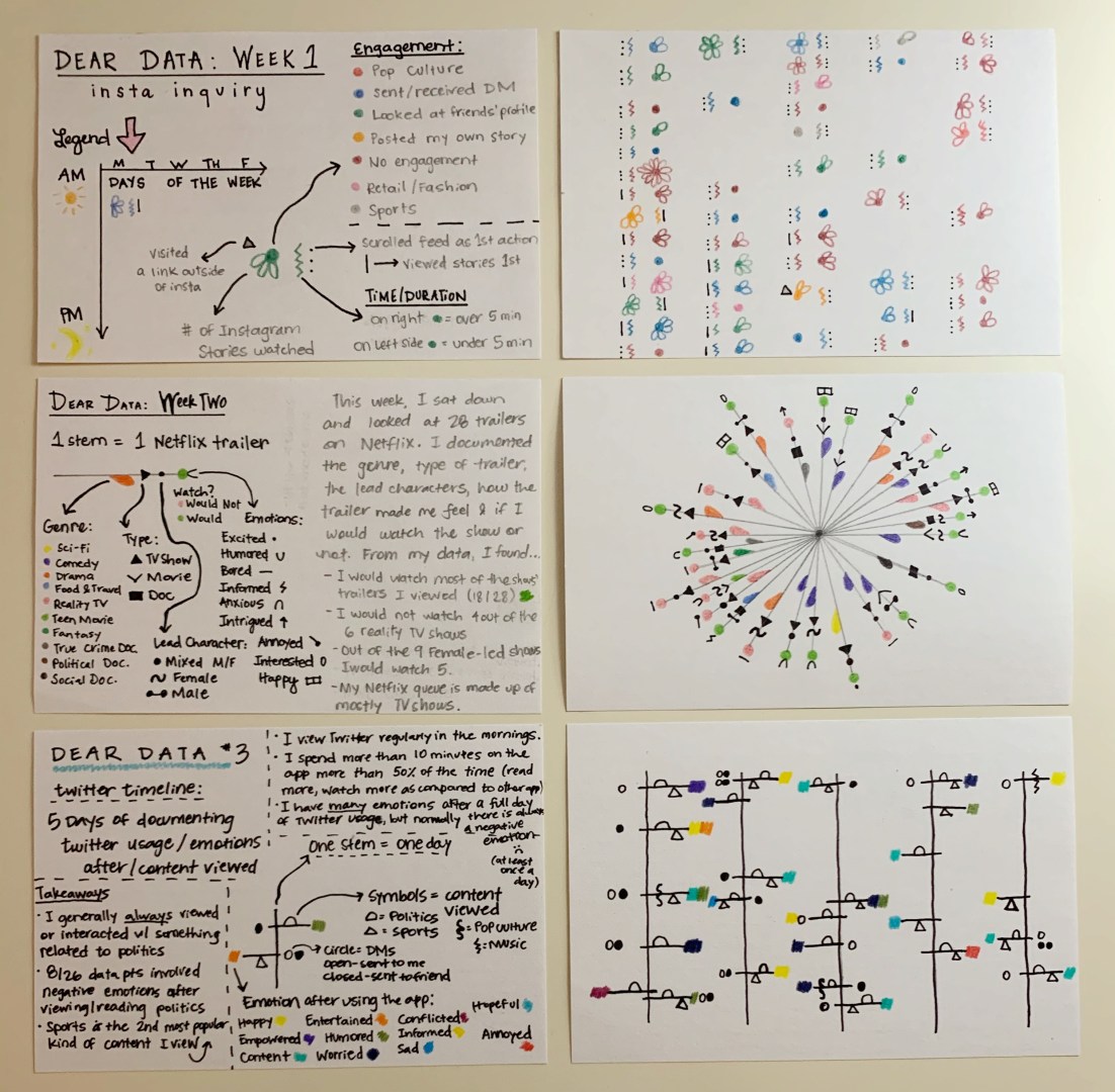
In Data Visualization, I learned to navigate the ins and out of personal data collection, cleaning and visualizing. For three weeks out of the entirety of the class, we collected our own data and then created data drawings based on the book Dear Data. My drawings are found above.
I really enjoyed these projects throughout the class. I am a visual learner and like to doodle and draw things out to help understand topics and information better. Throughout the three weeks, I learned that I really analyze what actions I am taking when I am collecting data. For example, while charting and noting my social media use, I was very aware with how much time I was spending on Twitter and Instagram. I also learned that I am interested in what my emotional response is to data collection, as I used emotions in all of my data drawings.
Interestingly, my favorite data drawing is the the second one conducted on Week Two. But, I actually found that the linear ones from Week One and Week Three are easier to understand for someone else at first glance.
When I comes to public data and collection, I did not know a lot coming into the class. Data cleaning was a brand new topic/practice that I did not know about. I also did not know how much public data is out there for anyone to use! I discovered that a lot of people use DataWrapper to show their visualization on public forums, and now I notice it a lot.
For the most part, I was able to grasp the general aspects of cleaning data and uploading data sets to DataWrapper. I will continue to learn more about Excel so that cleaning also becomes easier. Once you understand cleaning and all the things you can do with DataWrapper, it becomes an easier process than using daily manual data visuals, in my opinion. With DataWrapper, I enjoyed with interactive parts of the visuals. At first glance, I thought that it was going to be really complicated to create something like a choropleth or symbol map, but DataWrapper actually makes it really simple. The only thing I disliked was the help forums – I wish they had been a little more detailed and specific rather than just general inquiries.
With both final projects, Dear Data and the data story, I was able to learn how data can tell stories and create stories of my own. Even with something as simple as a color chosen on a data drawing, the story data can tell is so visually interesting and then, in turn, the viewer is more likely to keep reading. In addition, data graphics and drawings can help viewers and readers comprehend more information. It gives the eyes more to analyze and keeps them moving down or across the page.
As we have seen with the current pandemic, data sets, infographics and data visualization are important aspects of sharing information. It is also so important that data visuals are reliable, informative and easy to understand.
In my career, I can use data visuals to help with recruiting on social media and for in-person recruiting visits (when we have those again). I could also see myself using interactive data visuals to show statistical values of players for our student-athletes at Quinnipiac. The skills I have developed in this class will be so helpful in my job. Having the ability to share information in a visually informative and appealing way will be a great skill to have in the collegiate sports world. I am also excited to learn more about cleaning data sets and navigating DataWrapper.
