It’s All in the Bag

What is Design Thinking?

Design Thinking is a process that allows not only designers, but all different types of innovators and creatives, to solve problems that affect our everyday lives. The world’s best thinkers and innovators use Design Thinking every day. Brands like Apple, Google and Samsung have modernized their approaches to creating by introducing the Design Thinking process, and universities like Stanford, Harvard and MIT are teaching their students about it (Dam & Siang, 2020). 

“Design thinking is an iterative process in which we seek to understand the user, challenge assumptions, and redefine problems.” -Dam & Siang, 2020. 

The Design Thinking process includes five stages – empathize, define, ideate, prototype and test (Dam & Siang, 2020). 

After researching more about Design Thinking, I found out that companies and businesses that I have interacted with before were created through the Design Thinking process. Simple ideas have turned into insanely profitable companies because the people involved trust the process and put energy into creating great products.

Uber is an example of a company that not only was born because of Design Thinking, but also thrived and evolved because of it. Features that popped up after the company’s inception included cashless payments and ratings for drivers and riders (Upadhyay, 2020).

Design Thinking Comes to Life 

I recently ordered a pair of shoes online, and I received them about a week later. The shoes came in a cardboard box that was inside another cardboard box. I thought to myself, “I wish they [the shoe company] just sent the shoes without the box. It’s wasteful and unnecessary.”

And then BAM! I watched this video from Puma, and I was floored that a shoe company had already thought of this problem and attacked it with the Design Thinking process. Puma created the “Clever Little Bag” that is used in all of their retail stores and dramatically decreased their footprint. 

Clever Little Bag by Pump & fuseproject

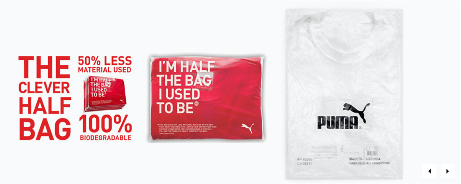
Pump partnered with the fuseproject and created a solution to a global packaging issue. The two companies began the Design Thinking process by diving into the process of how the original packaging was made, transported, handled and delivered. Diagrams, pictures interviews helped Puma and the fuseproject view the supply chain that goes from the manufacturing steps all the way to the customers. Improvements were made after viewing which areas needed the most help (fuseproject). 

After completing the first three phases of the Design Thinking process (Emathise, Define and Ideate), Puma and the fuseproject moved onto actually creating the prototype. In the end, Puma saved over 8,500 tons of paper, 20 million Mega joules of electricity, 1 million liters of fuel oil and 1 million liters of water every year when the Clever Little Bag was rolled out (fuseproject). 

Puma’s design of the Clever Little Bag is just one of the numerous examples of Design Thinking and its unimaginable impact. By starting with a simple idea, innovators can jumpstart into the Design Thinking process and end with a product or idea that helps people. 

Another example of Design Thinking in a real-life scenario is with the successful start-up turned billion-dollar travel business, Airbnb. Gebbia and Paul Graham, the co-founders, realized their website was not aesthetically pleasing the photos were terrible. After some experimentation, risks and outside-of-the-box thinking, Gebbia and Graham nearly doubled their revenue (Brown, 2020). 

Airbnb has over 150 million users & 2 million people stay in an Airbnb every night

Examples of Design Thinking are everywhere, which shows how relevant this process is, and how it can take a simple idea and transform it into a successful business, operation or product. In addition, Design Thinking and social media strategies can go hand-in-hand. In order for an idea to take off, the process, execution and communication of the idea must by in sync. 

In conclusion, one of the major parts of the Design Thinking process is empathy and how humans react to and tell stories. Telling stories help to inspire, evoke change and bring new solutions to tired ideas and situations. Stories are about humans, and every human has their own story. Design Thinking helps share those stories and create better ones to share. 

References

Brown, C. (14 April 2020). Five game-changing examples of design thinking and what we can learn from them. Career Foundry. https://careerfoundry.com/en/blog/ux-design/design-thinking-examples/#airbnb

Dam, R.F. & Siang, T.U. (August 2020). What is design thinking and why is it so popular? Interaction Design Foundationhttps://www.interaction-design.org/literature/article/what-is-design-thinking-and-why-is-it-so-popular

Fuseproject. (2010). Puma Clever Little Bag. https://www.fuseproject.com/work/puma-clever-little-bag

Upadhyay, I. (13 Aug. 2020). 10 great design thinking examples you can use to seek inspiration. Jigsaw Academy. https://www.jigsawacademy.com/blogs/design-thinking/design-thinking-examples/

A Recommended Redesign of the Yale School of Art Website

The Yale School of Art is a graduate-level school within Yale University that offers two-year Master of Fine Arts degrees in Graphic Design, Painting/Printmaking, Photography and Sculpture. Undergraduate students can take course at the Yale School of Art. The home website for the Yale School of Art is located here. The website serves as a landing page for people interested in applying to the school, looking for contact information, searching for public events or news and viewing students’ art work. 

The researcher conducted multiple experiments on the user experience of the Yale School of Art and how it can be changed and improved. The following is a brief blogpost about the findings, research and methodology surrounding a usability study on the Yale School of Art website. 

The Problem:

The Yale School of Art’s website serves as the primary landing page for future and current students looking to pursue a Masters of Fine Arts Degree at Yale. The website works as a wiki page – all members of the School of Art community can edit, add new information and contribute to existing content. 

At first glance, the website’s homepage is cluttered and overwhelming. This website’s overall look and aesthetic is messy and dysfunctional. As one of the premier art schools in the country, the website should be easier to navigate and read. In addition, the attractiveness and appeal of the website is lacking. It is difficult to read with various fonts, colors and shapes intertwining in disconnected patterns. However, it is very unique in that all members of the Yale School of Art community have access to share their work or news on the site. There is not another top art school in the country that formats their website in this fashion.

About the School page

Methodology:

The researcher used a variety of methods to determine usability issues from the Yale School of Art website.  The results show the researcher’s findings and the recommendations assigned to the website’s redesign. Personas were created to summarize the primary users and how those users interact with the website. Surveys, interviews and usability sessions were also conducted to analyze the participants’ thoughts and actions taken while using the website. A heuristic evaluation was also conducted to identify more usability problems. 

Results:

The different methods used to analyze the Yale School of Art’s usability proved to be helpful in determining the user experience errors within the Yale School of Art’s website design. On the basis of personas, the researcher used the descriptions and life examples to determine what usability errors might occur for the average user. 

A competitive analysis was created to examine the differences of website design between other top art school websites around the country. The Yale School of Art’s website is very unique in that a wiki design is used and the public/Yale community is able to edit the webpages. This leads to a very distracting and overwhelming design, as compared to other schools around the country. The researcher could also determine that Yale could be using this type of website design to stand out from the crowd and competition. 

On the basis of interviews, the researcher was able to create a 20-question interview for potential usability testing subjects. These subjects would help answer the research question for the Yale School of Art:

How can the Yale School of Art’s website’s design be restructured to more effectively fit the needs of the students, staff, art community and alums while maintaining the creative freedom from the wiki page setup?

The survey would help the researcher understand how users are scrolling through the Yale School of Art website and what their thoughts are as they do. A survey helps to categorize and identify trends in answers from the participants. Open-ended and multiple-choice questions were used to determine trends in the participants’ answers and concerns. 

On the basis of card sorting, the research was able to analyze participants thoughts on the website design, specifically the menus and the navigation. Card sorting helps to organize some of the consistencies that participants see when it comes to where a navigation link should change or stay the same. Three participants were used in this part of the usability study; all three participants were able to organize the menus and sub-menus successfully. This shows how the website’s navigation is not necessarily the problem. The heuristic evaluation and usability test will show how the design and aesthetic of the website need more work than the navigation, which was discovered through card sorting. 

The heuristic evaluation was conducted by a colleague from outside of the research group. The evaluator found that the layout is inconsistent and that the background changes are distracting from the body content. The Yale School of Art website is text-heavy, with an absence of icons, which the evaluator noted. The evaluator also encouraged a standardization process for the website to ensure more consistency. 

The final methodology used to study the user experience of the Yale School of Art’s website was a usability test. This type of methodology was very effective in helping the researcher discover how users interact and react to the Yale School of Art website design. Three participants were used in the test; the three participants completed all of the tasks given to them with little difficulty. Most of the reactions to the website were verbal judgments on the design and layout. Page length, color, design, text and order of navigation were the main focus points for all three participants. 

After the conclusion of the different usability tests, the research complied the recommended design changes after analyzing the problem areas. The problem areas included the artistic backgrounds, length of pages, dramatic use of color, size and font of text, the information on the “About the School” page and the editor option. Three of these problem areas are cosmetic issues surrounding the design of the pages. The other three are related to more of the navigation and page set-up. 

The researcher has five key recommendations for the site redesign: 

Don’t Change What Works – The researcher discovered the information participants were looking for was fairly easy to find. All of the tasks were completed despite the loud design. 

Take Away Quick Links Box – On the home page, there is a yellow box with a drop-down menu. In the menu, there are links that are very simple to the main menu links. There really is no reason to have this Quick Links box if the links are basically the same as the main menu.

Quick Links shown above

Keep the Art, Add the Organization – The researcher understands the artistic and unique value that this website exemplifies. However, the student art/design of the website is overwhelming. The participants in this study did not really see the value in the busy backgrounds and seemed to be more distracted by them.

Less Text, More Photos – This website is very text heavy. There is a lot to read and decipher. By changing the amount of text and how it is laid out, there will be a better flow to the website. In addition, having more photos of art would help showcase the students’ work. 

Add More Branding – If there wasn’t a title at the top of the home page, most users would have a hard time figuring out which graduate school this website was for. Yale University is not represented well on this website. From colors to logos, there really isn’t any footprint of Yale at all.

In conclusion, the Yale School of Art website is very unique, and for the most part, it probably wants to stay that way. The design of the website, however, can cause some distraction. The researcher recommends some tidying and organizing to bring everything together and on brand, while keeping the uniqueness of the website apparent. 

Yale School of Art Usability Testing

To analyze the user experience of the Yale School of Art website more intensely, I conducted a usability test on the website using three participants. The participants were involved in the testing as my friends and interacted with me through Zoom. I did not include screenshots of the Zooms to keep the participants identities confidential. 

The participants were briefed about the testing set-up and what they would be doing in relation to the Yale School of Art website. I created six tasks for the three participants to complete after some introductory questions were asked. 

Yale School of Art homepage

Here are the six tasks I created:

Task 1: You are a prospective student looking to find out more information on the school and its values. Find the mission statement for the school 

Task 2: You are a current Yale undergrad student interested in applying to the graduate school of Art of Yale but want more information from a staff member. You are interested in talking to the dean but don’t know who he or she is. Find the Dean’s name.

Task 3: You are a prospective student looking to find out more about the graduate school and what types of concentrations the degree offers. Find the graduate study areas (the different type of concentrations students can study).

Task 4: You are a prospective student looking to find out more about the graduate school and how rigorous the programs are. Find the total number of credits required to graduate in the Graphic Design (MFA) program.

Task 5: You are a proud New Haven resident and want to give back to the Yale School of Art. Find the webpage where you would go to donate money to the school.

Task 6: You are a prospective student looking to go on a visit of Yale’s campus, but do not know how far the trip will be from your home. Find the school’s address. 

All three participants were able to complete the tasks successfully. As the researcher, I took notes and documented important quotes throughout the testing. It was interesting to see the participants’ responses as they completed the tasks. 

Study Areas page

All of the participants had similar thoughts on the design of the website and how it was organized. They all noted that “there was a lot going on” in relation to the amount of color and business that came from the graphics used. Participants 2 and 3 both mentioned that the pages go one for a long time (it takes a while to get to the bottom of the pages). 

In addition, the participants’ successes with the tasks prove that the usability of the website is not necessarily a major problem. The information is there and is fairly easy to get to. The recommended changes from the researcher mostly include cosmetic shifts. The website is graphic heavy, so the researcher recommends decreasing the amount of graphics and adding more photography. 

The Yale School of Art website is filled with small, boring text. There is not a lot of variety in size or font when it comes to the text. The headings, subheadings and copy could be formatted in not only a consistent, but also in a more organized way. There are also a lot of text that is outlined with a rectangle in another color. This creates the sense that the text is hyperlinked, but a lot of the time it is not. 

The researcher also thought more about the uniqueness of the website and how Yale might want to stick out more and not follow the crowd with their website. Participant 1 mentioned this thought, as well.

In conclusion, the research saw a lot of value in the usability testing. The participants are put into situations that they have never been before and are able to navigate out of them to find the information they are looking for. Despite the Yale School of Art’s busy and distracting website design, it is effective when you are looking for the basic information you would need.

Support the School page

The Wonderful Wizard of Oz (Method)

The Wizard of Oz technique is a user experience research method that allows technology to be examined by using a human to analyze and use the system with another human watching the reactions. This is a technique used often to test technological concepts before they are distributed. 

The method involves a researcher acting as the “wizard”, who sits in a different room and monitors what the user is experiencing. The wizard stimulates what would happen to the system’s responses in real-time. 

The Wizard of Oz methodology can gather information about the user’s interaction and find out if there are problems people will have with the device, website or technique. In addition, this technique can allow researchers to investigate their products based on how well the product shows users how it can be used. 

J.F. Kelley created the Wizard of Oz technique and explains that “[it is used] to describe a testing or iterative design methodology wherein an experimenter simulates the behavior of a theoretical computer application” (Wizard of Oz, 2012).

Usability Book of Knowledge explains that there are many advantages and disadvantages to the Wizard of Oz method. The technique provides rapid iterations, allows early design critiques and provides insights into users’ actions. In regards to difficulties with the Wizard of Oz method, the “wizard” needs to have significant training in order to work with the users and respond to them in credible ways. 

Kelley introduced the Wizard of Oz method in 1984 to test the Human-Computer Interaction discipline. He was far beyond his time by allowing researchers the opportunity to test products and collect data while bypassing the development time and costs (Welk, 2018). 

In 2017, the Willowtree conducted a study about a mobile app. The research team wanted to know if the mobile app concept would effectively increase engagement with a physical wellness product. The product designer created a few concepts of prototypes of the app the research team was looking to create. They discovered that the group that received the information from the prototype app were most likely to use it in real life. The users were more familiar with the app after participating in the study (Welk, 2018).

Wizard of Oz research method

The tools needed to complete the Wizard of Oz method include participants, a “wizard”, the necessary images, videos, prototypes, programs and elements needed to test your product.  

This method can be complicated, but if it administered correctly, the results can be very beneficial for the researchers. The Wizard of Oz method is revealing in that it will provide researchers with information about early concept testing and exploration of user preferences (Geison, 2019). 

This method would be difficult to pull off for a study about the Yale School or Art website, in that you would need someone who knew the website well. The Yale School of Art website, however, is set up as a wiki page. Many people are able to see and edit the back-end of the website. 

References 

Welk, A. (2018, July 11). How to test a feature you haven’t built yet. Willowtree. https://willowtreeapps.com/ideas/sleight-of-hand-user-testing-with-the-wizard-of-oz-method

Geison, C. (2019, Aug. 20). What in the UX is “Wizard of Oz Testing”? https://www.answerlab.com/insights/wizard-of-oz-testing

Wizard of Oz. Usability testing tools. https://www.usabilitest.com/usabilitynet/tools-wizard

Wizard of Oz. Usability of Knowledge. https://www.usabilitybok.org/wizard-of-oz

First Impressions

Navigating a website is one of the most important parts of a user’s success and willingness to return to the website. If a user cannot find the answer to their question or where something is on the website, the user’s task at hand fails. In addition to the ease of navigation, the first impression of the website is also very important. According to Jeff Sauro of MeasuringU, when a user’s first click leads them to the page that will eventually lead them to their answer, 87 percent of users find what they are looking for. When a user clicks on the wrong path, however, they will only succeed 46 percent of the time. 

Navigation and an ease of clicking is a key part of a successful website design. Measuring and testing a first click path with the first click test is a great way to examine a website’s navigation paths. The first click test is a research method used to examine the usability of a website and how easy or difficult it is to complete a task (UsabilityHub). 

To conduct a first click test (Sauro, 2011):

  1. Create a set of scenarios for user to experiment with – The goal for the experiment user should be to solve a problem or answer a question. 
  2. Make sure to note all of the correct ways the user could solve the problem (multiple paths and click points)
  3. Track the clicks – use software like MUIQ or Chalkmark or track the clicks by hand
  4. Time how long it takes for a user to solve the problem or answer the question – if it takes a user a long time to find the answer that can be evidence for navigation errors.
  5. Use a seven-point scale and ask the experiment users to note how confident they were that they answered the question or found the answer
  6. Use the same seven-point scale to ask the experiment users if they thought it was difficult to find the answer – this can be an opportunity for feedback on things that could change within the navigation of the website. 
  7. Have the users try the same experiment on the new design of the website to see if it is easier or harder 

For a first click test, the tools needed would be a stopwatch and note taking tools (pencil/paper) if a click-tracking software is not used. In addition, the researcher would need to provide a few questions or problems for the experiment users to solve. 

This photo is an example of a heat map from Chalkmark that shows researchers where users click the most on a website’s homepage (Chalkmark & User Interviews).

Web analytics allow you to see the links that users clicked, but the reason why they clicked those links is not known. This is why the first click test is a great research method for website navigation. 

In 2006, the Center for Disease Control and Prevention (CDC) made some updates to its website (CDC.gov). Bob Bailey and Cari Wolfson conducted the FirstClick usability test and analyzed the factors that increased or decreased a user’s success level on a task. Their research would go on to be one of the most influential studies for website navigation and usability. 

Bailey and Wolfson discovered a correlation between a user’s first click and the success in the final task (Bailey, 2013). They also found that when users had trouble deciding their first click, the success of the task was not there as often. Bailey and Wolfson had users complete over 130 scenarios in a one-hour testing period because tasks usually took less than 30 seconds to complete.

Another example of a first click test could be asking users to navigate Yelp’s website to complete a task. 

In this example, users could complete the task by using the search bar or clicking in the menu. 

According to Optimal Workshop, 87 percent of users clicked in the menu bar and 13 percent clicked in the search bar first. 

In order to have an informative first click test, the researcher must select the webpages they want to analyze, establish the goals and write the tasks. Having quality participants is also important as they will give you valuable feedback. It is also important to select users who represent the website’s normal users. 

The first click test will allow a research to determine if there are navigation errors or improvement that could be made on the website to enhance a user’s experience. 

In conclusion, the first click test allows researchers to see users in real time attempting a task and how a website’s design can influence the ability to complete the given task. With many factors that can have an impact on a user’s ability to completing a task, it is important to use the information from a first click test to help make a user’s experience better. 

References 

An introduction to first click test. UsabilityHub. https://usabilityhub.com/guides/first-click-testing

Bailey, B. (2013, Oct. 8). FirstClick usability testing. Web Usability. http://webusability.com/firstclick-usability-testing/

Sauro, J. (2011 Oct. 19). Getting the first click right. MeasuringU. https://measuringu.com/first-click/

First click testing. User Interviews. https://www.userinterviews.com/ux-research-field-guide-chapter/first-click-testing

First click testing 101. Optimal Workshop. https://www.optimalworkshop.com/learn/101s/first-click-testing/

User Experience and Design Thinking

Design thinking. 

What does this mean? We see the world around us and how it is built and created. We see how things have existed. Innovation has led to blending the two ideas of how things can be improved and how things have existed before. 

Design thinking ideology is the idea that a hands-on approach to solving a problem can lead to innovation, which then leads to differentiation and a separation between competitors. Design thinking follows a framework that consists of three interconnected parts – understand, explore and materialize. From there, you can break down the framework even more to six parts – empathizing, defining, ideate, prototype, test and implement (Gibbons, 2016). 

“Design thinking isn’t one thing,” Neil Stevenson, the executive portfolio director at IDEO Chicago said. “but a bundle of mindsets and philosophies all wrapped up in one term, which obviously has the potential to lead ambiguity and misunderstanding (Lahey, 2017).”

Design-thinking philosophies require a certain type of thinking from the designer; ego and personal ideologies must be pushed aside. In order to be successful, designers must put the users’ rational and emotional needs first (Lahey, 2017).  

For example, when Amazon first started, it was primarily a book distribution company. People were able to buy and sell books. But now, as we have seen over the last 10 years or so, Amazon has transformed into a distribution giant that basically sells everything. The company saw a need from customers, and adapted their company and its navigation. People enjoy shopping online and receiving their items quickly and easily. 

This is where User Experience (UX) comes in. Before this year, I did not know what UX was, but now I realize there is a need for people who help users have a better experience when navigating technology or trying to use a product or service, which is what UX is all about! When thinking about UX, it is important to understand that there is balance between understanding the differences in usability and user experience. Usability is more concrete and objectively product-based, whereas user experience is more subjective and based on the ideas of what humans need (Baxter, Courage & Caine, 2015).

There are numerous jobs that are involved in the entire UX process. From a usability specialist to a creative director, many people come together to have a successful UX for consumers. 

Mental Models

When thinking about UX, it is also important to understand what influences our mental models. Mental models are the pictures we see inside of our heads that represent how something works or functions based on our own past experiences. Mental models influence how we solve problems and approach situations (Weinschenk, 2011). 

In interface design, mental models refer to how people imagine the world, a device or a process. There are many examples of when people use their mental models incorrectly. For example, when someone presses a button to call the elevator, they will occasionally press it again thinking it will come faster. This is called the “more is more” philosophy (Rogers, Sharp, Preece, 2004). 

“It is believed that the more times you press the button the more likely it will result in the desired effect,” (Rogers, Sharp & Preece, 2004). 

Rogers, Sharp and Preece describe the “more is more” philosophy is interesting to think about. Naturally, as humans, we ideally understand that the more we practice something, the better we will be. But, in the sense related to the idea that doing something more will bring the result you want, the notion is not correct. When you think about it, it is all a little backwards. We are trained as humans to do things over and over, so when something does not go how we plan, we result back to what we know. 

Understand Your Users

When I am looking to buy a new product, piece of clothing or furniture, I always like to read the comments and reviews. This section of a website is filled with valuable information for not only the people buying products, but also the creator. This is why it is important to know your products and use them yourself. If a customer has a complaint, and you do not know what the customer is referring to, this can create UX issues (Baxter, Courage & Caine, 2015). 

User-Centered Design | User Requirements vs Business Requirements 

The Satisfy the Cat video (here) showed great examples of how UX designers and creators must leave out their likes and dislikes to create the best experience for their client/consumer. In the video, the narrator explains that he as a human like chocolate and strawberries, but the cat does not. This is a simple example of showing how a UX designer cannot use their own likes and dislikes to influence the process of creating user-centered final product. 

Generally, the user’s requirements are going to be a little different from the business’ requirements. But, in the end, both parties will have the similar goals. The user hopes to have an enjoyable experience and when that happens, the business will be able to sell the product and have a consistent customer. 

References

Baxter, K., Courage, C., & Caine, K. (2015). Understanding your users: A practical guide to user research methods. Morgan Kaufmann Publishers Inc. July 2015.  

Gibbons, S. (2016, July 31). Design thinking 101. Nielsen Norman Group. https://www.nngroup.com/articles/design-thinking/

Lahey, J. (2017, Jan. 4). How design thinking became a buzzword at school. The Atlantic. https://www.theatlantic.com/education/archive/2017/01/how-design-thinking-became-a-buzzword-at-school/512150/

Rogers, Y., Sharp, H., Preece, J. (2004). Interaction design. 

Weinschenk, S. (2011, Oct. 8). The secret to designing an intuitive UX match the mental model to the conceptual model. UX Magazine. https://uxmag.com/articles/the-secret-to-designing-an-intuitive-user-experience

Businesses and Personal Privacy

Dear Mrs. Smith,

It is great to hear from you. I have worked in the social media realm for four years now, and I understand your concerns about privacy. It can be a scary world out there! But, I want to help you work through those concerns and expand your business and brand. 

It is important to understand your rights to privacy as an individual, but it is also important to know what is safe and secure to post from a business standpoint. Social media is so important to businesses; it is the biggest tool of communication we have now. Everything is instantaneously shared with your stakeholders and communication is seamless. 

There are many ways to help ensure your privacy and the privacy of your customers. For example, your company name uses your first and last night. Realistically, you would be find having your first and last name out there, but if you wanted to change your brand name you could do that, too. 

Chick-Fil-A is a company whose founding family holds a strong stance in the public eye, and everyone knows the names of their family members. That is part of the mission statement and brand – they are a family-oriented company. 

When thinking about posting photos and videos, I understand your concern for privacy and hesitation to post anything about where your location is or anything related to where you live. For your company, it would be important for us to create a social media plan and execute it. This includes not only photos and videos, but also graphics. Graphics are a great way to send communication out to your audience and stakeholders. They don’t reveal as much personal information and are easy ways to convey messages. 

In addition, having crystal clear photos will help your company on social media, as well. These photos do not have to reveal anything about yourself personally. They can be at your place of business or in a staged studio to showcase your product. 

Though we will try to always protect your privacy as the business owner, as a social media user, you will sacrifice some of your privacy. But, if you are willing to create social media accounts for your business specifically, your privacy will be saved a little. Business accounts are helpful ways for businesses to post on social media without disclosing the personnel behind the screen.

We understand all of your concerns about privacy and hope that we can work together to create great social media content for your business, while also maintaining your personal security. Let us know how we can help in any way. Your satisfaction and security are our top priorities. 

Sincerely, 

                                                                                                            Maggie Pruitt

                                                                                                            Digital Media 

Snapchat Security

Snapchat has been an app on my phone for nearly eight years. The little ghost icon is a staple on many millennials’ smartphones, and it has turned into one of the most influential social media apps out there. 

For an app that exclusively sees users’ faces, it was interesting for me to dive into the app’s privacy and information collection policies. Snapchat also introduced a geolocation feature in 2017 where you can view your friends’ locations on the “snap map” or a map of the world. Ghost Mode is an on/off feature that allows users to choose to share their location with their friends.

I went to Snapchat’s settings, which are limited to changing your Ghost Mode setting, your Bitmoji’s clothes and submitting map issues. Snapchat is powered by three different softwares – Mapbox, OpenStreetMap and Maxar. I researched what these platforms are all about. Each software serves a different role in the aspects that make Snapchat work. 

Mapbox works with Snapchat in the snap map that lets users see other public stories in specific locations around the country and world. OpenStreetMap is open data that is licensed under the Open Data Commons Open Database License. 

According to Maxar’s website, they are “the most discriminating and innovative customers on the planet. We deliver breakthrough technology and insights to unlock infinite possibilities for a better world.” At first glance, that statement is a little vague, but it seems like Maxar is a company that specializes in using location tracking to collect data for the companies they work or. Maxar states in their privacy policy “we will only use or disclose personal information for the specific purposes for which it was collected, except with your consent or as required or permitted by law.”


What is interesting about these companies is that most users have never heard of them. Snapchat is well known, but the companies that are actually taking and utilizing the data are not. 

Maxar collects cookies, which are small text files that track users’ tendencies on the app. They also mention that they use or disclose personal information for the specific purposes for which it was collected and it can all be shared by Maxar’s subsidiaries. With the information Maxar provides on its website, it is still difficult to know what exactly they are using the personal information for. 

Snapchat collects users’ snaps, chats and personal information within the app. In addition, Snapchat knows where users are despite if Ghost Mode is turned on or off. This is an example of why users need a little more transparency from apps when it comes to locations tracking. Many people probably don’t realize Snapchat is tracking their location even though they are not visible on the snap map. 

The social media app also can get personal information about you from other apps that are advertising partners with Snapchat. Any time you interact with an ad on Snapchat, the information about your interact is relayed to the advertising company and in turn, helps them create more targeted ads for you. 

You don’t use Snapchat, you say? Well, according to VPN Overview, which is a Dutch cybersecurity media website, even if you don’t have the Snapchat app, if a friend allows Snapchat to access their phone book for contacts, your information is being shared with Snapchat. It seems as though the main reason behind Snapchat collect your personal information and location is for better targeting for advertisers.

Snapchat has more detailed privacy information if you tap your bitmoji or person icon in the top left of the camera screen. From there you can look into turning off your data usage sharing on the map tabs, which is turned on automatically and is not a feature that asks for permission.

We can assume that most social media apps or other apps that require personal information to be submitted are tracking our data, location and tendencies. Our goal with new technological advances should be to have as much transparency as possible, but apps have shown that is not always easy or what is desired. 

References

https://vpnoverview.com/privacy/social-media/what-does-snapchat-know-about-me/

Mentions Mentions

Mentionmapp is a cool resource to use when you are looking for connections on social media within the reach of different brands and companies. I connected my work Twitter account (@QU_WIH) to Mentionmapp. Because this is a collegiate women’s ice hockey team, I wanted to stay close to the brand of Quinnipiac hockey and look for information and trends from searching different brands and keywords related to collegiate ice hockey.

The first keyword I searched was Adidas – we are an Adidas school, which means all of our gear comes from Adidas and only Adidas. Obviously, Adidas is a large international brand, so their Mentionmapp has a lot of information within it. Donovan Mitchell and Karlie Kloss were the two biggest celebrities involved with Adidas within the Mentionmapp. In addition, Adidas football, Adidas running and Adidas originals were the other accounts involved in the intricate web on Mentionmapp.

@adidas main account

After getting a feel for the ins and outs of Mentionmapp, I decided to narrow my search a little and enter in Adidas Hockey. This Menitonmapp had three superstar ice hockey players on the map including, Connor McDavid, Tyler Seguin and Sarah Nurse. The other two accounts were the Pittsburg Penguins team account and the main Adidas account. 

@adidashockey

I noticed the hashtag Team Adidas and thought it would be a good hashtag to incorporate more into my team’s tweets. Historically, any time I use an Adidas hashtag or tag Adidas hockey, the tweet does increasingly better than some of my other tweets when that hashtag wouldn’t necessarily apply. The other major hashtag used within this Mentionmapp was NHLAllstar, so I wouldn’t have much use for that messaging.

For the next search, I looked up ThreeStripeLife, which is one of Adidas’ slogans and hashtags. There was not a lot of data to take from this Mentionmapp – most of the accounts that branched off were from normal Twitter users. 

Next, I searched the NCAA Ice Hockey accounts, which has 120,000 followers. I discovered something that I am not surprised about but wish was different. All of the accounts were male accounts or men’s hockey team accounts, and none were female specific. This has always been an issue with the main NCAA Ice Hockey account; they don’t equally represent the men’s and women’s game, and in my opinion, they should have separate accounts for each. 

@NCAAIceHockey

I also noticed that the traffic from the hashtag NCAAHockey is heavily impacted back the NHL Playoffs whenever there is player that played college hockey in the U.S.

I scrolled through the menitons of NCAAHockey and also noticed a lot of quote tweets from a photo from Northeastern’s team account with their finished sheet of ice in their arena. Interestingly, I also just posted a similar video. I now realize that I probably would have received more traffic if I had used that hashtag and tagged the NCAA Ice Hockey account.

That tweet can be seen here.

That video did very well, so I wasn’t too worried about it. But, it is a good note to remember to tag or use hashtags related to Adidas and NCAA Ice Hockey. Those accounts are so large that if I were to get a retweet or even a like, the engagements on my content would increase immensely because of their wide audience numbers. 

Knowing what accounts and hashtags will help my account grow and earn more engagements is the main goal for my job as a social media manager and content creator, so Mentionmapp is very helpful.

In addition, if my posts do well, the hockey community and the women’s game grow more, too!

Chattahoochee Coffee Company

As the social media manager of Chattahoochee Coffee Company, I have been tasked to help the management decide the best route for opening up 10 drive thru coffee shops. The Chattahoochee Coffee Co. (CCC) is a Georgia-based and locally operated coffee company that is looking to expand into the end-user market. 

I began by thinking about the type of coffee chain we are and what our values are. We hope to become cities and towns favorite local artistry coffee company that provides a nice working or meet-up area and also a quick place to grab coffee with the drive thru. Our vibe is hipster and relaxed, and we like to incorporate local art and talent in our unique space. 

To begin my research, I looked into general search terms on Google Trends. The first key phrase I looked up was “coffee shops near me”. In my experience, that type of google search is something I do a lot, so it came back with a lot of information. Generally, that search term is something that people are looking for in every state. For our company, which is based in Georgia, we have a lot of options for which states we want to venture out for the other drive thru retail spaces. All of the states around Georgia also had analytics about the search term “coffee shops near me”. 

Search term “coffee shop near me” results | All states have some interests in coffee ☕️ | Google Trends

Just from looking at the map above, Tennessee, Alabama and South Carolina will be the three states that we could decide to open up the other drive through spaces. Even though Florida borders with Georgia, geographically it is too far from the home base of the company, which is in Atlanta. 

In addition, the related topic that came up after “coffee shops near me” was “drive through,” which had a +140% increase in traffic. So, from this data alone, it shows that we are making the right decision by having a drive-thru at our coffee establishment. During this time of COVID, less people want to get out of their cars and go into a retail space, so if there is a drive-thru that is great for customer appeal. 

Metro Atlanta area is the location with the most popularity for the search “coffee near me” | Google Trends

In addition, Google Trends also shows the popularity of the search term “coffee shops near me” in relation to the pandemic, when no one was going anywhere. The search results from March to May 2020 dropped drastically.

Big drop in interest from approx. March 15 – May 17 | Google Trends

Next, I decided to dive into the analytics in Georgia, specifically, and then venture on to the neighboring states. From the data given by Google Trends, Atlanta is the metro area where people are looking for coffee the most (as shown in the map above). Tennessee was the next state I looked at, and Knoxville and Nashville were the top metro areas in that state. 

Nashville was the top area in TN for the results “coffee shops near me” | Google Trends

In Alabama, the metro-Birmingham area would be the best target city for other drive-thru options for CCC. I was surprised by South Carolina’s results – the Myrtle Beach area was the top spot for that state. Columbia, which is where the University of South Carolina is located, was the fourth city on the list with a score of 52, so the search term was almost half as popular as Myrtle Beach. 

From this info, as the social media manager, I would recommend opening drive-thrus in Georgia, Alabama and Tennessee. More specifically, I believe the smartest option would be to try and open stores near local colleges, as students and young people love local coffee shops. 

In Georgia, I would recommend opening a coffee shop in downtown Atlanta, near Piedmont Park and somewhere near the Betline (bike path that goes through the city). This area is populated with young people and is near Georgia State University and Georgia Tech. The two other locations that I believe would be best are in Kennesaw, Ga., which is near Kennesaw State University. In addition, I believe opening a drive-thru location in Alpharetta, Ga., would also be a great location, which has an abundance of character. 

In Tennessee, I believe the best spot to open CCC drive-thrus (2) would be in Nashville. This city is very diverse with multiple colleges in town, along with a famous music and art scene. I believe the company could also open 1 drive-thru in Knoxville, Tn. This city is home to the University of Tennessee, which would be great for the large student population.

In Alabama, I believe Birmingham would be a great spot for two CCC drive-thrus. Birmingham is also home to a couple of colleges.