
When it comes to online shopping, design matters.
The better the website’s design is, the more likely I am willing to purchase something. If I have a difficult time navigating, figuring out prices, wondering about the shipping options or return policy, then I most likely stay away from purchasing anything.
An online shopper can spend hours browsing sales and great deals if the website is fit for it. For me, Anthropologie is one of my favorite retailers, and I love their website. It is one of the few retail websites I know that genuinely makes the shopper feel like they are in the store.
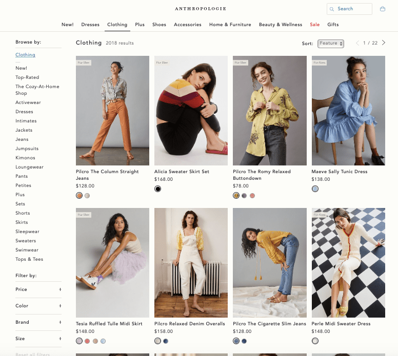
From a user experience (UX) standpoint, Anthro’s website is very easy to navigate. There is a main menu located in the top center of the homepage. The menu has drop-down menus pop up when you hover your mouse over each of the categories. Once the user starts browsing, the specific category pages are designed with multiple columns of product photos. There is a sidebar menu that also allows users to specify their searches even more.
Anthro’s website also includes numerous informational pages that can aid the user when they have questions on returns, store locations and contact information. The readability of Anthro’s site is clean, engaging and consistent.
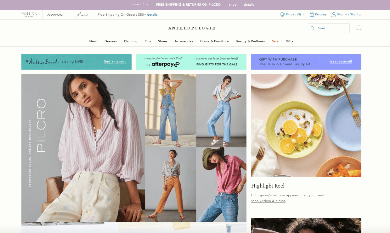
From a user interface (UI) standpoint, Anthro’s site is absolutely stunning. The photography, color scheme, design and typography are all pleasing to the eye and entices users to want to buy the products. As Anthro’s site also changes regularly, the website is designed right now with a look of spring with bright colors and new clothing that brings out a sense of sunshine and happiness.

Anthropologie highlights the new spring additions with new kitchenware and bright dresses (above).
Website Analysis
For a website analysis study, I decided to pick a J.Crew to compare and contrast to Anthro. J. Crew’s usability is very similar to Anthro’s. The style and theme are a little different – J. Crew has a sleeker and cleaner look as compared to Anthro’s bold and bright scheme – but, in the end, I discovered that both J. Crew and Anthro have great UX and UI design aspects.
FEEL/NEED Statements
For the website analysis, I went through specific pages that each website would have and analyzed my usability experiences with both of them. This included an emotional analysis statement that uses the phrase “This website makes me feel ____ because my need for ____ was or was not being met.” This statement can help us understand our reactions to the usability or functionality of a website.
I also attached a document below that has explanations about each FEEL/NEED statement from the two sites.
I analyzed my reactions to the following components of both Anthro and J. Crew’s websites:
-The homepage
-The clothing main page
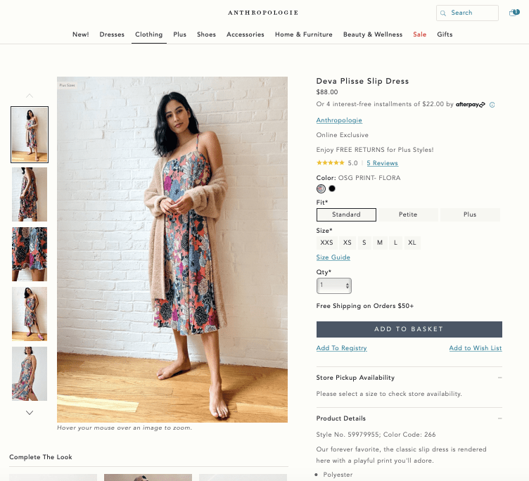
-A specific piece of clothing page
-The returns and exchanges page
-The store locator page
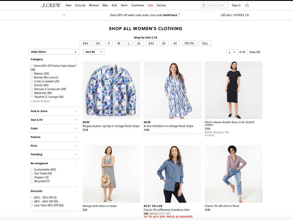
I found that both the UX and UI are in great shape for both websites. I enjoyed the actual shopping experience a little more on Anthro’s website, however, because of the boho chic vibe and bright color scheme that represents Anthro. I did enjoy browsing J. Crew’s website, but the black and white font type and simpler presentation made the experience just a little less exciting.
When it comes to the needs of a shopper, both websites do an excellent job of providing a website that is easy to navigate and provides shoppers with an exciting shopping experience.
