
The Yale School of Art is a graduate-level school within Yale University that offers two-year Master of Fine Arts degrees in Graphic Design, Painting/Printmaking, Photography and Sculpture. Undergraduate students can take course at the Yale School of Art. The home website for the Yale School of Art is located here. The website serves as a landing page for people interested in applying to the school, looking for contact information, searching for public events or news and viewing students’ art work.
The researcher conducted multiple experiments on the user experience of the Yale School of Art and how it can be changed and improved. The following is a brief blogpost about the findings, research and methodology surrounding a usability study on the Yale School of Art website.
The Problem:
The Yale School of Art’s website serves as the primary landing page for future and current students looking to pursue a Masters of Fine Arts Degree at Yale. The website works as a wiki page – all members of the School of Art community can edit, add new information and contribute to existing content.
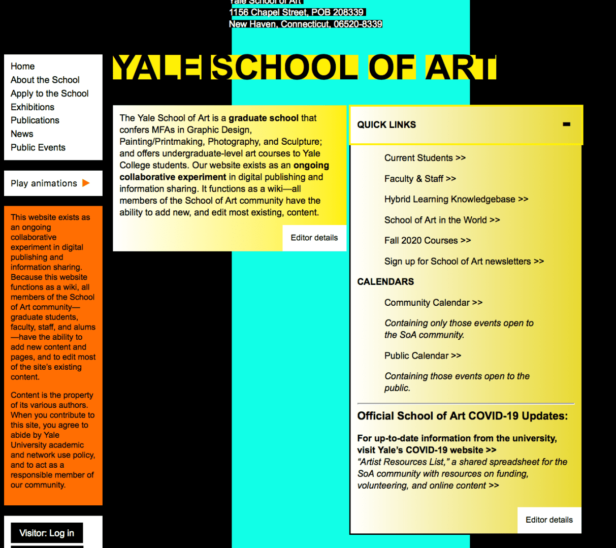
At first glance, the website’s homepage is cluttered and overwhelming. This website’s overall look and aesthetic is messy and dysfunctional. As one of the premier art schools in the country, the website should be easier to navigate and read. In addition, the attractiveness and appeal of the website is lacking. It is difficult to read with various fonts, colors and shapes intertwining in disconnected patterns. However, it is very unique in that all members of the Yale School of Art community have access to share their work or news on the site. There is not another top art school in the country that formats their website in this fashion.

Methodology:
The researcher used a variety of methods to determine usability issues from the Yale School of Art website. The results show the researcher’s findings and the recommendations assigned to the website’s redesign. Personas were created to summarize the primary users and how those users interact with the website. Surveys, interviews and usability sessions were also conducted to analyze the participants’ thoughts and actions taken while using the website. A heuristic evaluation was also conducted to identify more usability problems.
Results:
The different methods used to analyze the Yale School of Art’s usability proved to be helpful in determining the user experience errors within the Yale School of Art’s website design. On the basis of personas, the researcher used the descriptions and life examples to determine what usability errors might occur for the average user.
A competitive analysis was created to examine the differences of website design between other top art school websites around the country. The Yale School of Art’s website is very unique in that a wiki design is used and the public/Yale community is able to edit the webpages. This leads to a very distracting and overwhelming design, as compared to other schools around the country. The researcher could also determine that Yale could be using this type of website design to stand out from the crowd and competition.
On the basis of interviews, the researcher was able to create a 20-question interview for potential usability testing subjects. These subjects would help answer the research question for the Yale School of Art:
How can the Yale School of Art’s website’s design be restructured to more effectively fit the needs of the students, staff, art community and alums while maintaining the creative freedom from the wiki page setup?
The survey would help the researcher understand how users are scrolling through the Yale School of Art website and what their thoughts are as they do. A survey helps to categorize and identify trends in answers from the participants. Open-ended and multiple-choice questions were used to determine trends in the participants’ answers and concerns.
On the basis of card sorting, the research was able to analyze participants thoughts on the website design, specifically the menus and the navigation. Card sorting helps to organize some of the consistencies that participants see when it comes to where a navigation link should change or stay the same. Three participants were used in this part of the usability study; all three participants were able to organize the menus and sub-menus successfully. This shows how the website’s navigation is not necessarily the problem. The heuristic evaluation and usability test will show how the design and aesthetic of the website need more work than the navigation, which was discovered through card sorting.
The heuristic evaluation was conducted by a colleague from outside of the research group. The evaluator found that the layout is inconsistent and that the background changes are distracting from the body content. The Yale School of Art website is text-heavy, with an absence of icons, which the evaluator noted. The evaluator also encouraged a standardization process for the website to ensure more consistency.
The final methodology used to study the user experience of the Yale School of Art’s website was a usability test. This type of methodology was very effective in helping the researcher discover how users interact and react to the Yale School of Art website design. Three participants were used in the test; the three participants completed all of the tasks given to them with little difficulty. Most of the reactions to the website were verbal judgments on the design and layout. Page length, color, design, text and order of navigation were the main focus points for all three participants.
After the conclusion of the different usability tests, the research complied the recommended design changes after analyzing the problem areas. The problem areas included the artistic backgrounds, length of pages, dramatic use of color, size and font of text, the information on the “About the School” page and the editor option. Three of these problem areas are cosmetic issues surrounding the design of the pages. The other three are related to more of the navigation and page set-up.
The researcher has five key recommendations for the site redesign:
Don’t Change What Works – The researcher discovered the information participants were looking for was fairly easy to find. All of the tasks were completed despite the loud design.
Take Away Quick Links Box – On the home page, there is a yellow box with a drop-down menu. In the menu, there are links that are very simple to the main menu links. There really is no reason to have this Quick Links box if the links are basically the same as the main menu.
Keep the Art, Add the Organization – The researcher understands the artistic and unique value that this website exemplifies. However, the student art/design of the website is overwhelming. The participants in this study did not really see the value in the busy backgrounds and seemed to be more distracted by them.

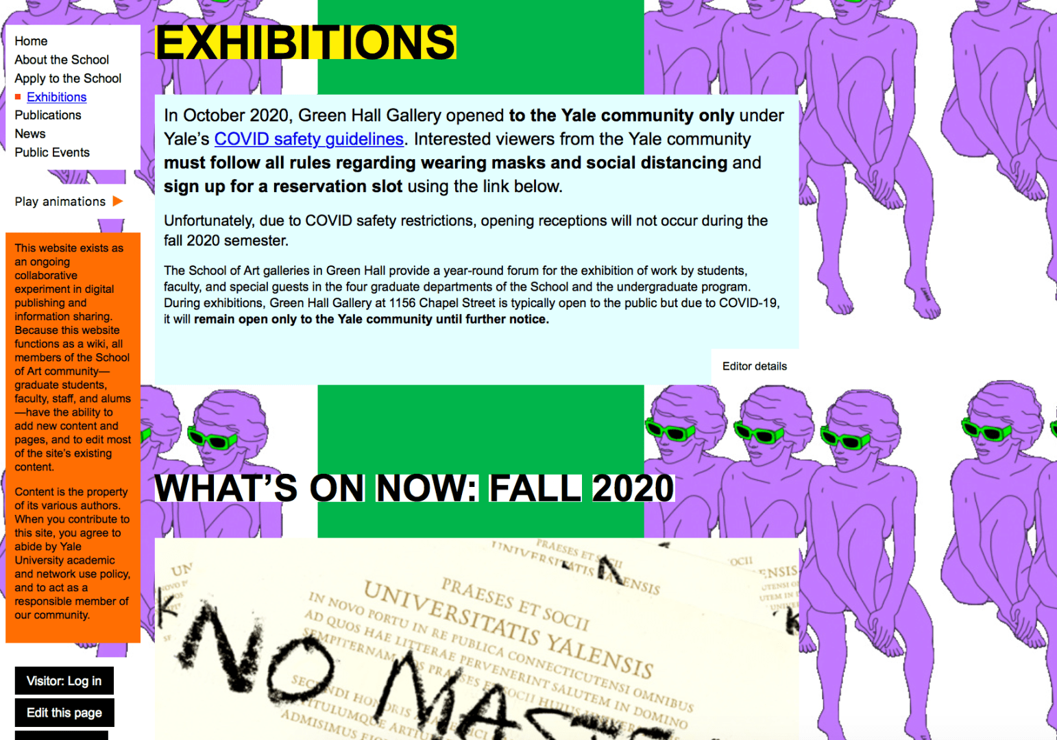
Less Text, More Photos – This website is very text heavy. There is a lot to read and decipher. By changing the amount of text and how it is laid out, there will be a better flow to the website. In addition, having more photos of art would help showcase the students’ work.
Add More Branding – If there wasn’t a title at the top of the home page, most users would have a hard time figuring out which graduate school this website was for. Yale University is not represented well on this website. From colors to logos, there really isn’t any footprint of Yale at all.

In conclusion, the Yale School of Art website is very unique, and for the most part, it probably wants to stay that way. The design of the website, however, can cause some distraction. The researcher recommends some tidying and organizing to bring everything together and on brand, while keeping the uniqueness of the website apparent.
