To analyze the user experience of the Yale School of Art website more intensely, I conducted a usability test on the website using three participants. The participants were involved in the testing as my friends and interacted with me through Zoom. I did not include screenshots of the Zooms to keep the participants identities confidential.
The participants were briefed about the testing set-up and what they would be doing in relation to the Yale School of Art website. I created six tasks for the three participants to complete after some introductory questions were asked.
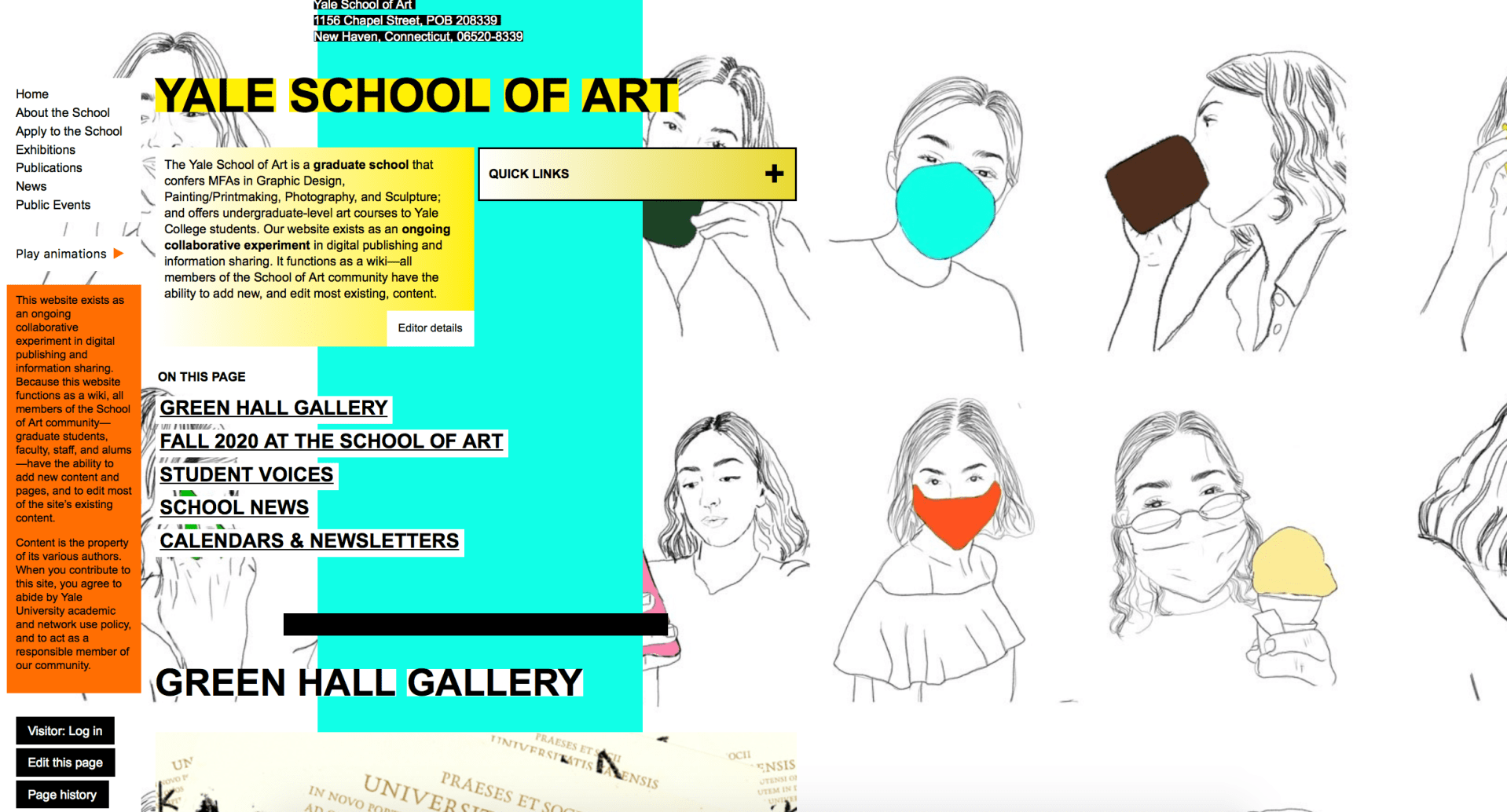
Here are the six tasks I created:
Task 1: You are a prospective student looking to find out more information on the school and its values. Find the mission statement for the school
Task 2: You are a current Yale undergrad student interested in applying to the graduate school of Art of Yale but want more information from a staff member. You are interested in talking to the dean but don’t know who he or she is. Find the Dean’s name.
Task 3: You are a prospective student looking to find out more about the graduate school and what types of concentrations the degree offers. Find the graduate study areas (the different type of concentrations students can study).
Task 4: You are a prospective student looking to find out more about the graduate school and how rigorous the programs are. Find the total number of credits required to graduate in the Graphic Design (MFA) program.
Task 5: You are a proud New Haven resident and want to give back to the Yale School of Art. Find the webpage where you would go to donate money to the school.
Task 6: You are a prospective student looking to go on a visit of Yale’s campus, but do not know how far the trip will be from your home. Find the school’s address.
All three participants were able to complete the tasks successfully. As the researcher, I took notes and documented important quotes throughout the testing. It was interesting to see the participants’ responses as they completed the tasks.

All of the participants had similar thoughts on the design of the website and how it was organized. They all noted that “there was a lot going on” in relation to the amount of color and business that came from the graphics used. Participants 2 and 3 both mentioned that the pages go one for a long time (it takes a while to get to the bottom of the pages).
In addition, the participants’ successes with the tasks prove that the usability of the website is not necessarily a major problem. The information is there and is fairly easy to get to. The recommended changes from the researcher mostly include cosmetic shifts. The website is graphic heavy, so the researcher recommends decreasing the amount of graphics and adding more photography.
The Yale School of Art website is filled with small, boring text. There is not a lot of variety in size or font when it comes to the text. The headings, subheadings and copy could be formatted in not only a consistent, but also in a more organized way. There are also a lot of text that is outlined with a rectangle in another color. This creates the sense that the text is hyperlinked, but a lot of the time it is not.
The researcher also thought more about the uniqueness of the website and how Yale might want to stick out more and not follow the crowd with their website. Participant 1 mentioned this thought, as well.
In conclusion, the research saw a lot of value in the usability testing. The participants are put into situations that they have never been before and are able to navigate out of them to find the information they are looking for. Despite the Yale School of Art’s busy and distracting website design, it is effective when you are looking for the basic information you would need.

