
Maps
The three primary mapping attributes are scale, projection and symbolism. A scale is used to show a ratio of size for the map and the real-life area. Scale can also refer to the level of zoom the map is placed in. A projection refers to how the creator represents a globe on a flat surface. This means that features on a map with be stretched and squished.
Maps can be grouped in two different ways – conformal or equal-area projections. Conformal projections keep the continental shapes, but the size is changed dramatically. A Mercator projection is the most widely used conformal projection, which has been used for sea navigation. Equal-area projections usually distort shapes but keep area ratios consistent to the real-life ratios.
Map symbols are used to show where places, features and other geographical information is. When selecting map symbols, the creator should keep the viewer in mind and make symbols easy to understand. Tourism maps use numerous symbols to help tourists get around and learn where sights are.
Choropleth maps can create problems. In the example used by Professor Marchese, the election map used by Pres. Trump showed counties won by either himself or Hillary Clinton. But, it did not show the distribution of population. The choropleth map made it appear that Trump won more of the country because of the amount of red in the map, but that is misleading based on population distribution in those areas compared to bigger cities, which Hillary won more of.
The Truthful Art – Alberto Cairo
Maps deal with spatial recognition and representation for visual information.
Because our planet is a globe shape, it is difficult to present this visual on a 2D surface. When you project a globe on a flat surface, five things will be distorted
How to Lie with Maps
Making Maps through Data Wrapper
Locator Map: Atlanta Movie Theaters Inside the Perimeter
For the locator map, I collect data for the movie theaters in the Atlanta area. “Inside the Perimeter” is a term Atleins use to describe the area inside of the circle-like 285 highway that encompasses the city. The outer part of the Perimeter is mostly suburbs.
Inside the Perimeter (ITP) includes 15 movies theaters. The red dots represent name-brand or chain movie theaters that you would find in other parts of the state or country, like AMC or Regal. The blue dots represent unique-to-Atlanta movie theaters (small local businesses). On Data Wrapper, if you hover over the dots, the name and location of the movie theater pops up.
I also assumed this could be classified as a symbol map as well.

Symbol Map: Connecticut Universities’ Growth from 2013-2017
I had some trouble with this map. I created a data set by following the same outline that the tutorial page used with population change across the country, but I was not able to get pass the step after adding the data to data wrapper. Here is what my page looked like.
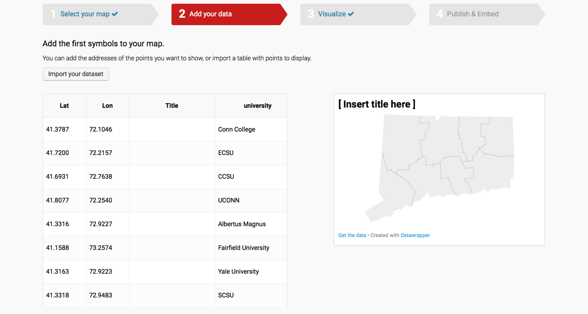
I am not sure why the title column was added into the data set? I did not have that in the information I copied and pasted. Is this page supposed to show something on the map of Connecticut?
