
Good Charts by Scott Berinato
Learning the ins and outs of data visualization can be compared to learning a new language. But, we, as humans, view and perceive charts and data in different ways. Scott Berinato writes in Good Charts (2016) that the best analogy for data viz is similar to music. Everyone has their own likes and dislikes when it comes to music, and that is also how people read and view data viz.
The information involved with data viz is always changing, but there are five ideas related to how people view charts…
People don’t read charts in order. Normally, when you read a book there is a pace, and in the West, we read left to right. But, in data viz, the viewer will jump around based on what catches the eye.
Eyes will go to what stands out first. From colors to shapes, viewer’s eyes will travel to points on a chart that stand out. This could include the intersecting lines on the chart about rural/urban migration or the large mountain-like figure in the chart about customer service calls (Berinato, 35-36).
We also don’t see a lot of information at once. The busier a chart is the harder it is to find individual meanings. In addition, experts believe we can only process eight colors at a time (Berinato, 37). As a chart increases the number of elements/variables (5-10), the meaning of the information weakens.
As we read charts and begin to make connections, we look for the meaning. If the design of the chart is not great, it is harder for the viewer to understand what the purpose of the chart is.
The fifth idea is that viewers use metaphors and conventional thinking to read charts. We read time as moving from left to right, not up and down. Viewers think of something like a high customer service performance to be visually high on a chart, not low. We have also formed conventions about information in our brains – north is up, south is down; red is negative, green is positive.
In order to make a good chart, there two questions you should ask before you start designing.
Is this information conceptual or data-driven?
Am I declaring something or exploring something?
A conceptual chart’s goal is to simplify information by using ideas. A data-driven chart uses statistics or numbers to inform the viewer of something.
Declarative charts focus on documenting something with the hopes of affirming information. Exploratory charts dive into a question with hopes of discovery through prototyping and interaction (Berinato, 56).
The two questions above asks about what information you have and what you are looking to do with it, respectively.
Four types of charts visual (Wodtke, 2017)

Conceptual-declarative
Idea Illustration
These types of charts use people’s abilities to understand metaphors to simplify ideas. Organizational charts, decision trees and cycle charts are examples of conceptual-declarative visuals.
This chart is used to show the process of making movies at the Walt Disney company from 1943. Michele Debczak describes the process with the center of the chart showing the director’s responsibilities and the production and management making up the perimeter. The chart is a good example of a conceptual declarative chart because it shows the flow of the data in a visual representation. (Debczak, 2015)

Conceptual-exploratory
Idea Generation
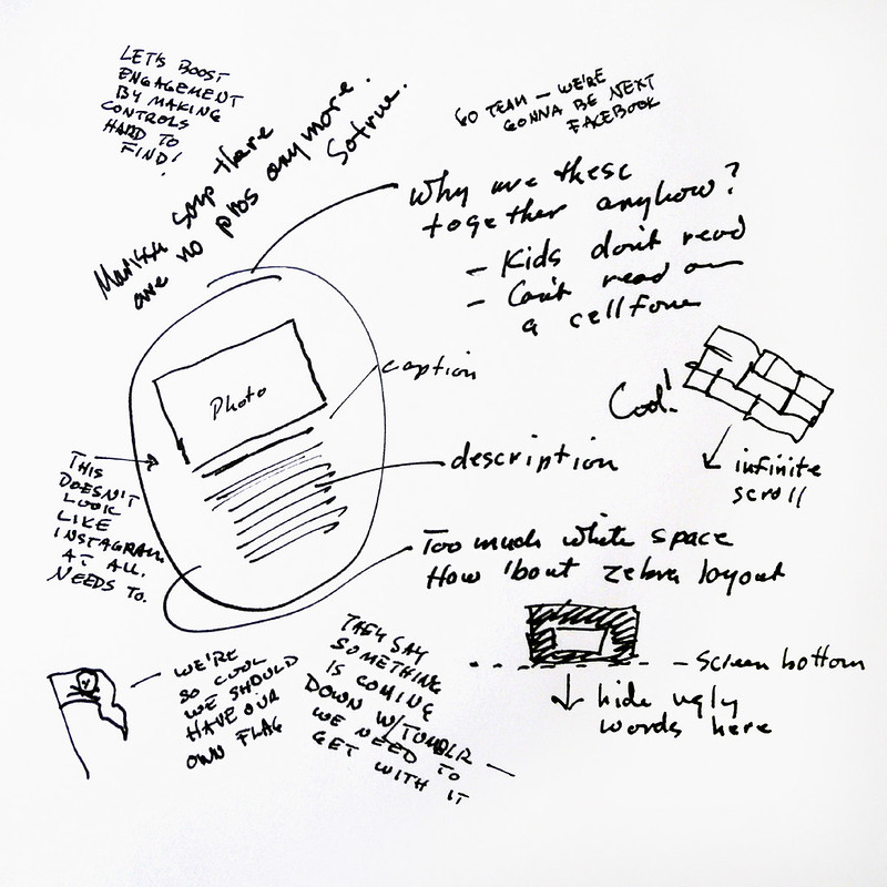
This type of “chart” relies on conceptual metaphors but in a more informal setting. It usually happens on a white board, scratch sheet of paper or napkin. It is used in the early-phases of projects to get ideas down. Jon Kolko, the founder and director of Austin Center for Design, says it is “our go-to method for thinking through complexity” (Berinato, 60).
This is a whiteboard sketch from Flickr that shows the process a team goes through when proposing changes to their layout. This sketch is the first draft and idea-centered process for the Flickr team and gathers numerous points of view (Crick, 2019).
Data-Driven Exploratory
Visual Confirmation
Within this category, there is a new type of task – confirmatory, in addition to declarative and exploratory. When using a visual confirmation for a chart, you are asking yourself “is what I suspected actually true?” or “are there other ways of looking at this?” (Berinato, 61).
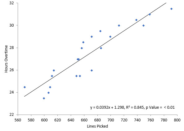
This scatter plot shows a strong correlation between the number of overtime hours worked and the number of items picked in a line in a warehouse. This is good example of a data-driven visual confirmation because you can see the correlation from the plots’ shape.
Data-Driven Declarative
These are the charts you see all the time. They can come from an excel spreadsheet and morph into bar charts, line charts, pie and scatter plots. The simpler, the better when it comes to data-driven declarative – the goal is to provide information without the need for explanation. These types of charts are often found in annual reports to show sales figures.
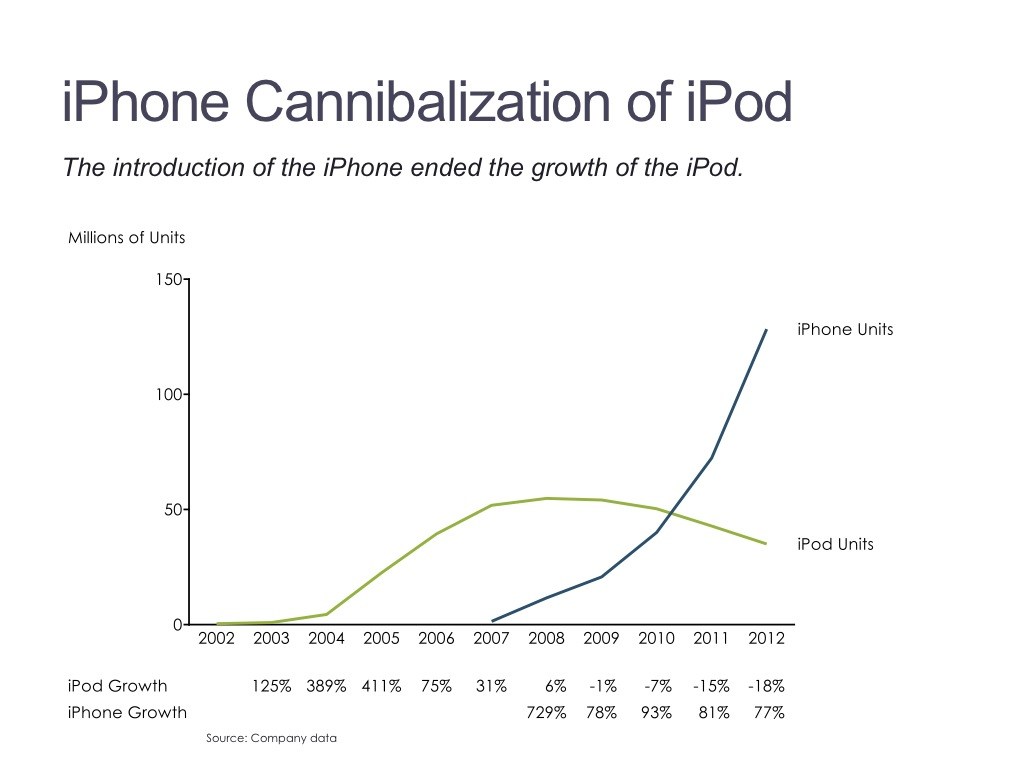
This chart shows iPhone growth compared to iPod growth over a span of 10 years. This line chart shows the growth/decline of each item and is easy to read (Crick, 2019).
The Beauty of Data Visualization – David McCandless
David McCandless expresses how a map of information can help viewers when they are lost in it. The chart that shows the world’s fears was colorful and caught the eyes of the audience with not only the ease of information but with content’s humor.
McCandless quotes data as the world’s new oil. “Data is the ubiquitous resource that we can shape to provide new innovations, new insights, and it’s all around us, and it can be mined very easily” (McCandless, 2010).
But, he then comes back to describe data as the world’s new soil. There has been a continuing and evolving process of putting data into world and fine-tuning it.
He also explains that because we live in a connected and technologically-advanced world, we sometimes don’t receive the whole picture. A military budget chart shows that the U.S. has the biggest military budget in the world, but that number can be broken down and shown as information in many different ways.
References
Berinato, S. (17 May 2016). Good Charts.
Crick, S. (2 June 2019). Types of Visuals and when to use them. Retrieved from https://shelleycrick.com/types-of-visuals-and-when-to-use-them/
(July 2018). Scatter Diagrams. Retrieved from https://www.spcforexcel.com/knowledge/root-cause-analysis/scatter-diagrams
Wodtke, C. (25 May 2017). A visual vocabulary from concept models. Retrieved from https://medium.com/@cwodtke/a-visual-vocabulary-for-concept-models-f771b2b2e9
