
From medieval to modern times, there is an extensive intellectual history of data visualization. The Milestones Project was used to collect and organize important developments from a range of areas and fields that influenced the creation and evolution of data visualization (Friendly, 2006).
The earliest roots of data visualization begin with map-making and visual depictions. The 19th century was most likely the earlies time of statistical thinking and data collection in relation to planning (cities, buildings) and commerce. The historical documentations in fields like probability, statistics, astronomy and cartography align with the developments over time with data visualization.
Epochs – a period of time in history or a person’s life, typically one marked by notable events or particular characteristics (the Victorian epoch)
Friendly provides a graphic overview of milestones in different epochs throughout history. Starting with the 1500s and moving forward, Friendly examines a graph that shows the milestones of data visualization in history. The earliest moments of visualization came before the 1700s with star maps and geometric diagrams. Egyptians laid out city structures in grid maps and would be reference tools for other civilizations until the 14th century.
By the 16th century, geographic and position visualizations were well-developed. One of the most important and sophisticated developments during this time was triangulation, which pin-pointed locations.
Towards the end of the 18th century, more detailed cartography came to fruition. Mapping of geologic, economic and medical data was attempted in visualized forms. William Playfair (1759-1823) is considered to be the inventor of many data visualization forms used today – the line graph, the bar chart and later, the pie chart. In 1833, Andre-Michel Guerry used the Ministry of Justice in France’s centralized system of crime reporting to produce work on the moral statistics of France. His work was said to be the first foundation of modern social science (Friendly, 2006).
We’ve seen throughout history that data visualization was used in so many forms and fields of study. In 1831, the first case of Asiatic cholera was reported, but the water-born cause of the disease would not be discovered until 1855 when Dr. John Snow made his famous dot map. By the mid-1800s, the need and understanding for numerical information and visualization was soaring in Europe, as people began to realize the importance for social planning, industrialization and transportation. The Age of Enthusiasm transformed into the Golden Age, which was known for its beauty and innovation in visualization (Friendly, 2006).
Francis Galton had major contributions in the history of data visualization. He developed ideas of correlation and regression in graphs. In 1881, he created a “isochronic chart” that showed how much time it would take to travel anywhere in the world from London. His most notable graphical discovery was the anti-cyclonic pattern of winds in low-pressure regions (Friendly, 2006).
After the “golden age” of the 1800s, the “modern dark ages” of visualization came in the 1900s. The rise of data visualization fell off throughout the 1900s and there were few graphical revolutions until the 1950s.
In the last quarter of the 20th century, data visualization transformed into a vibrant, extensive research area. Software tools for a wide range of uses were implemented for desktop computers. Friendly explains that it is now more difficult to track and highlight the recent updates to data visualization’s history because it is now so vast and expansive and happening at a quicker pace.
Friendly’s Milestones: Places of development chart was interesting to examine. He explained how Europe was the leader in data visualization in the early history, but it is interesting to see the immense spike that happened in North America, which left Europe behind. Even in the 2000s, Europe is behind North America in relative density.
Final Thoughts from Friendly
From Friendly’s broad view of the history of data visualization, he summarizes with the idea that the modernizations of data visualization came from practical goals and the need to understand relationships and correlations in new ways. The transformations of statistical research and resources helped move the history of data visualization to where it is today.
Pros and Cons of technological advances in data visualization
Throughout history, we have seen the transformation of data visualization happen over time. With technological advancements, data visualization has become increasingly sophisticated. For example, with the current COVID-19 pandemic happening, new information is available almost every day from around the world. We can chart the trends of the virus, number of deaths, number of cases and share it with the public. Information is available to be processes and charted quickly, so information is spreading as fast as the virus itself. Back in the early periods of documenting data visualization, this was not possible.
In addition, with the advancements in data visualizations, people are able to predict correlations based on history. Using trends in data visuals can be super helpful in medical case studies and in real life situations.
Cons of data visualization do exist as well. Sometimes, viewers can have too much information. A lot of colors, numbers, statistics and geometric figures can be confusing for viewers. This is called visual noise (Gorodov & Gubarev, 2013).
What Makes an Effective Chart?
In my opinion, a good chart is easy to read, follow and understand. It doesn’t take long for the viewer to understand the flow of information in a good chart, and the viewer is able to understand specific themes and trends after seeing the chart.
When I look at a chart, I strongly respond to data visuals that are appealing to the eye and easy-to-follow. If there is a lot going on, and if the chart is labeled poorly, I won’t look at the chart for a long time. This is especially true if I am looking at a chart with information I don’t know a lot about. If I do know more about the subject, I can usually interpret the chart without too much difficulty. But, if the information is new to me, then a detailed key and easy-to-follow flow is better for me as a viewer.
Here are a few examples of “good” charts and data visuals, in my opinion.
Sarah Bartlett’s “Say What? A Brief History of Profanity in Hip Hop” was a very interesting set of data visuals.
The chart labeled “Which City Swears the Most?” was really easy to understand and engaging at the same time. The circles on the cities represented the average number of swear words per city in hip hop music. The bigger the circle, the higher number of swear words. Bartlett’s entire data report on the history of profanity in hip hop was really cool. I thought her color scheme was clean and her visuals were all unique and engaging.

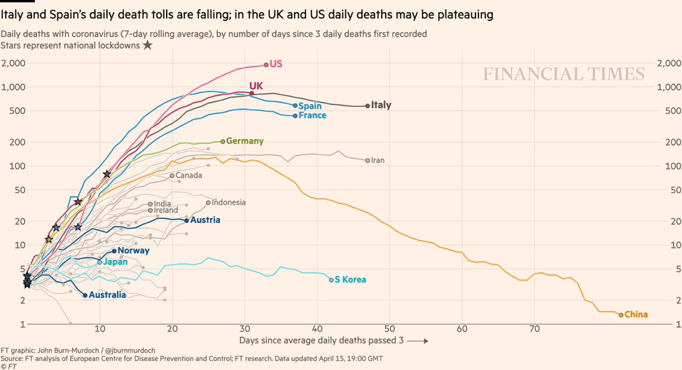
I also enjoy viewing the classic line graph with the x and y axis. This chart from Financial Times shows the death tolls from COVID-19 in numerous countries around the world and how they have risen or fallen since the time when three daily deaths were recorded. This chart is easy to read with the x axis showing the number of days passed and the y axis represents daily deaths. The colored lines lead the eye across the graph and show the increase or decreases of deaths in each country.
This third chart is also from the Financial Times. I found their COVID-19 home base to be very interesting, educational and easy to read. The chart shows the surges of global daily deaths from COVID-19 and which countries have held the highest number of average daily deaths. At the beginning of the pandemic, Europe and the United Kingdom were in the epicenter and accounted for a majority of daily deaths, which is shown by the large blue wave on the left side of the chart. The timeline extends to July 9, and now, Latin America has taken over and accounts for 49 percent of the average global deaths, with Brazil leading the way. The U.S.’s share of average daily deaths has fallen to 12 percent.

Another interesting aspect to this chart is the major difference between the sizes at the beginning and end of the chart. The ends represent the average daily deaths across the world. The left side, which represents the beginning of the pandemic, shows the small number of 393 daily deaths. The right side grew immensely and now the average daily death number is 4,731 with Brazil at the forefront.
These charts are all different in their own ways, but they all accomplish the same goal – giving the viewer information in an easy-to-follow way. There is an ample amount of information that is being received by the viewer, which is also a good quality for a chart.
References
Bartlett, S. (2019). Say What? A brief history of profanity in hip pop. Retrieved from https://public.tableau.com/profile/sarah.bartlett#!/vizhome/SayWhatABriefHistoryofProfanityinHipHop/SayWhat
Gorodov, E. & Gubarev, V. (26 Nov., 2013) Analytical Review of Data Visualization Methods in Application to Big Data. Retrieved from https://www.hindawi.com/journals/jece/2013/969458/
Friendly, M. (21, March 2006). A Brief History of Data Visualization.
FT Team. (10, July 2020). Corona virus tracked: the latest figures as countries start to reopen. Retrieved from https://www.ft.com/content/a26fbf7e-48f8-11ea-aeb3-955839e06441
